8 Graphic Design Trends for 2021


TL;DR
Design is shifting from flat, orderly visuals to richer, more expressive systems.
The insight: 3D (including 3D type), voxel/pixel aesthetics, illusion-driven layouts, and “chaotic” typography are becoming lead actors, balanced by nature-inspired shapes and restrained monochrome/duotone palettes.
The takeaway: pair bold, dimensional elements and characterful illustration with strict guardrails for legibility, performance, and accessibility; use geometry and limited color systems to keep complex compositions coherent. Done well, the result is brand voice with more depth, without sacrificing clarity.
What is happening in the world of graphic design?
There are rumors about new trends!
The designers have been brainstorming and are becoming super excited because there are some new art directions on the threshold of the new year. This year may have been stormy, but professionals came out full of experiences and ideas that they can't wait to show to the audience.
The pieces of the design received new coatings. Some have become bold. Out of the box, out of frame. Others got tamed with style. Some have become or remained classics. However, they all have become very personal and influential.
The possibilities of graphic design are inexhaustible. That is why we have to use them wisely to show their attributes and deliver a notable visual story. They all reflect our flow of thoughts.
You will see that designers listen carefully to our wishes and needs and realize them as visuals of our daily life.
We present you with 8 promising graphic design trends that have found their way to 2021. The best quality is extracted from them, which already provokes the most positive reactions. After all, they have already grabbed attention, covered the pages of the Internet, and posed themselves as logos, product covers, and billboards. Check it out!
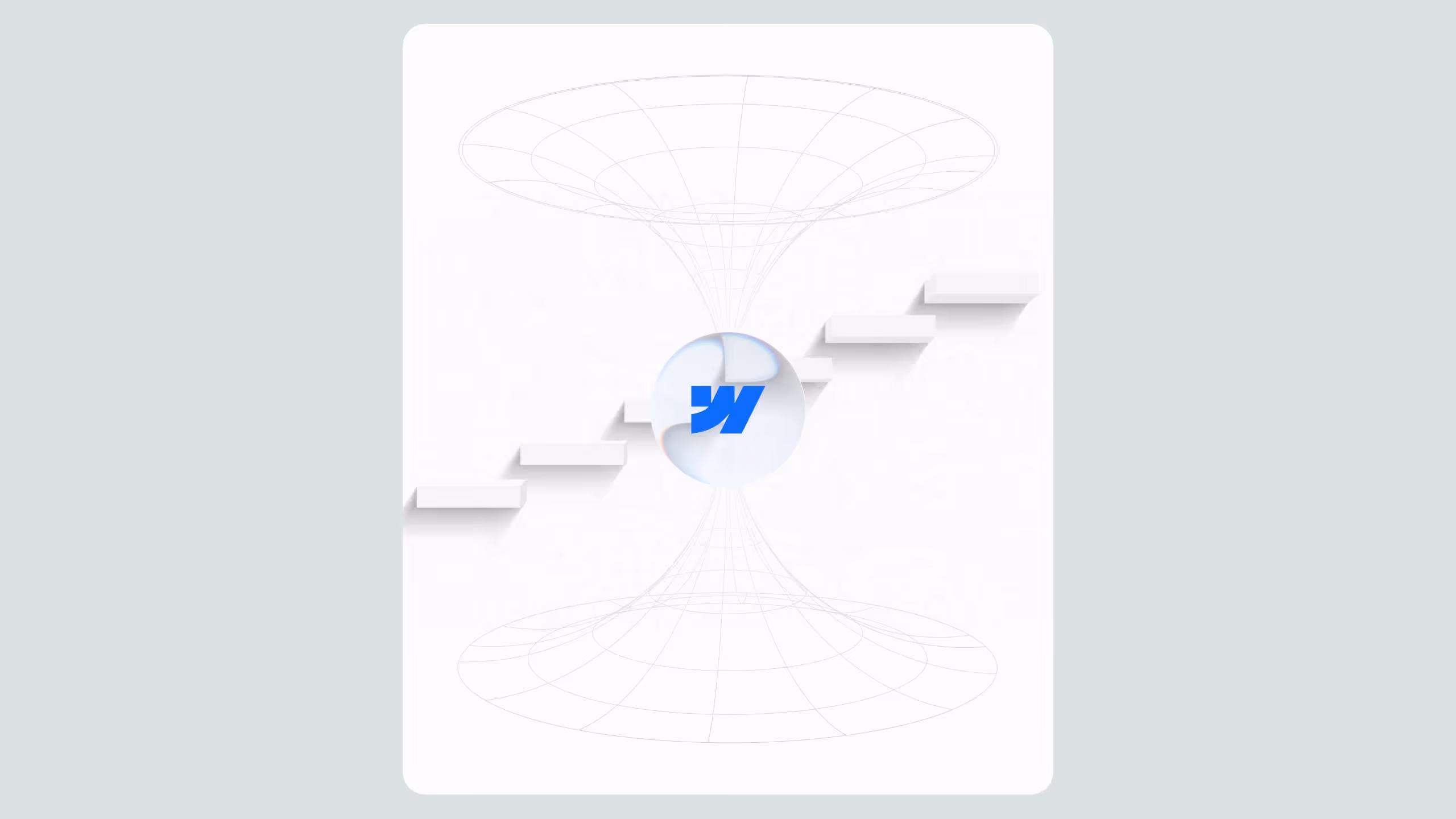
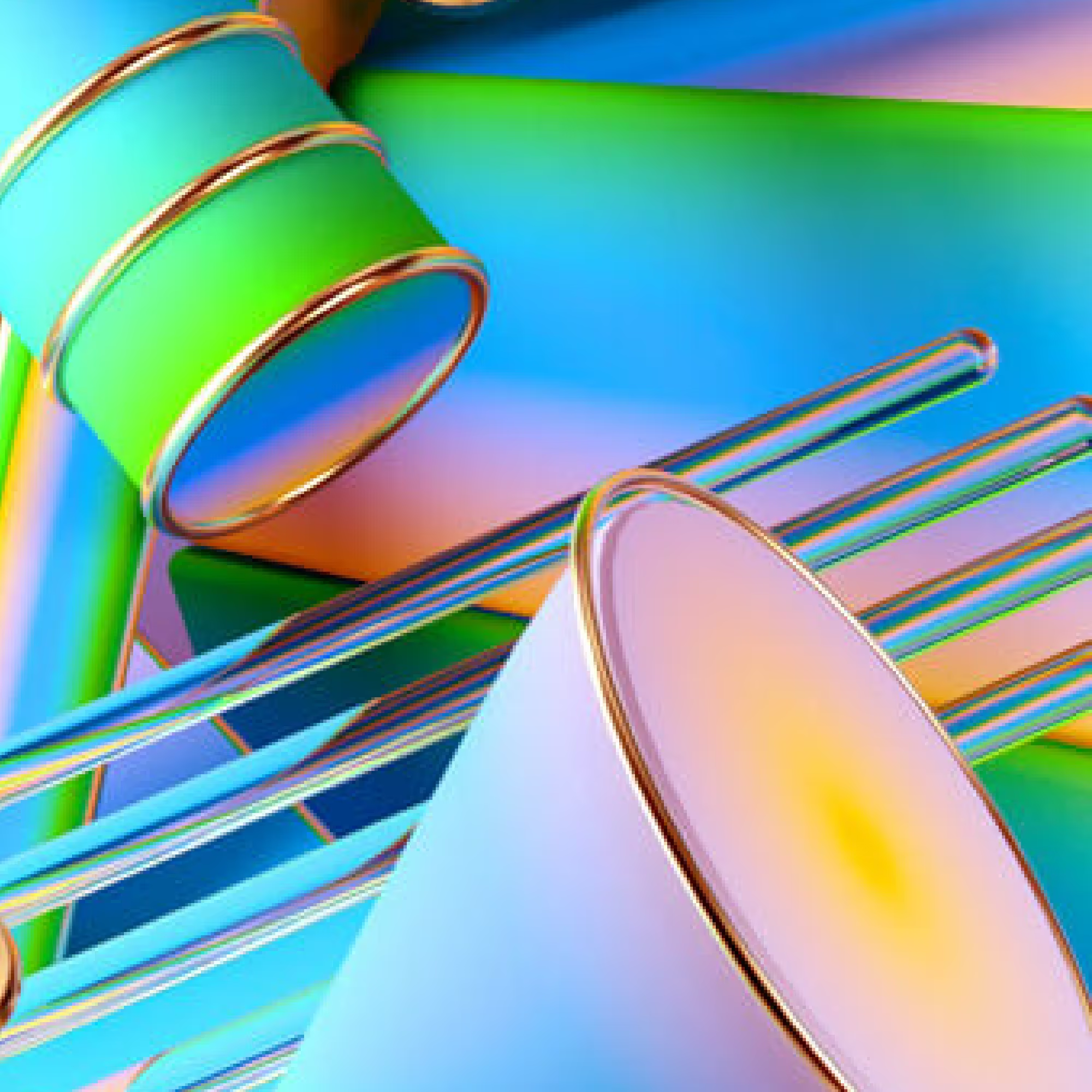
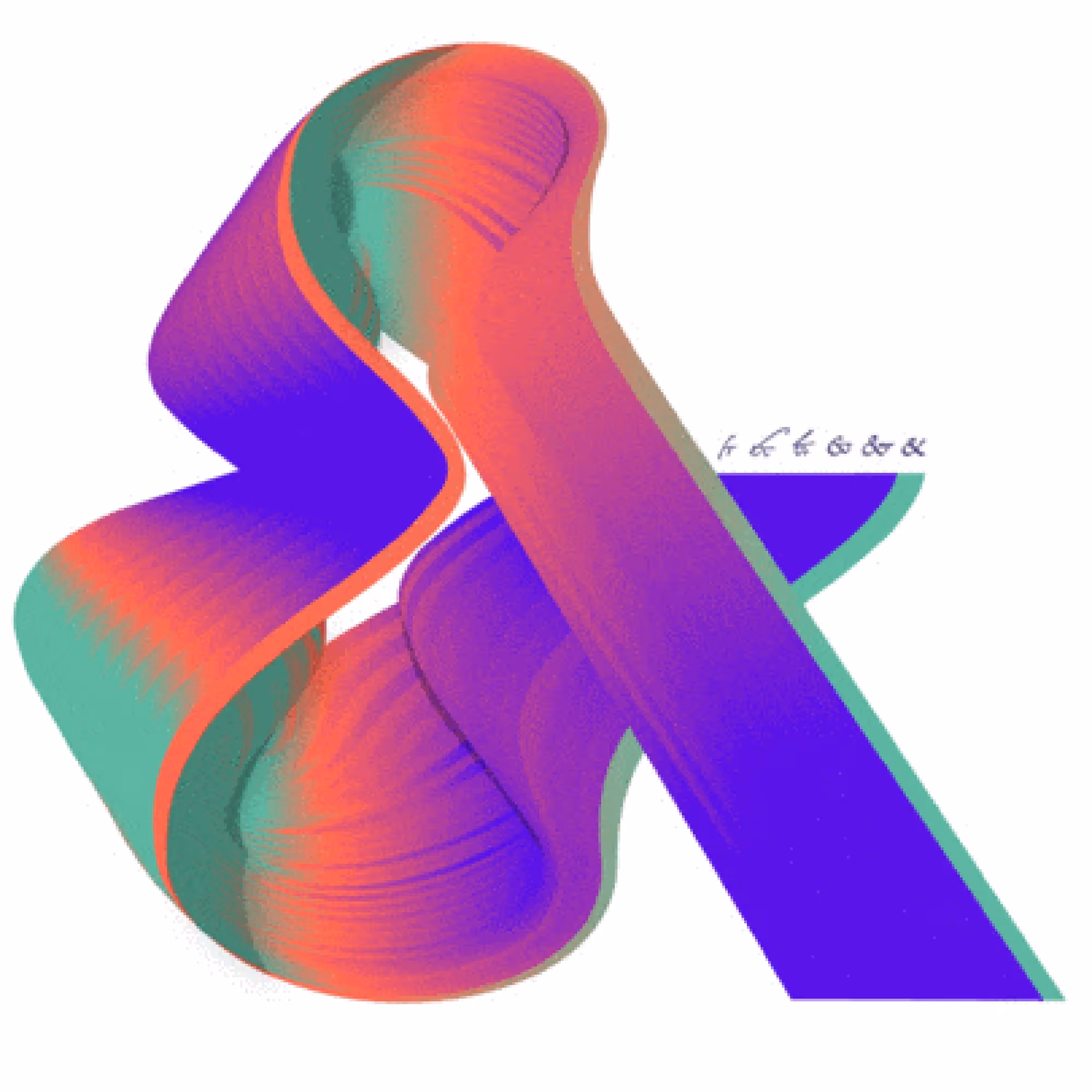
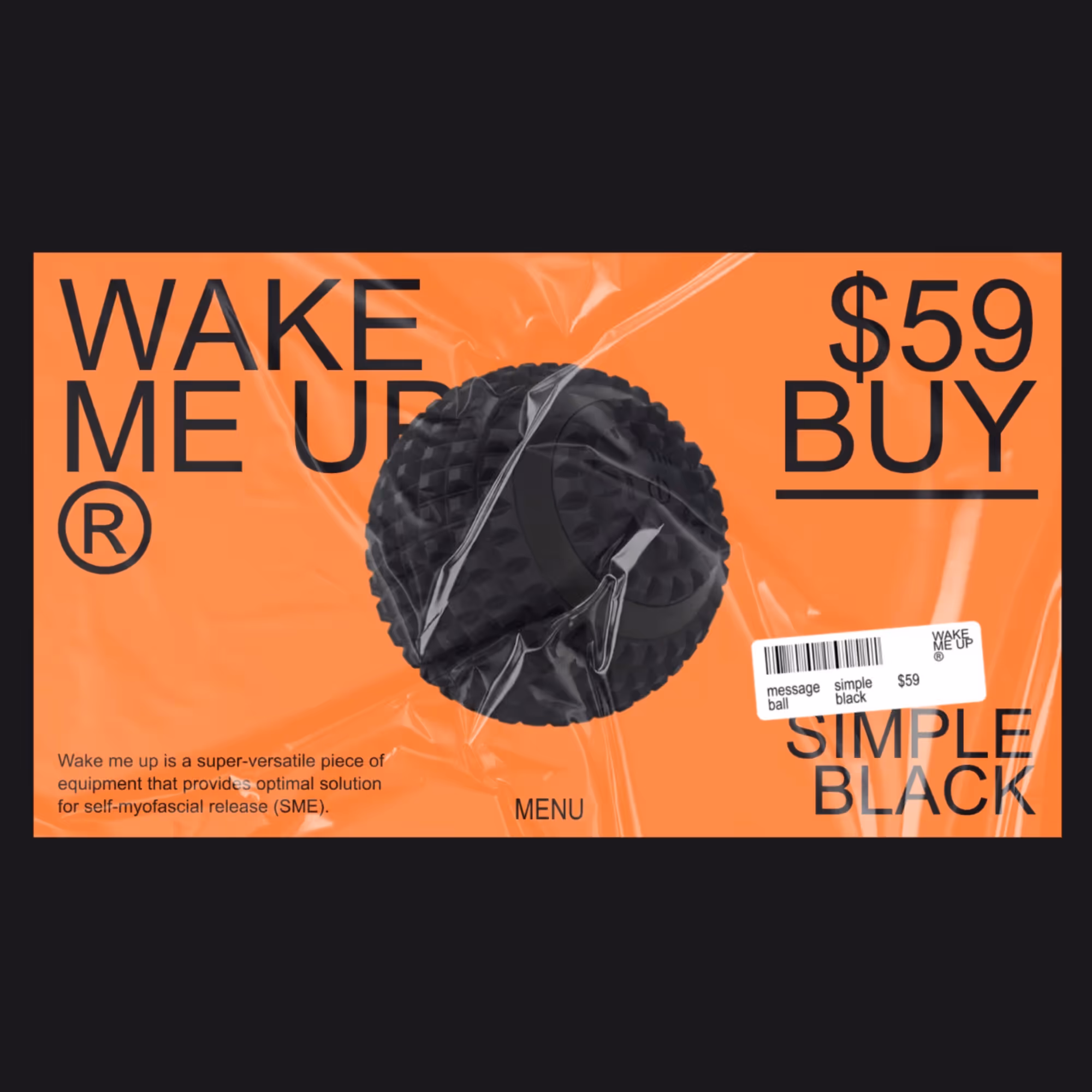
1. 3D Design
New design products in 2021 take us literally into the third dimension!
3D as a tool has already proven itself well in many sectors of technology and the digital world, and it is certainly not a new thing. So, what is so fresh about it? It is quite certain that in the design, 3D figures are now coming to the center of attention in the latest ways.
A little bit of the old craft and new ideas bring new visual experience in the most modern packaging. People with good ideas find that 3D offers an incredible number of possibilities to use, so the figures have already brought to life many design stories.
Now, they tend to appear not only as elements of a larger image but as the main trump cards of a visual experience. 3D shapes are starting to play a leading role. In the visual story, they stand out as a fundamental element, spread over the entire page as the first thing that meets the eye. This is not only a new and modern approach in the use of 3D in design but has resulted in powerful images. So how does 3D help us express ourselves?
It literally and figuratively gives a new dimension to the design. These shapes successfully speak for themselves, what every great design must do. Professionals have already begun to implement 3D into content to harness its best potentials and create countless combinations of these figures with other features.
So, do not be surprised if you find 3D shapes on various backgrounds, alongside illustrations and typography of different styles. This fusion of multiple visual worlds is something that gives fabulous results today.
An exceptionally fancy vibe showed up after adding animation. Animated 3D figure gives the whole concept a realistic and tangible feeling. The images become dynamic in appearance, very much alive, often in motion, and calling for action. It seems that at the very beginning of the year, the designers give us back a sense of wholeness, figure, and movement.
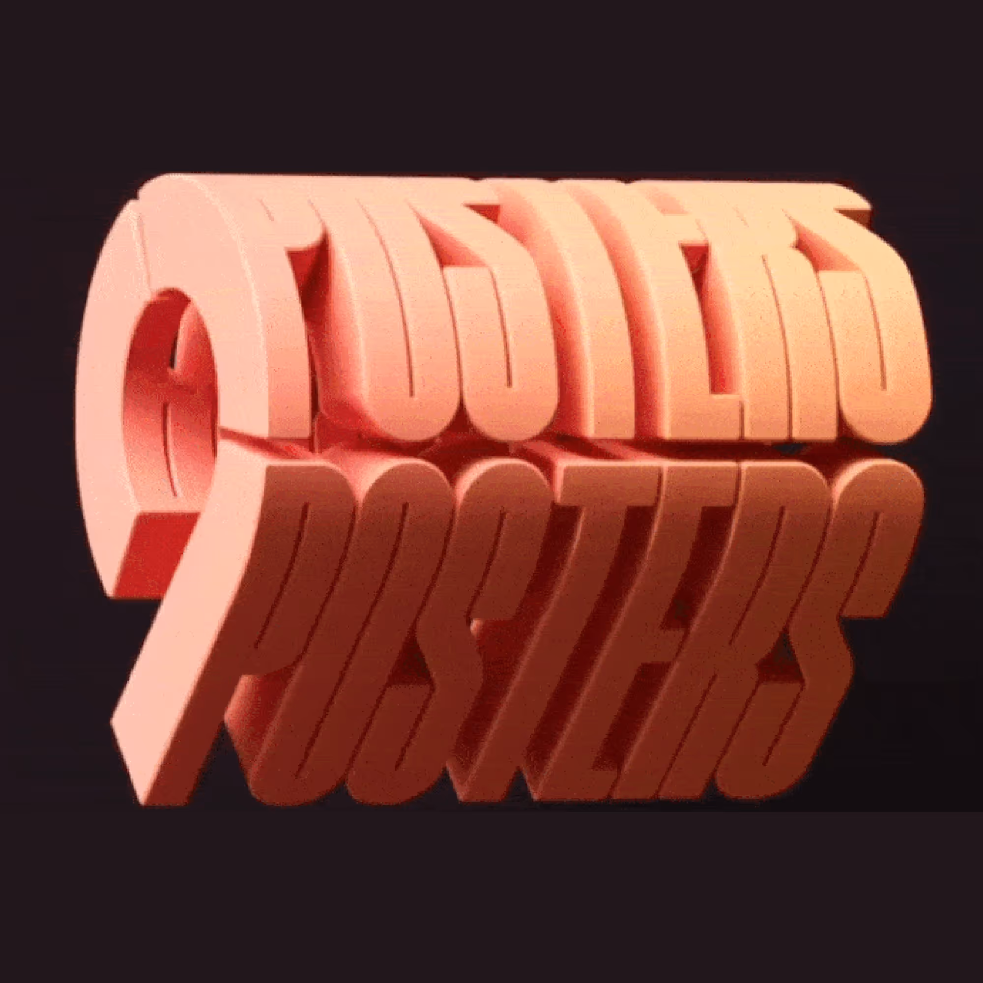
1.1 3D Typography
The most resourceful among designers took this a step further and combined 3D with typography techniques. Because, why not?
The letters are not only flexible in terms of shape but have proven to be ideal for experimenting and adding a new experience to words. How many new stylish word layouts in 3D!
It's not just about the shape, but also about the colors and textures that gave such a blend - a real revolution in the game of design. It is the freshest of all ideas and promises a lot in the new year. Creators and customers, let your imagination run wild now that words have another way of conveying messages.
2020 may have welcomed 3D, but 2021 certainly wants to test all its possibilities, especially typography in UI design.
2. Geometric shapes
It may already be known that from year to year, we abandon the old rules and set new ones. There is a special charm in that. Truth be told, the design does not really like to be constrained by the rules, but it loves regularities.
Long-established regularities of shapes and space have long been taking part in many artistic processes. Such are the geometric shapes that are very popular due to their flawless forms.
These regular shapes continue to dominate the scene because they are consistently helpful and always tend to prove themselves. Therefore, geometry is also entering the big door in 2021 as a new-old trend.
Geometry is a proven tool in the design process. It allows both the whole and the parts to stand in the eye of the observer. To come to the fore at the same time.
Square, circle, triangle. What is very useful is that these simple shapes work like puzzle pieces. While participating in the bigger picture, they are simplified enough to enter the assembly, where they become building elements. On the other hand, the simplicity of geometric shapes does not hinder creativity. Precisely because the possibilities in their use are innumerable, versatile striking designs can be obtained.
What, even more, makes designers pursue geometry in their work is the new 3D look. It is definitely the leading star in 2021. It transforms these shapes into figures so that their use as a building material is even more noticeable in the design. As already mentioned, 3D is all about the tangible impression. The pieces take part in complex pictures but give the impression of individual life and appearance.
We should not forget the classic look of geometric figures. With a smart assembly of colors and sizes, and with good organization, you can always create a unique and bold piece of design. Maybe even add animation to the whole experience.
The secret of this trend lies in the skill of using the ratio of small parts and the big image. So if you do it wisely, playing with geometric shapes is an inexhaustible well of good ideas.
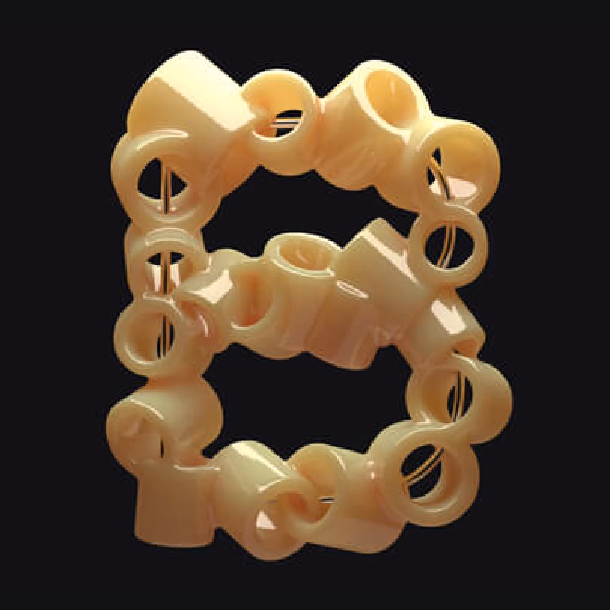
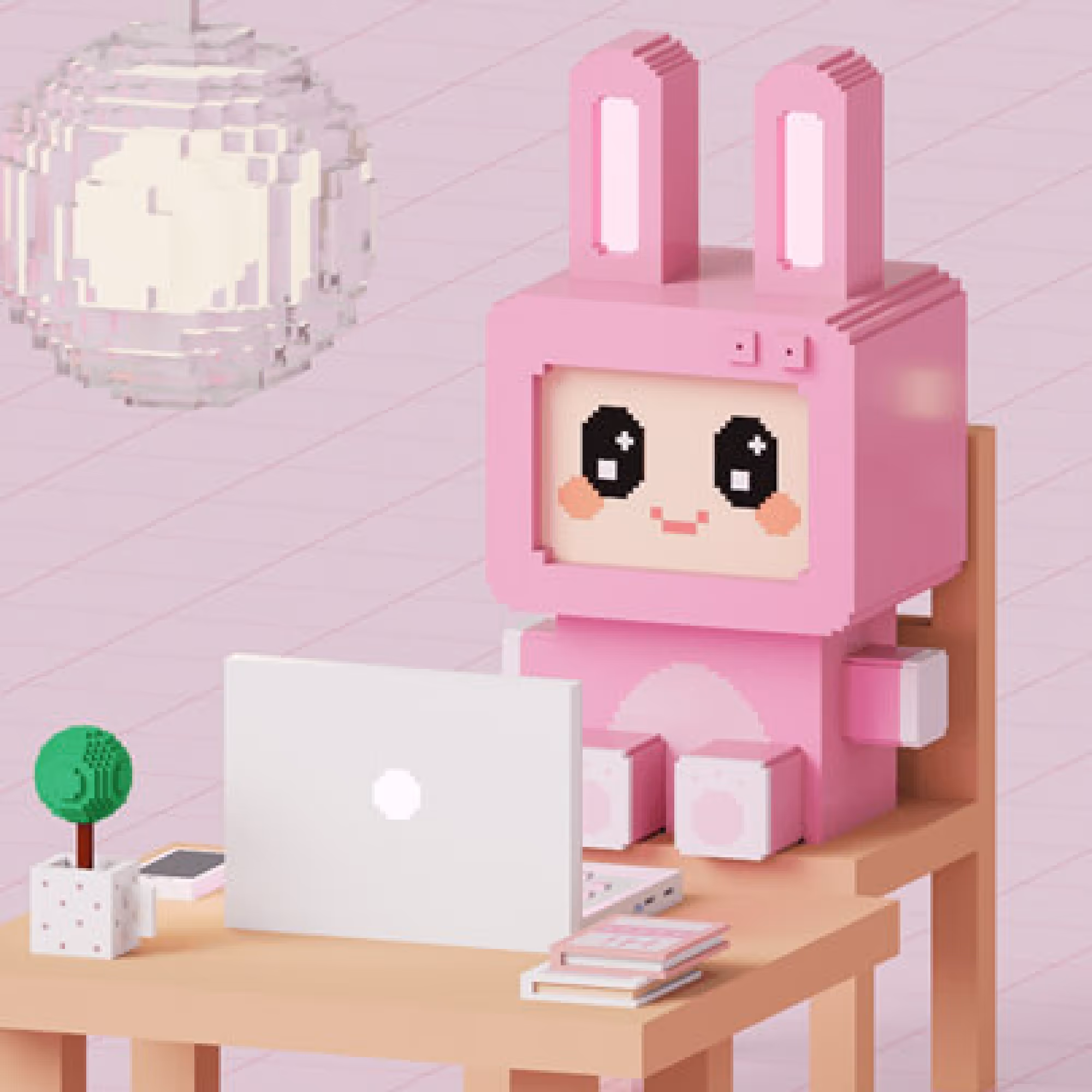
3. Pixels and Voxels
We talked about some building material in the design process and how we started boldly showing the tools we use.
Sometimes that becomes the point of the whole concept. The parts of the structure become plainly visible and carry a portion of the meaning that the whole represents. The more we decompose an image, the more significant elements we get until we get to the smallest material unit - to the pixel itself.
A pixel is a cell of digital art. A zillion of these tiny particles shape one consistent image and are arranged in such a smooth way that they cannot be seen. Grainy images usually cause a lot of trouble, and pixels are not something we want to see in our picture. This is what is usually considered the basic image quality. But do they still have to remain invisible?
Most designers disagree, now that we’re playing by the new rules and unstoppably pushing the boundaries of design techniques.
In 2021, designers are starting to express the naked nature of pixels in a new way, and we think that is ingenious.

Pixels were extracted from their structure, and their abstraction became visible to the human eye. This idea has contributed a lot to a more dynamic look of many designs. The pictures themselves, as always, speak louder than words because they have acquired a much more entertaining character.
Also, this trend as well passed through the 3D filter. All because of its variability and influence that has been spreading extremely quickly. It is another upgrade of pixelization. 2D pixels become 3D voxels, and images now get some movement. It can be said that, in 3D, everything looks playful, like arranging cubes, and many professionals already know how to apply it in their next work.
The design does not stagnate, ever. It is constantly working on some new complex ideas that, on the contrary, give lightly structured and fun products. Not only does building with voxels, block by block, provide casual delivery, but it activates the users themselves in discovering the meaning of the image. In any case, pixel and voxel patterns can deliver a strong impact and brand many products that call for interaction, progress, and upgrading.
4. Cartoon Illustrations
Nothing gives us so much freedom to express ourselves as an artistic creation. In the new year, we simply want something unique that connects with our personal story.
One such trend in widespread use is a free illustration of content.
How free? Enough that the use of all drawing and painting techniques come into consideration, which gives designers and clients incredible branding opportunities.
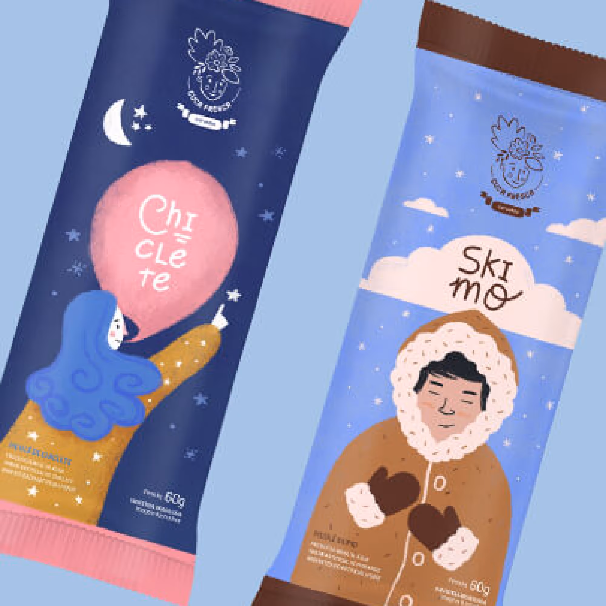
Illustrations easily rule over the Internet and always get a positive reaction from the audience. How come? Because the styles of illustrations are so diverse that there are a bunch of ideas for everyone. Playful content attracts people by always telling a unique story in an imaginative way.
The particular feature of the illustrations that will take over branding in 2021 is a cartoonish look. And we already love it!
The cartoon characters ease up the atmosphere perfectly and quickly entertain everyone who sees them. At the same time, they can very closely connect with the brand and become its first association.
That is why customers already want drawings of their mascots as representatives of their brand and products.
Integrating cartoon characters into a brand means enriching the entire visual identity. We say this from personal experience. Our little ninja Hiro - the mascot of the Broworks - has become a perfect reflection of the values and ethics of our company. And not only that, but he is also our recognizable representative on the Internet.
In addition, we had the opportunity to work on something similar when we were redesigning the logo for gamer Sevou. His Spoidermon quickly established itself as his trademark, so he appeared not only as a logo but also on other products. Meaning that cartoon characters are not only attractive icons but also take an active role in branding. It can be said that such illustrated characters are almost part of the team.
Designers are here to show the qualities of these characters and connect them with people. A character in the hands of a real master gets its proper function: it can look elegant and professional, but also playful and goofy, all depending on who and what it represents. Whether it is a minimalist concept or a flashy look, cartoon illustrations are fun caricatures of our reality and quickly drag under the skin.
Indeed, we all remember at least some illustrated story or character that left us with the impression of being authentic and recognizable.
4.1 Emoji
Along with the cartoon characters, emoji come to the surface. Small heads that reflect our feelings better than words and often express us when we become speechless are something we fell in love with very quickly.
We are not saying that emoji have not had a strong influence on the Internet so far. On the contrary, we very often use them in communication on social networks. However, you will be glad to hear that emoji are now getting more significant roles in designer stories.
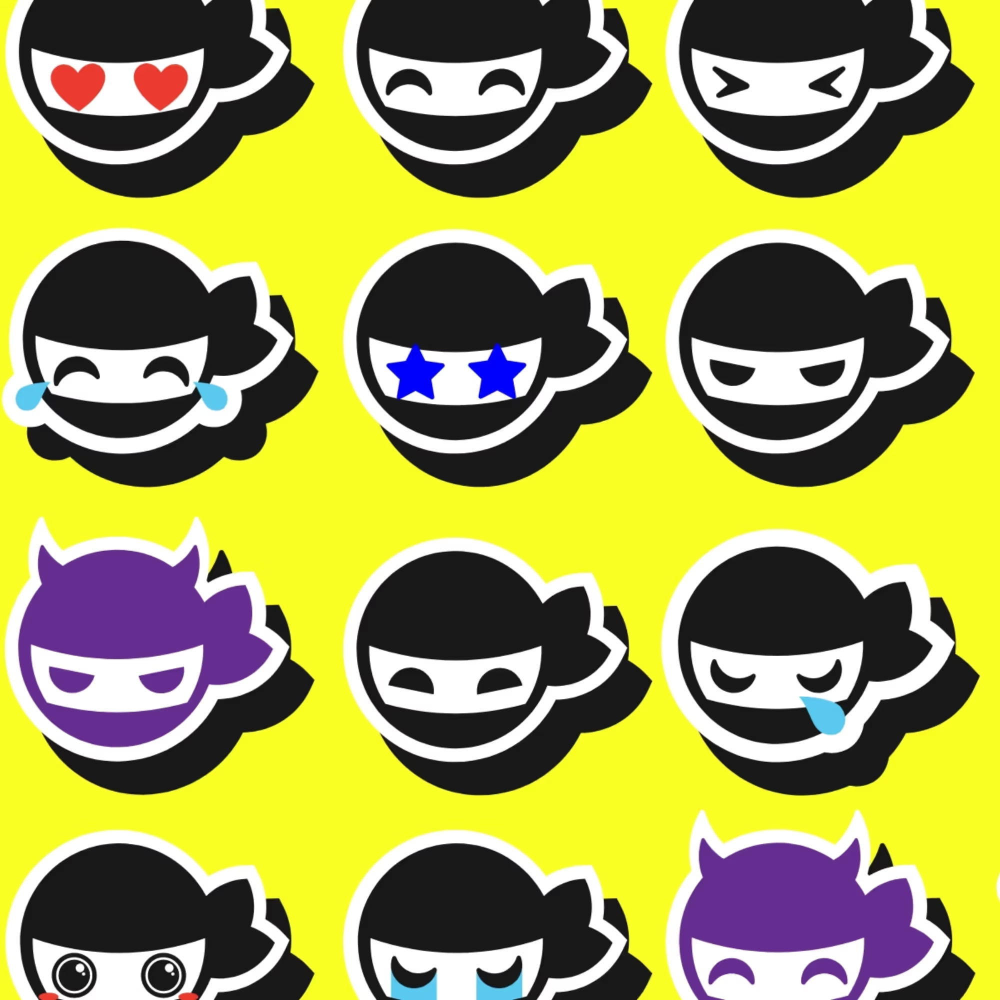
With them, online content has never been more relatable because they create an atmosphere, reflect our emotions and thoughts. 3D emoji heads become even more vivid and call for interaction. That's why designers often like to bring them to life by adding animation or combining them with active elements such as buttons and the like.
Colored or colorless, classic looking or modified, emoji have abnormally enriched web content. They allow us to feel present in the events, and now we are just waiting for them to pop up somewhere in the most modern designs.

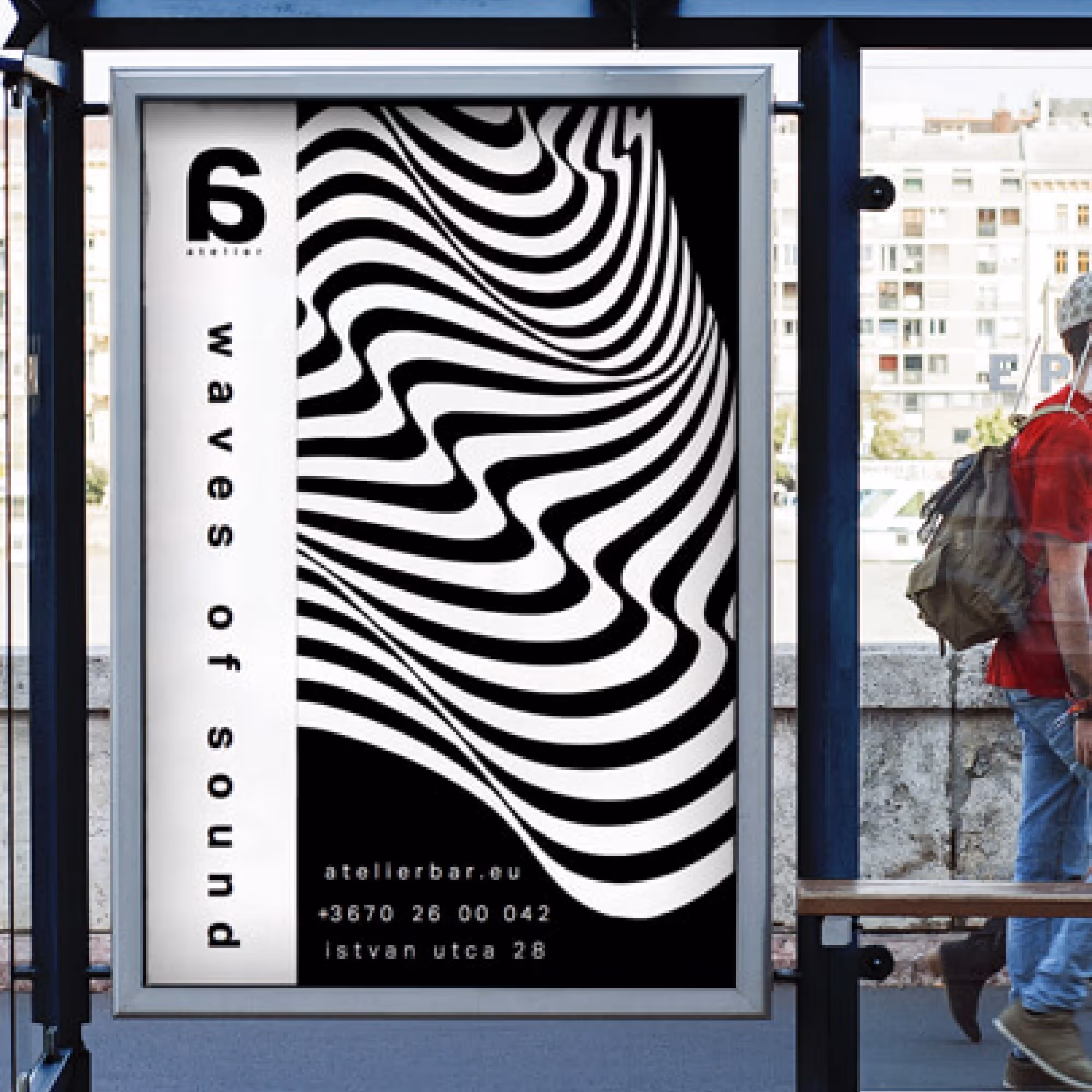
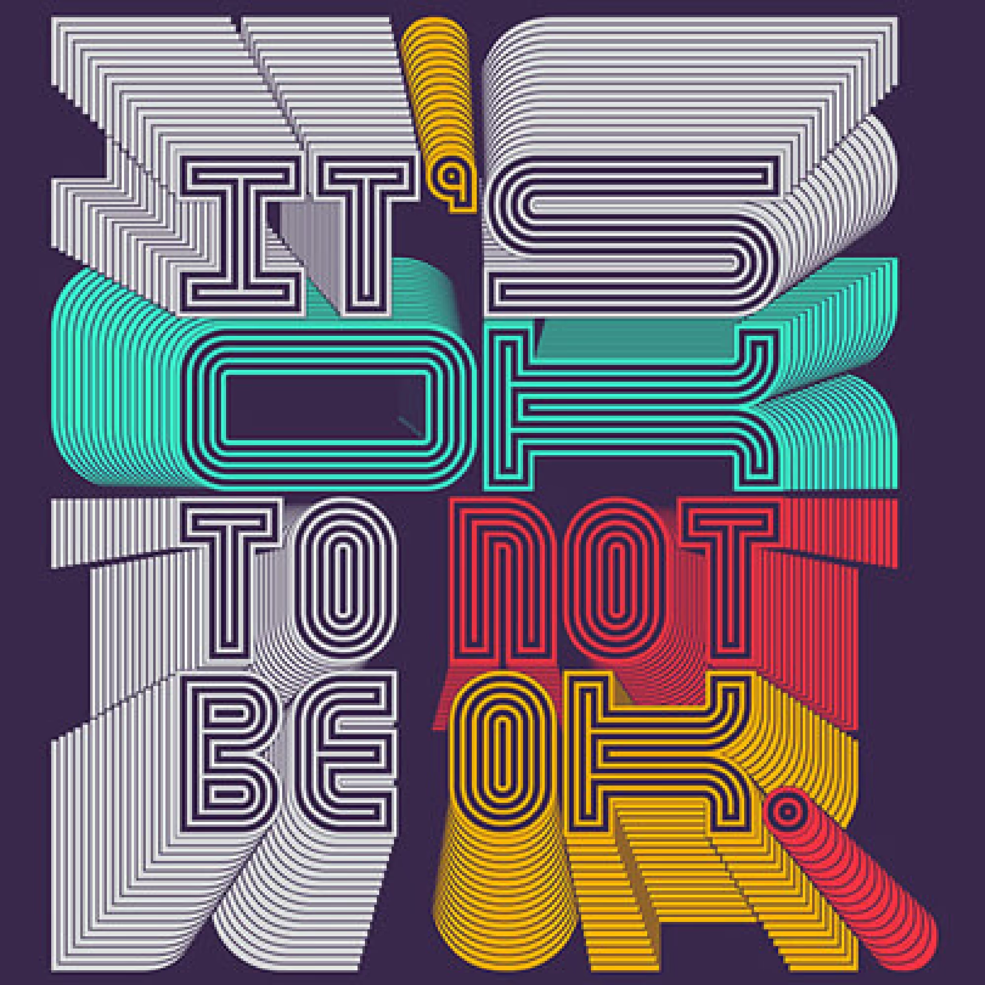
5. Optical Illusions
It is common knowledge that the human eye can be deceived, and we have experienced this in different situations. We rely heavily on the power of our sense of sight, hence the urge to design - to play with shapes and colors.
As such visual beings, we are not very comfortable when our powerful eye betrays us. Therefore, people often have different reactions when they encounter various optical illusions.
lllusions caused trouble for a long time, so they have been avoided as something that cannot pass the test of aesthetics. But true masters of art saw this as a challenge and decided to tackle the deceptive nature of these depictions. And they did it masterfully.
Optical illusions, actually, perfectly enhance the design when you know how to use them. They must be well dosed to avoid the pressure they otherwise put on viewers. A good connection with some meaningful part of the design can do a real miracle here. Add a mysterious note to letters or some other element with these visual tricks! You will see that people will not be able to look away. Maybe add a drop of some color and turn your idea into a mirage that will boldly represent you.
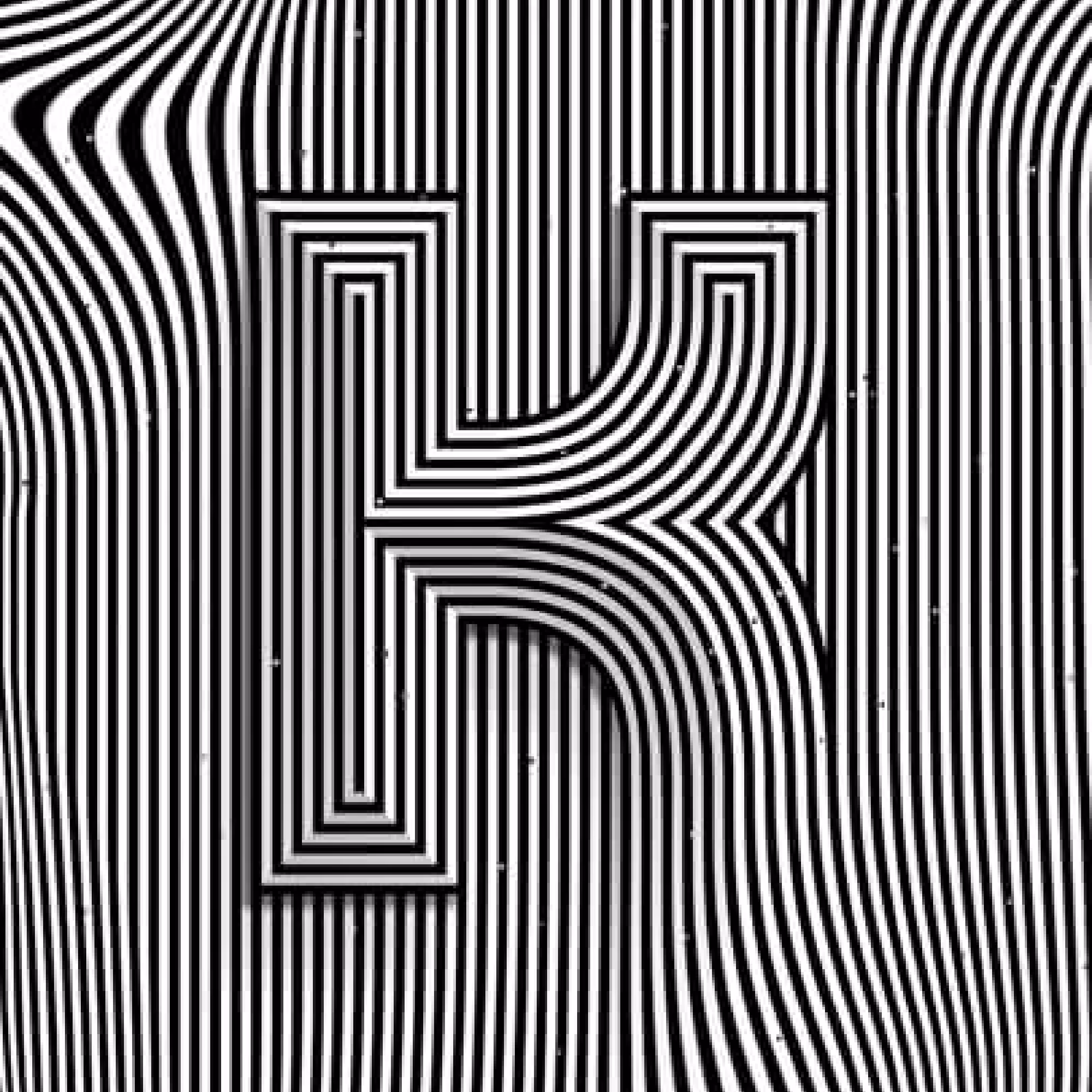
Optical illusions can not only add an intriguing part to the design but can also brand many products and services. While attracting and retaining attention from all sides, it can take on the character of your brand by highlighting it in a cool way.
Well, if you know how to tame the terrifying energy of optical illusion, you can hypnotize people with style.
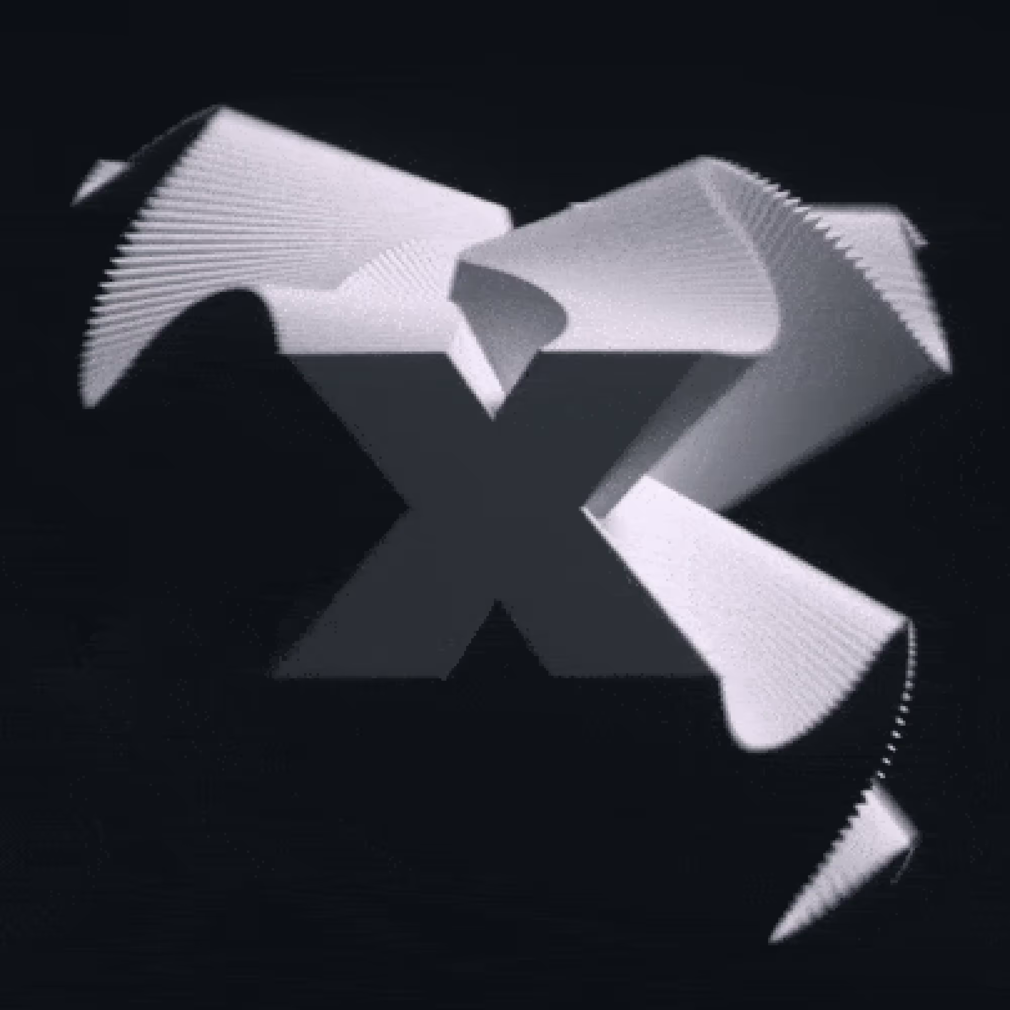
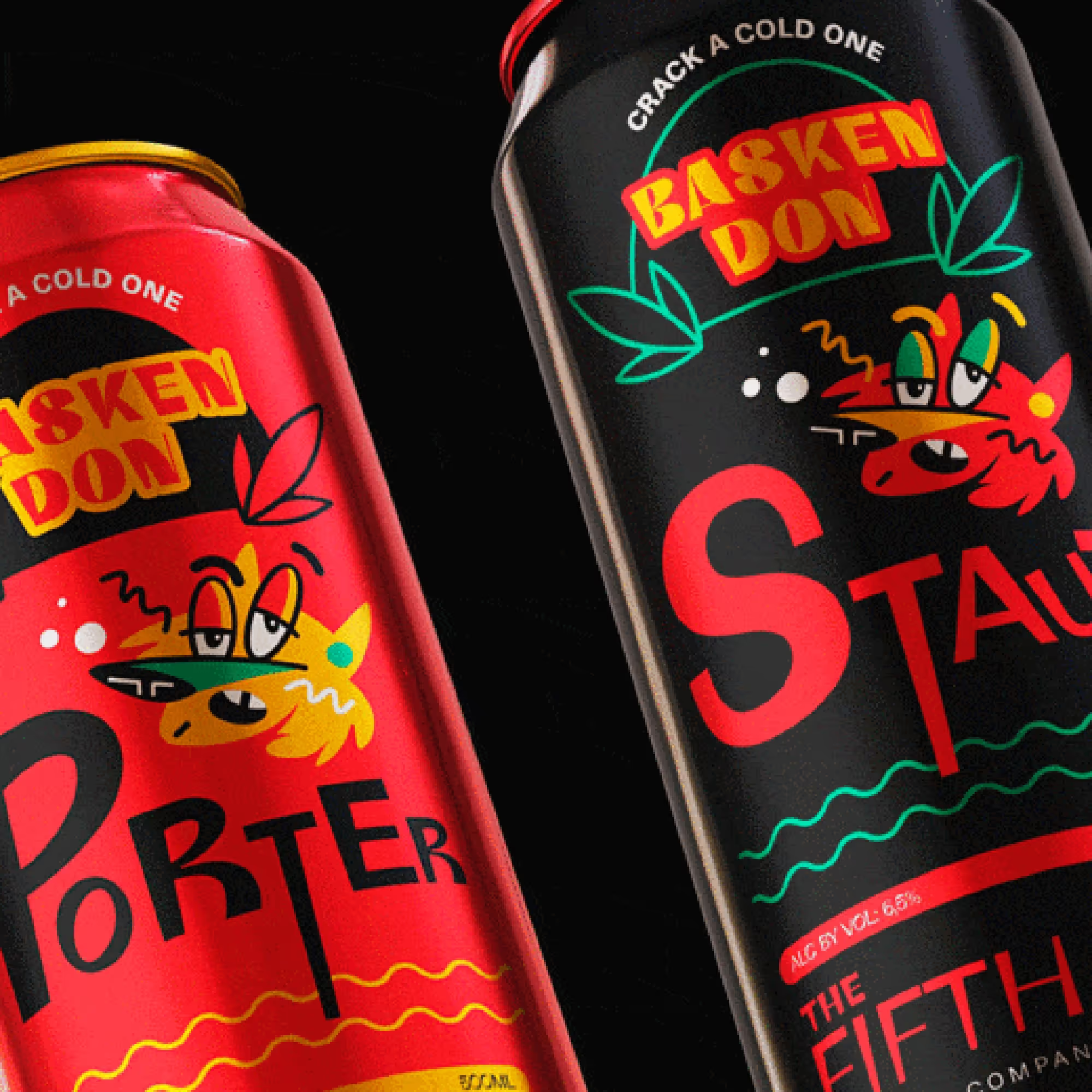
6. Chaotic Typography
By popularizing optical illusions, have we opened the door to other concepts out of order?
Of course, we did! In 2021, professionals will go very deep beyond the boundaries of the known and recognized to show how seemingly wild concepts can very well play on our side. And be very efficient.
We could notice the chaotic typography as well as other trends earlier. In the new year, however, this way of wordplay will experience expansion because we may be a little tired of our words having some uniform frames and shapes. The 3D typology has already begun to transform word strings into modern figures with multi-layered meanings. The chaotic typology is rebellious to move the boundaries a little more.
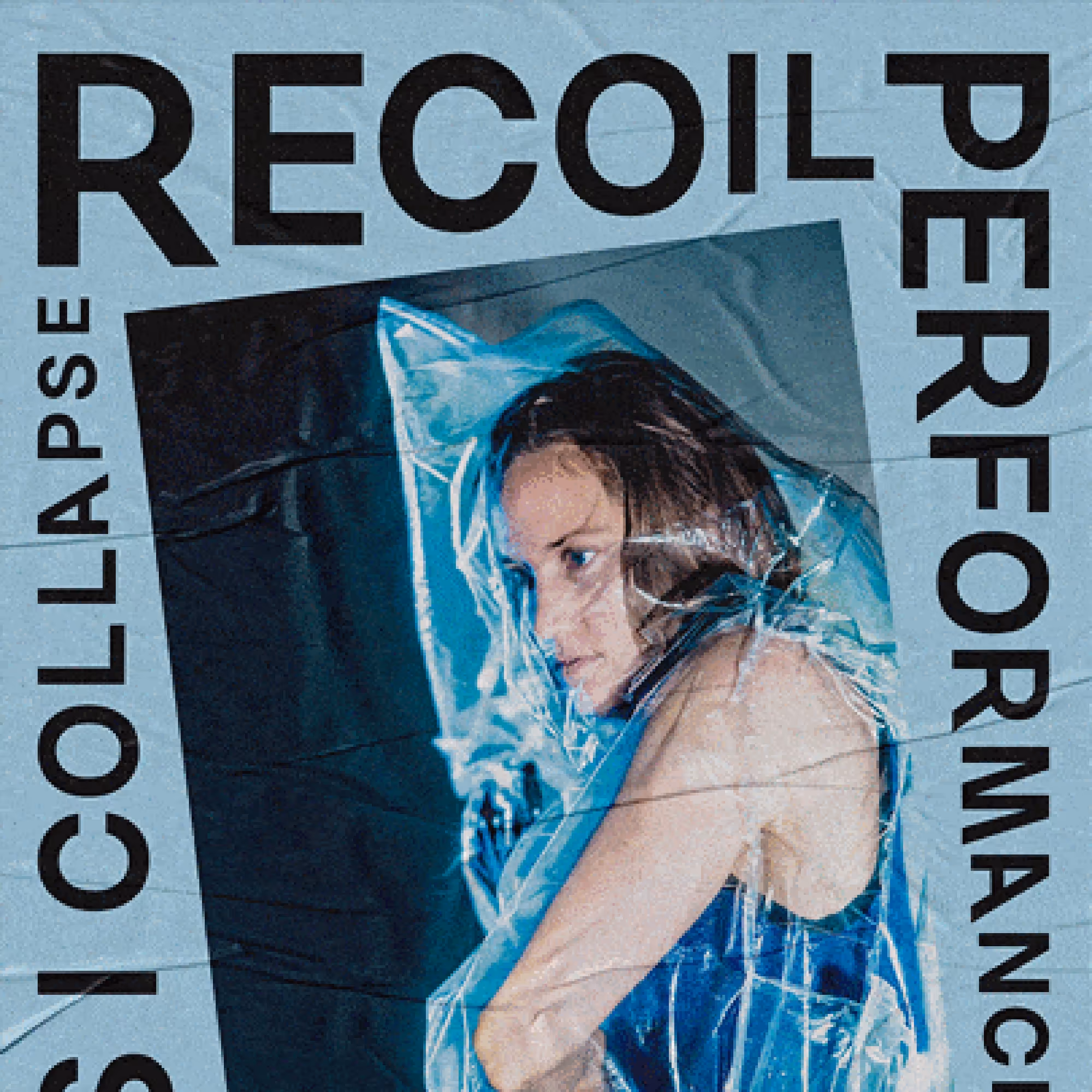
Linear strings, equal letters, and regular frames - do our words in design always have to be organized by some templates? If you disturb the proportions just a little, adding variation in size and shape, you could see that this not only pleases our eye but also gives a more classic spirit to typography. The result is almost romantic.
The disorganization of the text in a strange way proves to us to be natural because it gives a good dose of freedom in expression.
Combinations of bold and thin, small and large, non-linear shape, and an inconsistent string of words - it is all in one picture. We seem to have been waiting for this for a long time.
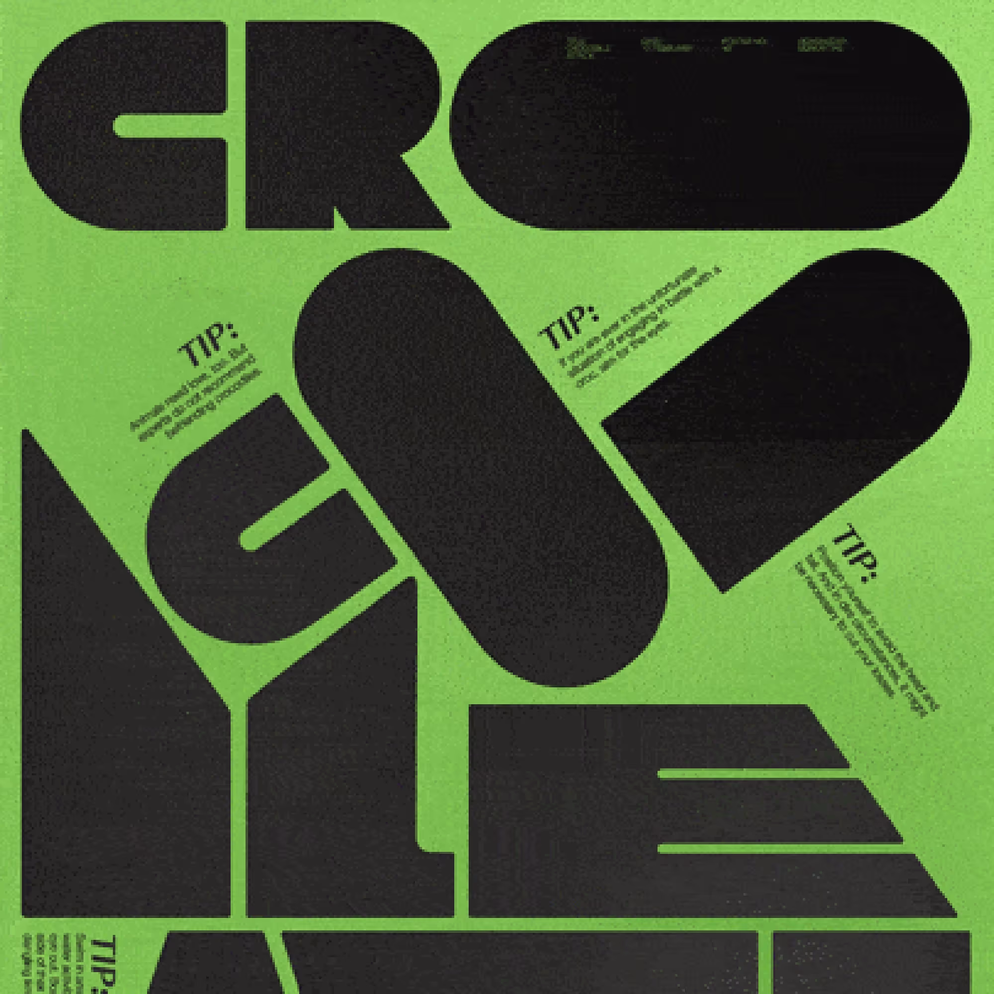
Chaotic typography is exactly the chaos among the rules. It disrupts everything except legibility and incredibly attractive, aesthetic representation. Recommendations for the use of chaotic typography simply do not exist because it can give so much to designs for any purpose. It is free of restraint just enough not to cause discomfort to the observer, and so changeable that it fits the wild look as much as the retro.
We can freely say that playing with typography is a special kind of art. So, how can it not be in the top 8 trends that will navigate the design course for a long time?
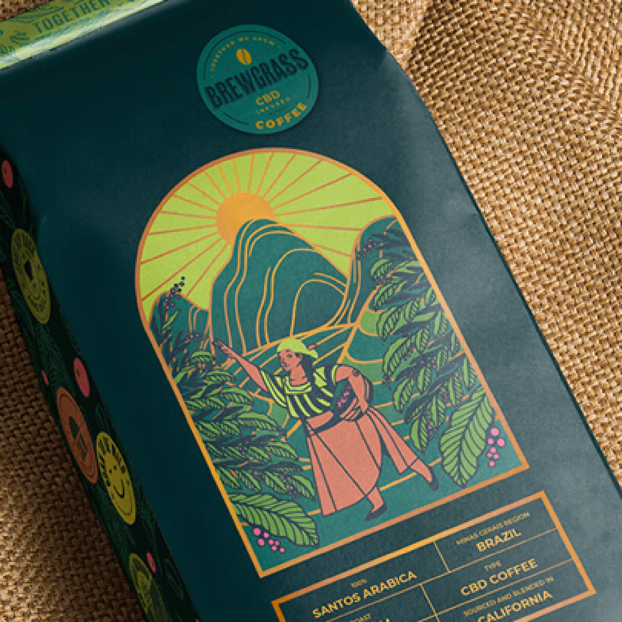
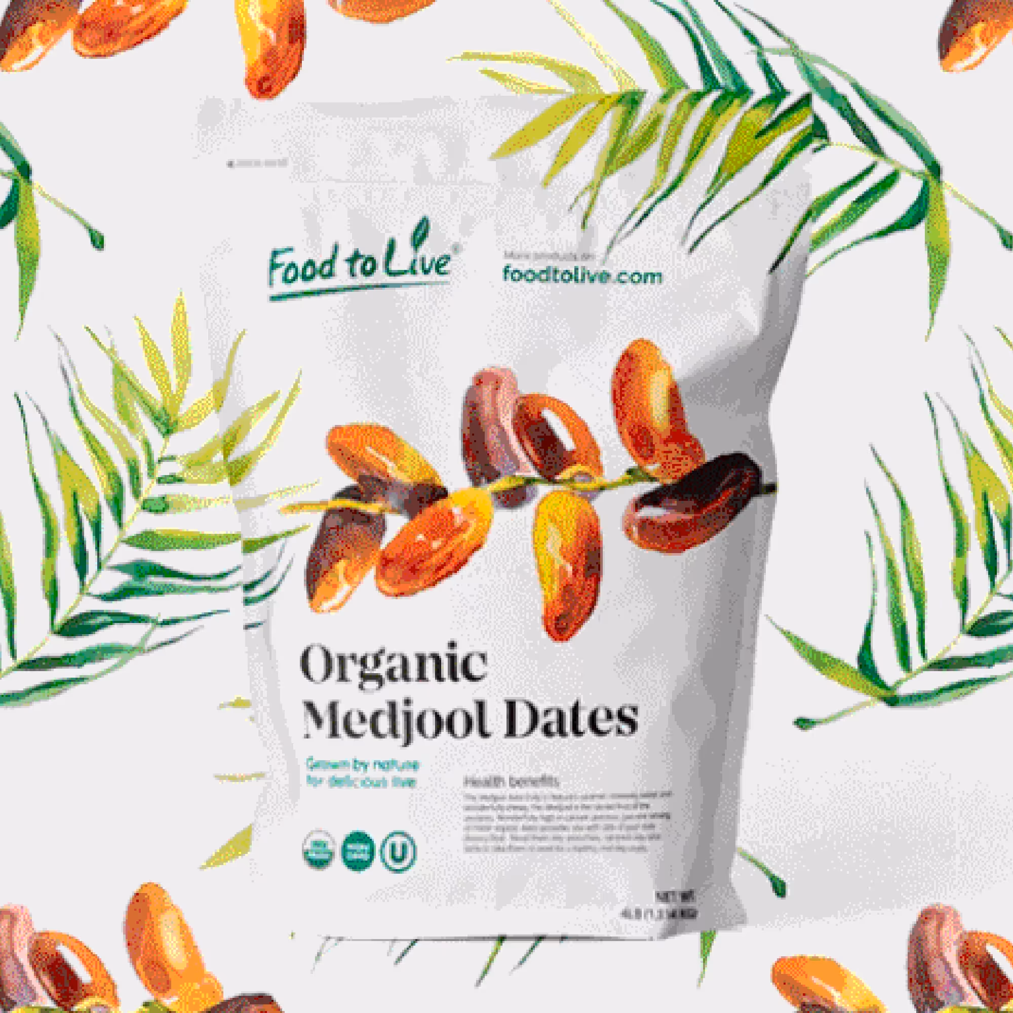
7. Nature - Inspired Design
Up to this point, we have followed trends in graphic design that compete for the attention of the audience.
Their stories are modern, influential, and reflect the spirit of modern-day society. So, it will not surprise you that among the top 8 is a design technique that has its roots in nature.
A gentle sight for our often tired eyes, the design inspired by nature gives us back a sense of the simple and the basic. Sometimes this is what we exactly need, an image that will calm the atmosphere, slow down the pace, and be pleasant as a walk through the garden. And this trend has so many wonderful ideas in its garden that it can offer.
Soft curves, gentle transitions, and natural elements taken directly from the outdoors are imprinted in our everyday images. Colors became smooth, more grounded. Slowly, warm shades of brown, earth colors, green and orange, beige, but also other beautiful pastel coatings appeared.
Designers thus fit these light forms into concepts that may not be so bold but certainly are powerful and meaningful.
We crave nature and natural products, so even though we are advancing towards futuristic types of designs, they do not necessarily have to give up these discreet, eye-resting techniques. On the contrary. Same as call-to-action, vivid ones, serene visuals also play vital roles. And they often convey important messages.
As we are focused on improving the ecological condition, our life, and the environment, we are voting louder and louder for what is natural in products. The nature-inspired design would fit perfectly with products like this, but it can be flattering to any other visual representation. So, there are a million reasons for this nurturing design to be widely used in 2021.

7.1 Brutalism
One thing is for sure: new designers' stories also include emphasized materials and textures. These are also characteristics of nature-inspired design, but with this technique, they become the main object of attention.
Brutalism is a literalist among artistic directions, in love with the concrete and untouched. The idea of introducing brutalism into graphic design is not new, but in 2021 we are all about even more compelling messages and more direct expression. That is why some designers have decided to put the very essence of things on a pedestal, looking for the most realistic possible appearance.
In other words, the trend is to use raw elements and looks, with as little processing as possible. Whether this is a complication or a simplification cannot be exactly said. It certainly takes skill to assemble the raw design elements into a well-composed image. In any case, the results are surprising, so diverse, and they hit the point.
And as such, brutalist design has already become famous in product branding, commercialism, advertising, and the like.
8. Monochrome and Duotone
Sometimes there is too much on the screen. Not because of poor design organization, but because there are so many different ideas that are quick and easy to access.
The nature-inspired design has provided us with a way to keep from getting tired and overwhelmed by the content we watch on the web.
The designers are using many tricks to manipulate the life of the image and make it appealing. They do it not only on the shapes and organization but also on the color palettes. The colors are associative, the first to be noticed, and can create that memorable energy. As a very challenging feature, they can sometimes convey the meaning of the whole concept. Therefore, colors are worth researching.
In 2021, we will be especially interested in how to know what is not excessive while coloring. Luckily, Monochrome and Duotone techniques appeared among graphic design trends as slightly more eye-resting approaches.
Monochrome images - a variation of tones of only one color - are perfect for creating a balance between image elements.
The use of one color emphasizes the point of the whole experience while, at the same time, creates a pleasant background atmosphere.
Many, therefore, consider the monochrome technique to be the perfect ally to highlight some products and services.
The message of your design remains intact, and discrete gradients between shades do not steal the attention of the observer.
Similarly, the duotone technique used to contrast the two colors serves to highlight the image. Searching for mid-tones and causing a tense relationship between the two colors changes the vibe design discreetly. Then, even a small change means a lot. As the shades collide, the whole atmosphere that emerges is still calm.
Similar to the tray on which the main meal is being served, monochrome and duotones deftly deliver your story. Playing with a color theme can give a retro, modern, or elegant look to the product. But rest assured that everything is entirely in the service of aesthetics.

.svg)
.svg)