Typography in UI design


TL;DR
Typography isn’t just about choosing a nice font, it’s about shaping how users read, feel, and interact with your design. In UI design, typography guides attention, builds hierarchy, and ensures accessibility. A poorly chosen or formatted type can ruin even the best visuals.
Here are 5 essential rules for typography in UI design:
- Typeface Choice: Use clear, legible fonts (Serif or Sans-serif). Avoid decorative fonts for large text blocks.
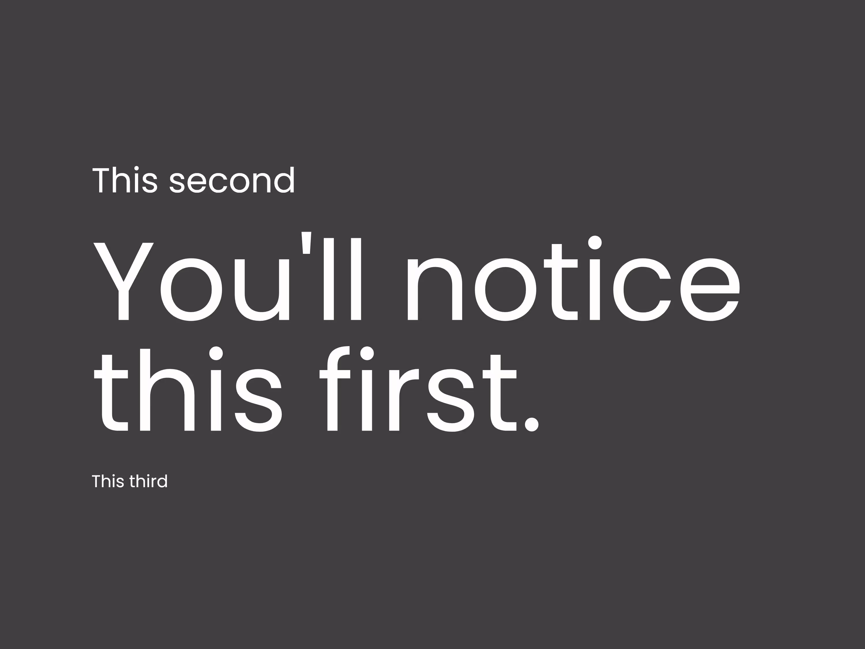
- Hierarchy: Use size, color, and spacing to show what’s important, headlines should grab, body text should inform.
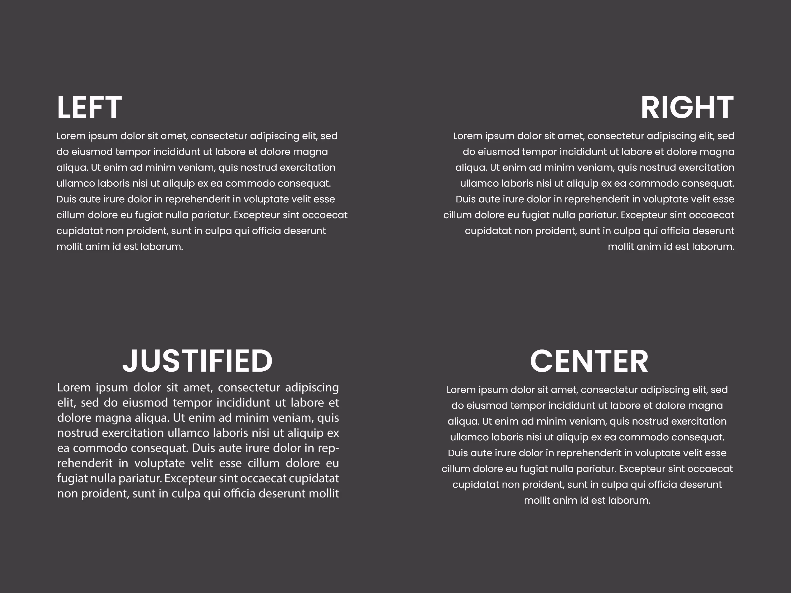
- Text Sizing & Alignment: Keep body text at least 16pt. Use consistent alignment, mostly left-aligned for readability.
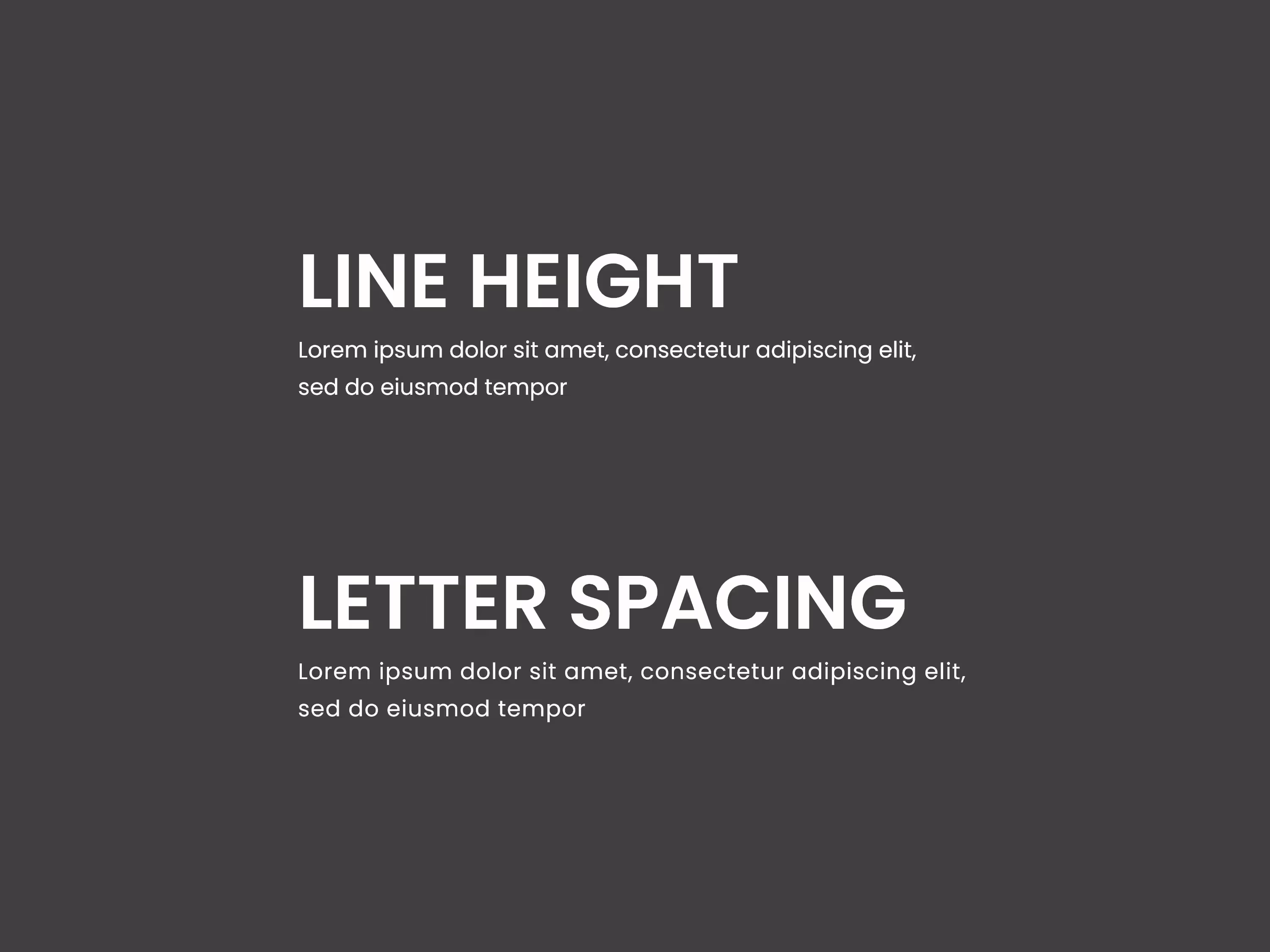
- Line Length, Height & Spacing: Keep lines around 70–80 characters long and use 130–180% line-height for easy scanning. Adjust letter spacing based on font weight and size.
- Colors & Contrast: Maintain high readability with pleasant contrast between text and background. Avoid pure black/white; use softer shades for better visual comfort.
Typography is where language meets design, a balance of clarity, structure, and style that turns text into visual storytelling.
It may be unnecessary to say that the word is a cell of everyday communication between people. Speech or text, our use of words is wide and - surprisingly automatic.
It means that we often miss how much power and influence our message in the text can have on someone who reads. We often forget that apart from meaning, words can have another dimension - a visual one. Yes, today, we are dealing with words - our leading tool for conveying thoughts and ideas. But we deal with words as design elements that, in addition to meaning, also have a strong visual impact on the observer. We deal with the role of typography in design.
Typography as a technique has existed for many years. People early have discovered the many roles of a well-composed sentence, phrase, or text. Apart from sharing our thoughts with others, we also care about how we sound. We want to organize our message and know what it means to others. In other words, it is no longer just the content of the text that matters. What matters is the way we convey what we have to say. The form of the text, structure, organization, and the appearance of all its elements became a significant part of communication. In this way, the text becomes an element in the service of aesthetics and design function. It provides a real small fortune to design work.
Well, who said that a picture speaks louder than words? A word is a picture.

Typography in UI design
UI design refers to the design of websites and applications. It means all products and services that are in direct contact with customers. That is why the design of such User Interfaces must be perfectly adapted to easy, clear, and fast usage. The same goes for typography in web design and the like.
If you want to have a well-designed website or application, take the rules of typography seriously. It must not be the last thing in the design process or just something that goes along with other design elements. Micro and macro-organization of the text are important because if your text is chaotic and sloppy, be assured users will not care about what you have to say.
That is why we singled out something for you - 5 thoughtful rules of typography in UI design. So, check out what we have found out!
5 rules of typography in UI design
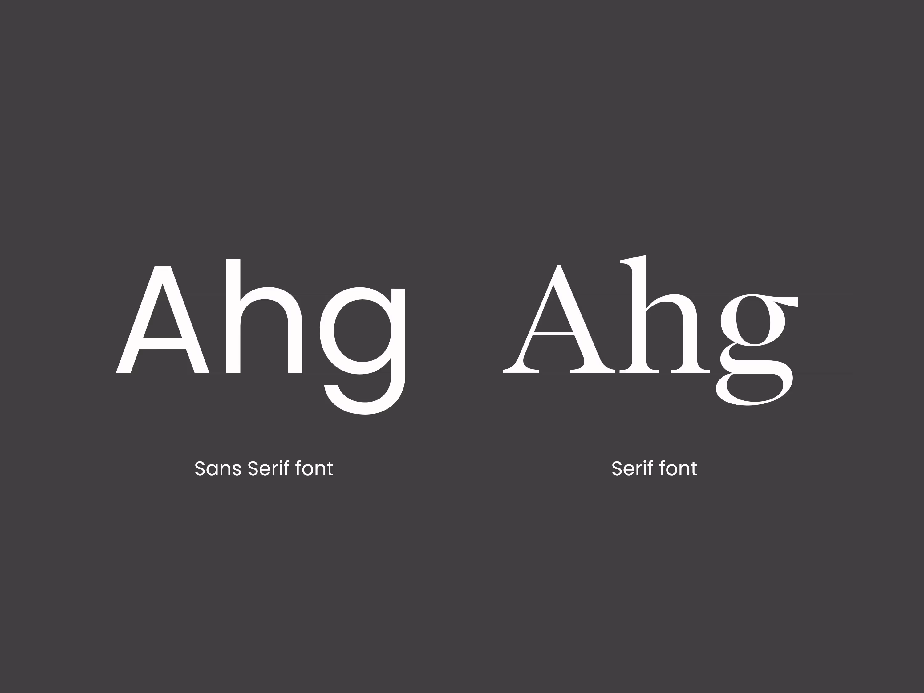
- TYPEFACE CHOICE. First, you may already know, you need to choose the right typeface for your text! Surely, you have seen some attractive designs and thought about how much the letter shape changes the impression of everything. We agree that some typefaces are very cool and are well shaped, but they can be tricky. When it comes to UI design, one should stick to typefaces that are clear and legible. Such is the Serif and Sans-serif typefaces. They differ in that the Serif has dashes at the ends of the letters that add an elegant vibe. Sans-serif does not have these typography features, so it is often used in modern minimalist concepts. These letter molds are perfect for a standard look that is not difficult to read and go nicely with designs from different brands. There are also various fonts within typefaces, so you don't have to worry about the text looking monotonous at all.
Typical mistake: People often fall for decorative typefaces. Although they are versatile and look great, they are often not useful for UI design. Remember that the message should be clear and legible in the first place and not be a reflection of artistic expression. There are, of course, situations where curvy decorative typography is well used in UI designs, but these are usually short phrases or words that should not inform in the first place.
- TYPOGRAPHY HIERARCHY. Speaking of monotonous - decide what is more and what is less important in the text because not everything can look the same! When you organize thoughts, you will easily decide what the user should notice first and what only in the end. You can then use different font sizes, spaces, colors, and positions to create a hierarchy of information. What is important should be - a larger format, in an obvious place, maybe at the top of the page, centered in the middle and the like. This way you guide the user as he reads the content of the website so that he experiences and understands it in the best way. Pretty cool, huh?
- TEXT. SIZING AND ALIGNMENT. Let's face it, text size can (and should) vary. Following the hierarchy we have mentioned, some parts of the text, such as headings and subheadings, should be larger. The proper font size should also depend on the screen size on which the page is displayed. However, the point is to scan easily relevant information on any screen. In any case, the text size should not be less than 16pt! This is very important when it comes to typography for the website and applications. If you want the letters to be 16pt exactly, then let it be the size for the body copy (text), which contains a little more detailed description. When we talk about text alignment, we actually talk about left-aligned, right-aligned, centered, and justified text. And how you align the text on the page again depends on the content. Striking thoughts and messages put in the center! So everyone can see them for sure. Such parts of the text are usually shorter and concise because they leave the strongest impression on the reader. Think of it as some little punchlines. Left alignment is standard for website typography. It is used for more text or less with various information. On the other hand (literally and figuratively) it is possible to align the text on the right, which can be interesting in some cases. Right-aligned short messages at the bottom of the page or contact information look like a nice add-on to the main text. However, the right-aligned text is most popular with right-to-left languages.
- LINE. LENGTH, HEIGHT, SPACING. The length of the line is cut based on the type of text. For example, the typography of a website differs from the typography for a blog. In the blog, you will always find longer sentences and more freedom in writing (hehe) because the text content is far more extensive. In UI design, the sentences in the copy should be about 70-80 characters long. It is quite enough for the user to find out the relevant information without getting lost in reading. And it’s enough for all the typography elements to have an impact. Typical mistake: You want to put everything relevant in two sentences. Then at the end of the sentence, users can't even remember how it all started. Keep it short and with clear thoughts. Line spacing or line-height is the space between two lines in the text. If you know how to manipulate these simple dimensional changes, the text can become much more readable. 130-180% of the vertical distance is recommended for optimal readability and scanning. While choosing the best font size for the website, pay special attention. When reducing the font more spacing between lines is needed. Letter spacing. The space between the letters is important, especially if you use different font sizes and weights. Namely, to make the impression better, use tighter spacing for larger letters, and use looser spacing for smaller letters.
Typical mistake: People often think that a word is more readable if the letters are closer, but that may not always be the case. Especially with weighty fonts, tight letter-spacing can strain the eye and make it hard to read particularly essential parts of the text.
- COLORS. Don't forget about them! As with any design part, colors can enhance or compromise the overall image. They are the vital elements of typography. If we start from the main rule that everything should be easy to read, then the text colors should also be pleasant. Especially the text-background correlation. The text color and background color create the whole atmosphere in which the reader finds himself. That's why it should be noted that the frequent background colors - black and white - are very bright on the screen. As it can be very tiring to look at, some very light shades of other colors are used instead of white.
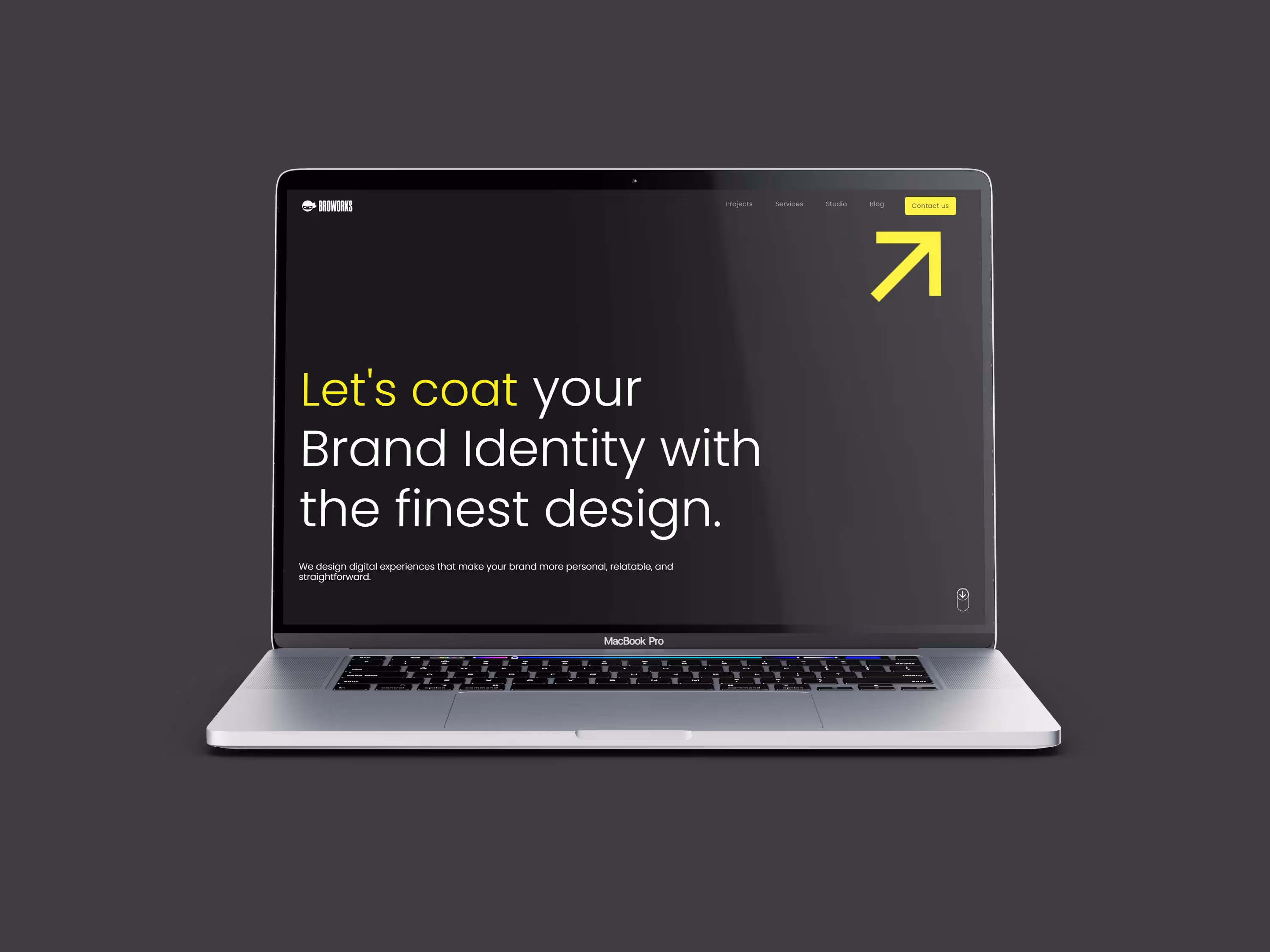
In this regard, when creating the logo and website of our Broworks studio, we used dark gray instead of black. Searching the website is so much more enjoyable that way.
Typical mistake: People, of course, want some color of their brand to be primary on the website. However, what if it doesn't quite fit with the typography of the text. Don't force that color if the contrast is bad, because many shades of it can look much better in the environment. The authentic colors of the brand will not be questioned, while the typography becomes much more effective.
Contrast. The contrast goes hand in hand with coloring. You can manipulate the color opacity of the text and point out the main parts of it. It can be even more enjoyable to read. Lighter and darker shades of the text in a healthy combination can make a wonderful overview of everything on your pages.
And that would be all!
If you take all this into account, there is little chance for typography to be poorly designed. On the contrary, these typography tips will make all the web or app content look sleek and professional. In the long run, everything is based on making your message clear and aesthetically organized.
Tap into the power of typography. The rest is all about creativity!
More stories
.svg)
.svg)