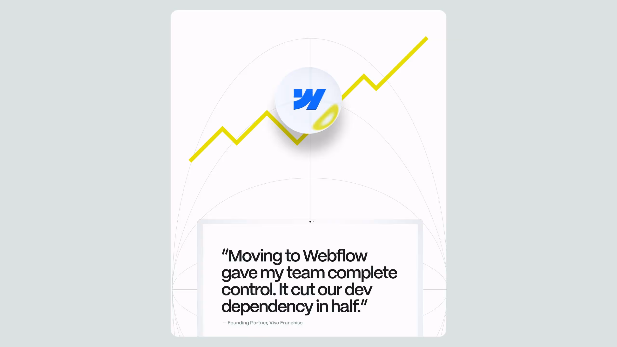
CRO for B2B: Stop Losing Half Your Conversion Funnel


TL;DR
- Most B2B teams run desktop-first CRO programs while mobile converts 42% worse than desktop a gap driven by form friction, poor thumb-zone design, and slow page load times, not design aesthetics.
- A documented CRO process (audit → qualitative research → hypothesis → prioritized testing → implementation) compounds over time; companies using structured CRO tools report an average 223% ROI, yet fewer than 40% of B2B teams have a documented strategy.
- Mobile CRO on B2B Webflow sites requires dedicated fixes thumb-zone-positioned CTAs, progressive multi-step forms, Core Web Vitals optimization, and mobile-only A/B tests configured in Webflow Optimize's audience segmentation, run as a parallel track to desktop optimization, not a subset of it.
If your B2B website traffic is growing but your pipeline isn't, you already have a CRO problem. Most marketing teams at SaaS and tech companies are optimizing for traffic acquisition while their conversion funnel quietly hemorrhages qualified leads. CRO for B2B is not a conversion rate trick or a button-color debate, it is a systematic discipline that identifies exactly where buyers drop off and removes the friction stopping them from converting.
This article lays out the standard process for desktop CRO and goes deep into where most B2B teams leave money on the table: mobile. With benchmark data, a structured optimization process, and a walkthrough of mobile-specific fixes including thumb-zone design, form UX, page speed, and A/B testing in Webflow Optimize, this is the framework your team needs to stop patching symptoms and start fixing the funnel.
Why CRO for B2B Are Structurally Low
B2B conversion rates are not low because B2B buyers are harder to convince. They are low because most B2B websites are built to impress rather than convert. The average B2B website conversion rate sits between 1% and 3%, with B2B SaaS companies specifically averaging around 1.1% according to industry benchmark data. Legal services lead with a 7.4% average, while B2B SaaS and software development struggle at 1.1%, with an overall average conversion rate of 2.9%.
Part of this is structural. B2B sales cycles are getting longer in 2024, the average cycle was 25% longer than it was just five years earlier, and 77% of B2B buyers describe their last purchase as complex or difficult. You are not selling on impulse. You are guiding a committee through a multi-month evaluation. Every UX friction point, every slow-loading page, every form field that asks for budget before value, each one compounds the likelihood of abandonment.
But here is what the benchmark data also shows: companies using CRO tools report a 223% ROI, yet only 39.6% have a documented strategy. That gap is the opportunity. Most of your direct competitors are running on intuition.
CRO for B2B (conversion rate optimization for B2B companies) is the practice of systematically identifying and removing friction points in the buyer journey that prevent qualified leads from taking a desired action, booking a demo, downloading a resource, or requesting a proposal. Unlike B2C CRO, which often optimizes for impulse and volume, B2B CRO must account for longer sales cycles, multiple decision-makers, and high-ticket consideration. A documented CRO strategy that includes heatmaps, session recordings, funnel analytics, and controlled A/B testing is the foundation of any sustainable improvement to B2B conversion performance.
The Desktop CRO Process for B2B Sites
Before addressing mobile, it is worth establishing the standard desktop CRO process. This is the baseline, the foundation that every optimization decision is tested against.
Step 1: Baseline Audit and Funnel Mapping
Start by mapping every step of your conversion funnel from first touch to form submission. Use Google Analytics 4 (or equivalent) to identify drop-off rates at each stage: landing page → scroll depth → CTA click → form start → form completion → thank-you page. Most B2B teams discover that the largest drop-off happens not at the CTA, but between CTA click and form completion. That is a form UX problem, not a messaging problem.
Step 2: Qualitative Research
Quantitative data tells you where people drop off. Qualitative data tells you why. Deploy session recording tools (Hotjar, Microsoft Clarity) and heatmaps on your highest-traffic pages. Watch real users navigate your site. You will almost always find the same cluster of issues: navigation menus that bury the primary CTA, hero sections that fail to communicate value in the first five seconds, and contact forms that ask for information the sales team does not need at this stage.
Step 3: Hypothesis Formation
Every A/B test starts with a specific, falsifiable hypothesis. "Changing the CTA from 'Contact Us' to 'Get a Free Audit' will increase demo requests by reducing ambiguity about the next step." The hypothesis must be tied to an observed behavior (from step 2), a proposed change, and an expected outcome with a measurable metric.
Step 4: Prioritization Using ICE or PIE Framework
Not every hypothesis gets tested immediately. Use a scoring system, ICE (Impact, Confidence, Ease) or PIE (Potential, Importance, Ease), to rank tests by expected value and implementation cost. Focus first on high-traffic, high-drop-off pages with clear friction signals. For most B2B SaaS sites, that is the pricing page, the demo request page, and the homepage hero.
Step 5: Test, Measure, Implement
Run A/B tests with proper statistical significance (minimum 95% confidence, enough traffic to avoid underpowered tests). Implement winners promptly, document losers as learning, and feed both back into the next hypothesis cycle. The compounding effect is real: organizations running AI-powered testing report 2.7x more tests per quarter, and over 12 months this produces cumulative conversion lifts of 40–60% annually for systematic CRO programs.
Key elements to test on desktop B2B pages, in rough order of impact:
- Hero headline and value proposition clarity
- CTA label, placement, and visual hierarchy
- Form length and field sequence
- Social proof positioning (logos, testimonials, case study callouts)
- Navigation structure and cognitive load
- Pricing page transparency and structure
The Mobile CRO Problem B2B Teams Are Ignoring
Here is where the real gap lives. Most B2B marketing teams still build, test, and optimize primarily for desktop. It is an understandable bias, historically, B2B buyers did their research and converted on laptops. That picture has changed materially.
By 2023, mobile accounted for nearly 48% of B2B ad spending, and that figure is expected to climb past 50% by 2025. Your buyers are not just discovering you on mobile, they are evaluating you there. And if your mobile experience is an afterthought, you are handing those evaluations to competitors.
The device gap in conversion performance is stark. Mobile accounts for 65% of all website traffic but converts at only 1.82%, compared to desktop's 3.14%, a gap that has actually increased from 38% in 2024 to 42% in 2026, despite mobile-first design investments. The culprit, as that same analysis identifies, is not the visual design. It is checkout friction, form complexity, and page speed.
49% of smartphone users hold their phone in one hand and tap with their thumb. Most B2B contact forms were designed for two hands and a mouse, buttons in the wrong place, forms that require precision tapping, and scroll-heavy layouts that push the CTA off-screen.
B2B companies that optimize primarily for desktop conversion are structurally losing mobile leads, even when mobile accounts for the majority of their traffic. The mobile-to-desktop conversion gap sits at approximately 42% in 2026, driven by form friction, poor tap target sizing, slow page loads, and CTA placement outside the natural thumb zone. Fixing mobile CRO requires dedicated attention to thumb-zone architecture, progressive form disclosure, mobile-specific A/B testing, and Core Web Vitals compliance, none of which is addressed by simply making a desktop design "responsive."
Thumb-Zone Design: Fixing the Ergonomics of Your Mobile Funnel
The thumb zone is the area of a smartphone screen that a user can comfortably reach with their thumb while holding the device in one hand. UX researcher Steven Hoober's analysis of thousands of mobile interactions, referenced widely in the UX research community, established that in the majority of mobile grips, the thumb is doing the work, and it can only reach certain parts of the screen comfortably. When primary actions like search, primary CTAs, and navigation live outside the natural zone, users hesitate, make mistakes, or abandon flows.
The screen is divided into three functional areas:
- Natural zone (bottom-center): effortless one-handed reach, ideal for primary CTAs and submit buttons
- Stretch zone (upper half): reachable but slower and slightly awkward
- Hard-to-reach zone (top corners): avoided or requiring a grip shift
Interactive elements should be at least 44–48px in size to prevent fat-finger errors, and primary actions should be placed in the bottom-center natural zone for effortless one-handed use. Bottom navigation bars should be used for core tasks, with hamburger menus reserved for secondary navigation.
For B2B sites specifically, this means:
- Demo request and contact CTAs anchored to the bottom of the viewport on mobile
- "Book a Call" or "Get a Free Audit" sticky buttons placed in the natural thumb zone
- Navigation reduced to three to five tabs maximum in a bottom bar
- No precision-dependent tap targets for primary actions
Even a few seconds of friction caused by out-of-zone button placement can increase mobile bounce rates by up to 20%. That is a recoverable number once you have identified the problem, but it requires designing mobile layouts independently of desktop, not just scaling the desktop layout down.
Mobile Form UX: Where B2B Leads Actually Drop
The contact or demo-request form is the most critical conversion point on a B2B site. It is also, almost universally, the worst-designed element on mobile. Most B2B forms were built for desktop data entry: multiple columns, small fields, no inline validation, and a field count optimized for the CRM intake rather than the user's patience.
Typing on a glass screen is high-friction work. Every unnecessary field in a form drops your conversion rate by a significant percentage. For B2B mobile forms, the standard desktop design fails on every axis.
The principles for high-converting mobile B2B forms:
- Reduce field count ruthlessly. Ask only for what is required to qualify the lead. Company name, work email, and one qualifying question is enough to trigger a sales follow-up. Budget range, team size, and current tech stack can be gathered in the discovery call.
- Use progressive disclosure. Break multi-step forms into two or three screens. Show one to three fields per screen. Completion rates improve significantly when each screen feels completable.
- Trigger the correct keyboard. Email fields should open the email keyboard. Phone fields should open the numeric keypad. Failure to set input type attributes is a small technical detail with a measurable UX cost.
- Validate inline, not on submission. Showing errors only after hitting submit on mobile, where the user has to scroll back up to find the flagged field, is one of the highest-friction patterns in web forms. Validate each field on blur, immediately after the user leaves it.
- Keep labels above fields, not as placeholders. Placeholder text disappears when the user starts typing, forcing them to remember what they were filling in. On mobile, where cognitive load is higher, this matters more.
- Make the submit button large, clearly labeled, and within thumb reach. "Send Message" is less motivating than "Book My Free Audit." The label matters. The size matters. The position matters.
The highest-impact principles for lead generation are thumb-zone architecture that positions CTAs within natural reach, progressive disclosure that reduces cognitive overload, mobile form UX that minimizes input friction, and Core Web Vitals performance that ensures the page loads within acceptable thresholds.
Page Speed on Mobile: The Silent Conversion Killer
Page speed is not a technical vanity metric. It is a direct conversion variable. Google's research has consistently shown that load time and abandonment rate are closely correlated on mobile, and for B2B, where the first mobile session is often an evaluation check rather than a deep research session, a slow page is a lost lead.
Faster sites with approximately one-second load times, mobile-first design, and AI-driven CTAs materially raise conversion rates. The inverse is equally true: every second added to mobile load time increases bounce probability.
Core Web Vitals are the framework Google uses to measure perceived load performance. The three metrics that matter most for B2B mobile CRO:
- LCP (Largest Contentful Paint): How quickly does the main content render? Target under 2.5 seconds. For B2B hero sections with large imagery or video backgrounds, this is commonly the first failure point.
- CLS (Cumulative Layout Shift): Does the page visually jump as it loads? Layout shifts cause mis-taps on mobile, a user intending to click "Book a Demo" clicks a shifted navigation item instead.
- INP (Interaction to Next Paint): How quickly does the page respond after a tap? High INP causes the sensation of a "broken" form or CTA button, leading to repeat taps and frustration.
Fast LCP under 2.5 seconds and low CLS are priorities for preventing accidental taps and abandonment on mobile.
For Webflow sites, achieving strong Core Web Vitals on mobile requires attention to image compression and next-gen formats (WebP), deferring non-critical JavaScript, limiting heavy third-party scripts on initial load (chat widgets, analytics, marketing automation), and using Webflow's built-in lazy loading for below-the-fold content. The Webflow development architecture choices made at build time, how components are structured, how custom code is loaded, have a direct and measurable impact on mobile CWV scores.
How to Configure Mobile-Only A/B Tests in Webflow Optimize
Running desktop A/B tests and calling it CRO is one of the most common mistakes on B2B Webflow sites. Mobile users behave differently, navigate differently, and encounter different friction points. A variant that wins on desktop can easily underperform on mobile, and vice versa. This is why mobile-specific testing is not optional, it is a distinct testing track.
Webflow Optimize, announced at Webflow Conf 2024, enables rapid testing, personalization, and AI-driven decision-making to increase engagement, conversions, and brand revenue. It includes A/B testing, audience segmentation, and AI-powered personalization with no external scripts required, with pricing starting at $299 per month with usage-based billing.
Critically for mobile CRO, Webflow Optimize supports audience targeting and personalization that allows you to tailor content for specific user groupsincluding mobile visitors, visitors from certain regions, or returning users.
Here is how to configure a mobile-only A/B test in Webflow Optimize:
- Open Webflow Optimize from the Designer and create a new experiment on the target page (typically your highest-traffic demo request or contact page).
- Define your audience segment as mobile visitors. Webflow Optimize's audience targeting settings allow you to filter test participants by device type. Select mobile to ensure only mobile traffic enters the experiment.
- Create your variant. In the visual editor, make your mobile-specific change — repositioning the CTA button to the bottom of the viewport, shortening the form to three fields, or replacing the hero video with a static image for faster load time.
- Set your primary goal. For B2B, this is almost always a form submission or a specific click event (e.g., "Book Demo" button click). Connect the goal to a conversion event tracked in your analytics setup.
- Set traffic split and run the experiment. With a 50/50 split between control and variant, run the test until you reach statistical significance, typically at least 95% confidence. For lower-traffic B2B sites, this may require three to four weeks to collect a valid sample.
- Analyze by device segment. Even if you set the experiment to mobile-only, use Webflow Optimize's reporting to break down results. Confirm that the winning variant performs consistently across mobile device types (iOS vs. Android, various screen sizes).
- Implement and document. Apply the winning variant as your new control. Log the test hypothesis, result, and learnings in your CRO documentation for future reference.
AI-driven experimentation platforms achieve valid test results in an average of 14 days compared to 21 days for traditional tools, and identify winning variations that human testers miss 18% of the time by detecting interaction effects between multiple page elements simultaneously. Webflow Optimize's AI-powered insights layer accelerates this process within the platform natively.
For B2B Webflow sites that do not yet have the traffic volume or budget for Webflow Optimize, device-specific testing is also achievable through Google Optimize alternatives integrated via Webflow's custom code embed, though native tooling is significantly lower-friction to implement and maintain.
Desktop vs. Mobile CRO: Comparison Framework
Configuring mobile-only A/B tests in Webflow Optimize requires creating an audience segment filtered by device type (mobile), applying a specific page variant targeting known mobile friction points, such as CTA repositioning or form simplification, and setting a primary goal tied to a B2B conversion event like a form submission or demo booking. Webflow Optimize's native audience targeting eliminates the need for external scripts, making mobile-specific experimentation accessible without developer involvement. Teams should run mobile-only tests for three to four weeks minimum on B2B sites where mobile traffic volume may be lower than desktop, to ensure statistically valid results before implementing a winner.
.svg)
.svg)