Webflow Accessibility: 7 Mistakes and How to Fix Them


TL;DR
Accessibility isn’t just a compliance checkbox, it’s the foundation of great design and SEO. In Webflow, neglecting accessibility limits reach, performance, and conversions. Simple fixes like writing descriptive alt text, improving color contrast, and structuring headings properly make your site easier to navigate for everyone, including users with disabilities and search engine bots. As Google increasingly values accessible experiences, focusing on accessibility in Webflow enhances user trust, search visibility, and engagement, while making your site future-ready for both human and AI visitors.
Unfortunately, accessibility is often an afterthought in web design. A box-ticking exercise with little impact, looked at just before launch. But that’s not how it should be. When you focus on accessibility, you create a better user experience for everyone, improve your SEO, and ensure that your brand reaches as wide an audience as possible, leaving no one out.
Another accessibility misconception is that it doesn't affect many people, but have you ever struggled to read a bright red text on a white background? Or missed a particularly small button on your phone. Those are common accessibility issues that most online users have faced, regardless of special needs or disabilities.
Today, around 16% of people globally are living with a disability, and more than one billion users rely on assistive technologies such as screen readers, magnifiers, and keyboard navigation to help them explore the web. By ignoring accessibility, you limit your audience and your potential for growth.
In this article, we’ll walk through the seven most common accessibility mistakes Webflow users make, why they matter, and how to fix them using Webflow’s accessibility tools and best practices.
Why Webflow accessibility matters
Luckily for us, Webflow has made accessibility a key focus for the business and ensured it’s more than just a technical checkbox.
Great accessibility equals great design, and Webflow's designers and developers know that. Accessible websites reach more users, perform better in search engines, convert more visitors, and offer better accessibility options, positioning brands as more thoughtful and inclusive.
For SEO, Google is now directly looking for high-performing accessible sites. So, contrast page structure and mobile usability should be front and centre if you want to rise through the SERPs. Focusing on accessibility in your Webflow site means designing a better site for everyone and reaping the rewards for your business.
Mistake 1: Missing or poor alt text
For users who use screen readers, alt text describes images aloud to help people with visual impairments understand your content. It also works as a way to communicate with search engines, describing exactly what your images display.
When creating your alt text, put yourself in the mind of someone using a screen reader. When picking images for sites, you probably agonised about the perfect one for weeks; the same level of care should go into writing your alt text and conveying the image's content.
Example from We Rate Dogs
A black and grey long-haired Yorkiepoo sits at a desk in a university classroom. A piece of paper lies on the desk in front of her, her paws propped up on the desk as if she's bracing herself. There are students in the background hunched over and working on paper in front of them. The pup looks at the camera with a concerned side eye. She's realising she probably should have read some of the homework before eating it.
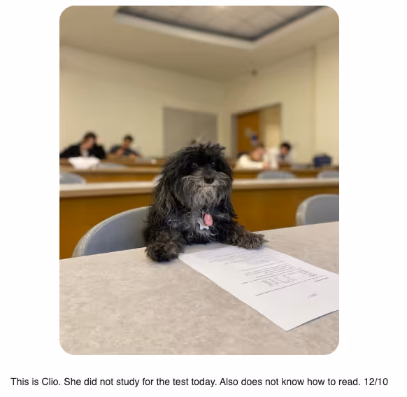
This is a perfect example of alt text that serves its function, serves the audience, and maintains the brand's tone of voice.
How to fix it in Webflow:
- Open your Assets panel.
- Select the image and add your alt text in the Image Settings.
- Choose between Descriptive or Decorative.
- Decorative images can be skipped by screen readers.
- Descriptive text should explain the image to someone who cannot see it.
- Decorative images can be skipped by screen readers.

Pro tip: Add alt text at the asset level so it automatically carries across your entire Webflow project. If you need custom alt text for the same image, click the image on the page from the designer, go to image settings, and choose custom description from the alt text dropdown.
Mistake 2: Poor color contrast
Poor colour contrast is when the combination of two colours does not create enough of a difference to be easy to tell apart, making it difficult to read content, especially for those with visual impairments and colour blindness.
According to WCAG 2.1 guidelines, body text needs a contrast ratio of at least 4.5:1, while large text should have at least 3:1.
How to check contrast in Webflow:
- In Designer, select a text element
- In the Typography section on the right-hand side, click the font colour,
- Under the colour selector, you will see a letter indicating your colour contrast score. You should be aiming for an AA or AAA.
- Click the eye icon to see what colour would work on your background to achieve this
.gif)
Pro Tip: Use Webflow’s X-ray Mode to simulate different types of colour blindness and see how your design holds up. This can be found under Canvas settings, in the Advanced settings drop-down.
Colour contrast not only makes your site more accessible but can also be a great design tool. Building contrast-friendly colour pairs into your brand's design system ensures consistent, accessible design across every channel.
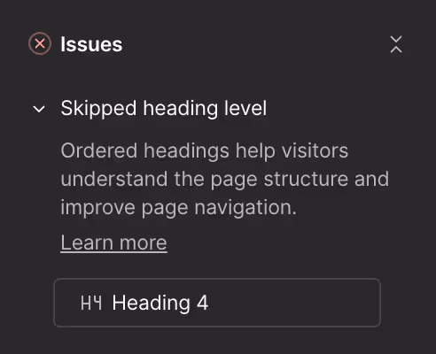
Mistake 3: Unclear heading hierarchy
We all know that headings give the page design visual hierarchy, but did you know they also provide structural hierarchy?
Screen readers and search engines rely on heading levels to understand your page layout. Misusing heading tags (like multiple H1s or skipping from H2 to H4) can break accessibility and harm SEO.
Think of your headings as an outline:
- H1 = Page title (use once per page)
- H2 = Main sections
- H3 = Subsections within each section
- H4 = Smaller sections within your subsections
How to fix it in Webflow:
- Check each heading’s tag in the Settings panel.
- Use Webflow’s Audit panel to spot skipped heading levels or duplicate H1s.
Pro Tip: Make sure these rules are also followed in Rich Text Elements and communicated to all members of your team. You can use different styled “headings” to create distinct visual hierarchies, just make sure the actual heading tag serves its structural purpose first.
Mistake 4: Non-descriptive links/buttons
Every link and button should clearly describe its purpose. When a screen reader announces “Click here” or “Read more,” it’s meaningless without context, making the page confusing to navigate.
Example:
❌ “Click here”
✅ “Read more about Webflow accessibility best practices”
How to fix it in Webflow:
- Use clear, action-based language for all links and buttons.
- Add an ARIA label so screen readers can identify their purpose.
Select your element, go to Settings → Custom Attributes, and add aria-label="Play video" or whatever fits the action.

Pro Tip: For links within a blog or other Webflow CMS collection, create a field for your ARIA label and attach it dynamically.
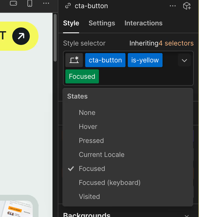
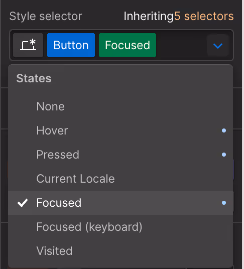
Mistake 5: No focus states for keyboard navigation
Not everyone uses a mouse or trackpad to navigate sites. Many users navigate with a keyboard or assistive technology. If you do not have a visible focus state set, users cannot tell where they are positioned on the page.
How to fix it in Webflow:
- In the Designer, select a link or button.
- Click States → Focus.
- Add a visible outline, background change, or border that stands out clearly.
Webflow also supports adding focus styles through custom CSS if you want a more tailored design that still meets accessibility guidelines.
Pro Tip: Want to see this in action? Just click Tab on your site and see what happens.
Mistake 6: Ignoring form accessibility
Forms are one of the most important conversion tools on any site, but also one of the easiest places to overlook accessibility best practices. Missing labels, unclear error messages, and placeholder text-only fields are all common issues.
How to fix it in Webflow:
- Every input field must have a visible label or an ARIA label.
- Use helpful error messages that describe what went wrong instead of relying only on colour.
- Make sure form instructions are placed above the fields, not just inside placeholders, which disappear as the user types.
Pro Tip: Make sure to add a success message when a form is submitted properly. Screen readers will automatically pick this up and announce it to the user. It's a great opportunity for some on-brand micro copy, builds trust, and improves the experience for everyone.
Mistake 7: Auto-play animations or videos without controls
Auto-playing or looping videos can overwhelm users with cognitive or visual sensitivities, and they interfere with assistive technology.
How to fix it in Webflow:
- In the Video settings, disable autoplay or loop by default.
- Always include pause and mute options.
- For background animations, consider adding a toggle that allows users to stop motion if they choose.
Accessibility does not mean removing animation entirely. It means giving users control over how they experience it.
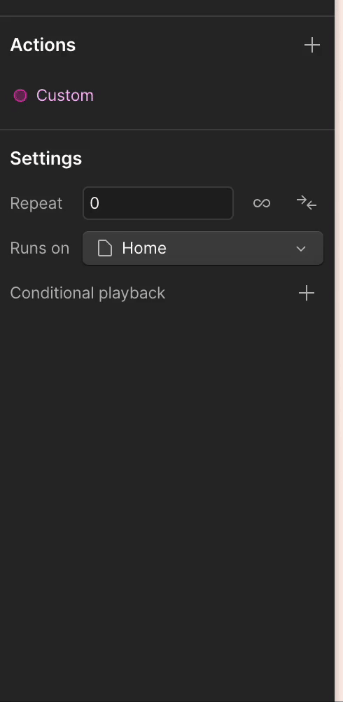
Pro Tip: If you’re using Webflow's new GSAP animations, utilise their conditional playback feature and if the user sets “If site visitor prefers reduced motion” to have no animation or to skip to the end of the animation.
Bonus: Accessibility testing in Webflow
Accessibility is not a one-and-done task. As websites grow and evolve, accessibility should be revisited often. Here are some tools to monitor your site's accessibility:
- Lighthouse (in Chrome DevTools): Built-in accessibility auditing tool with scoring.
- axe DevTools by Deque Systems: Browser extension for deeper WCAG compliance checks.
- WAVE Web Accessibility Tool: Visualises accessibility issues directly on your page, providing a deeper understanding of the issues.
- Accessibility Scan and Monitor: Automates ongoing accessibility monitoring.
Pro Tip: Integrate accessibility testing into your design and QA processes, and conduct regular site audits to improve SEO.
Final thoughts
We said it before, and we’ll say it again: great design is accessible, and accessibility is great design. By focusing on accessibility, you improve the user experience for everyone, strengthen SEO, and improve conversions.
For Webflow designers, developers, and marketing teams, building accessible websites is one of the easiest ways to boost engagement, reach, and compliance without sacrificing creativity. By following and correcting the 7 most common Webflow accessibility mistakes outlined in this article, you can transform your site and begin your journey toward accessibility.
If you want expert help making your Webflow website accessible, fast, and growth-ready, talk to Broworks today.
.svg)
.svg)