
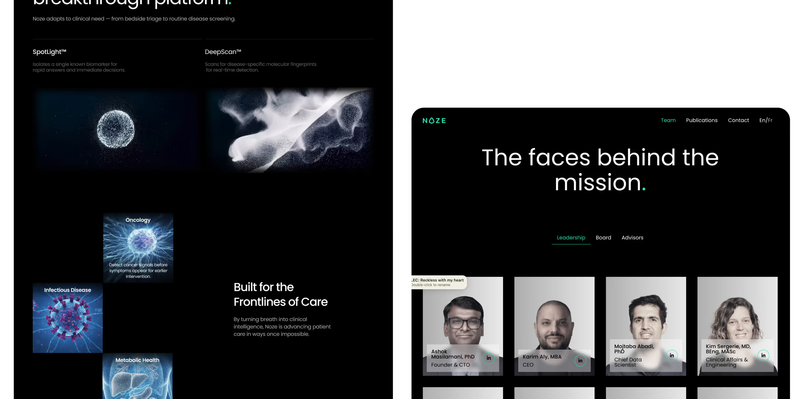
Noze
Noze is a technology startup preparing for growth and investor conversations. Their website needed to do more than explain the product, it had to clearly communicate value, credibility, and traction, while guiding visitors toward key conversion points.
Challenges
Noze’s existing website didn’t reflect the ambition or potential of the product. Key issues included:
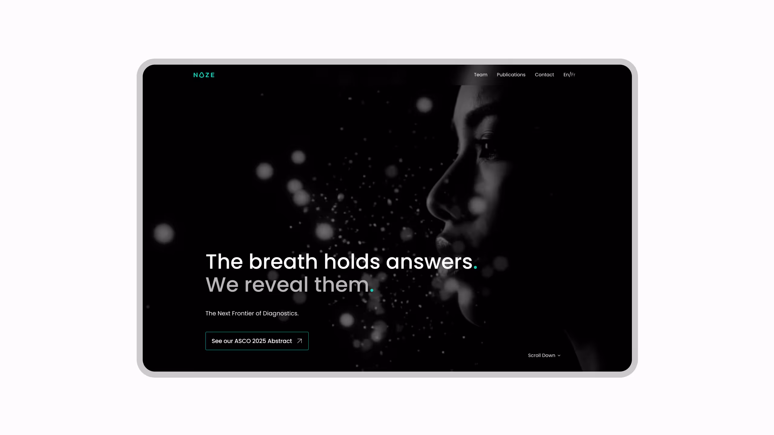
- Unclear value proposition above the fold
- Weak conversion structure for demos and inquiries
- A presentation that lacked investor-grade polish
- Messaging that didn’t scale across audiences (users, partners, investors)
For a startup at this stage, the website needed to work as both a conversion engine and a credibility layer.
How we approached it
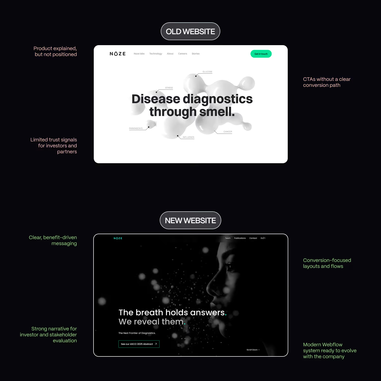
Conversion-Focused UX Strategy
We redesigned the website around decision-making moments. This included:
- Clarifying the value proposition immediately
- Structuring content to support scanning and validation
- Designing CTAs that guide users toward meaningful actions
The goal was to reduce friction and increase confidence.
Investor-Ready Presentation
Special attention was paid to how the company is perceived by:
- Potential investors
- Strategic partners
- Early enterprise prospects
We focused on clarity, restraint, and structure, presenting Noze as a serious, scalable business, not just a product idea.
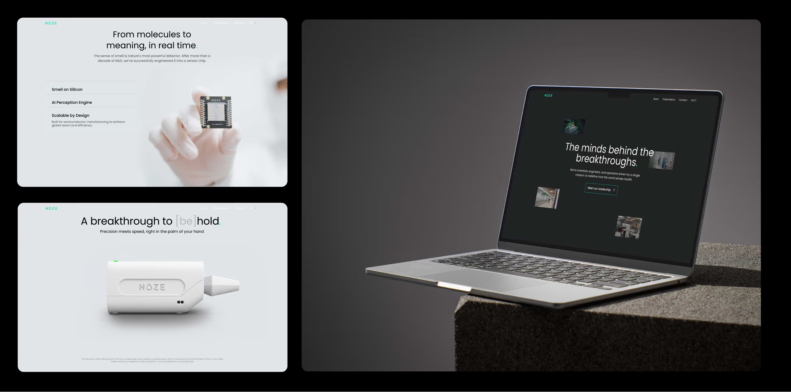
Webflow Design & Development
The website was redesigned and built in Webflow to provide:
- Fast iteration for a moving startup environment
- A flexible system for future updates
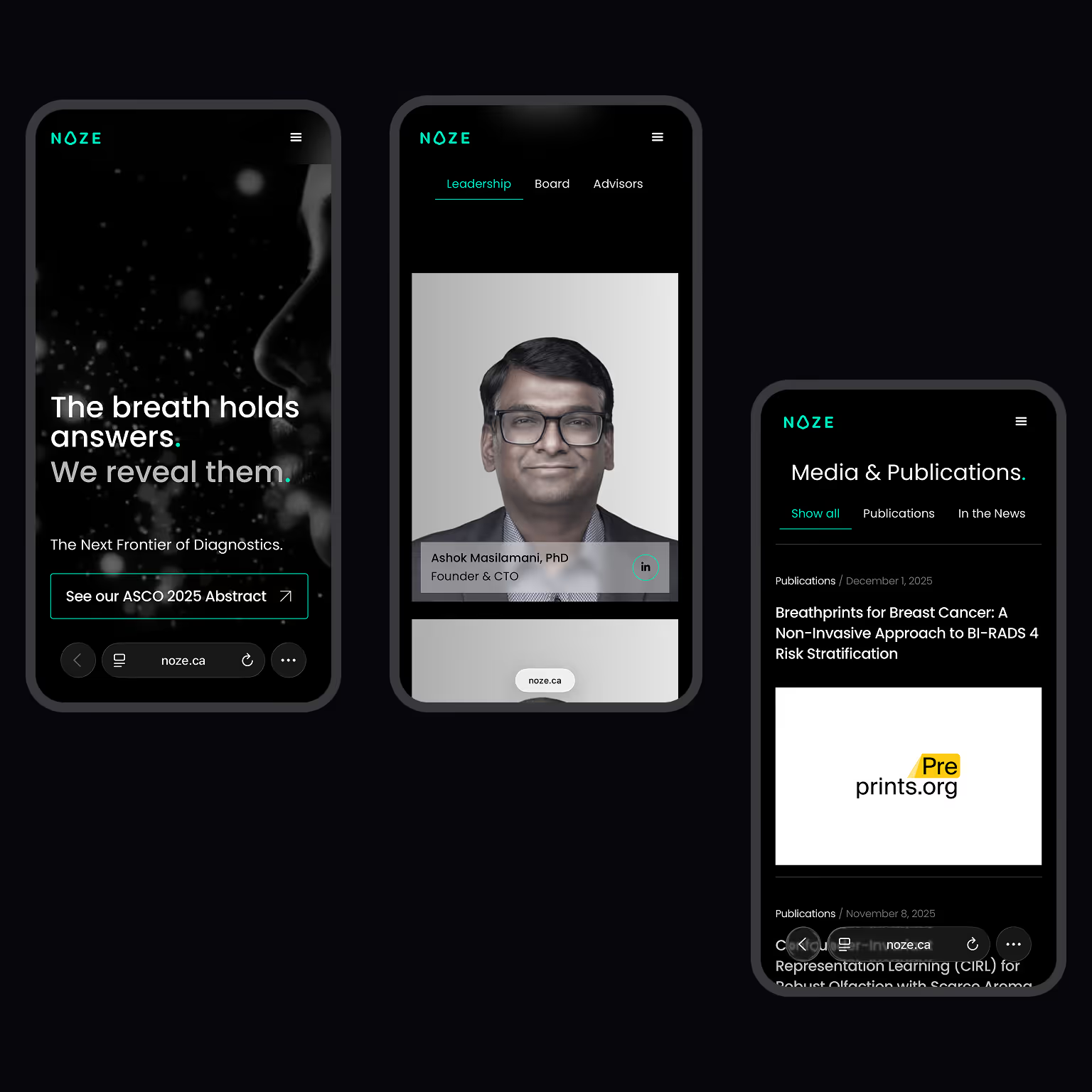
- Consistent experience across devices
Ux img
What we achieved
- Conversion-focused Webflow redesign
- Clearer positioning for investors and partners
- Improved UX hierarchy and messaging clarity
- Scalable website system supporting growth stages
- Stronger first impression across all stakeholder touchpoints
- The website now supports both fundraising conversations and user acquisition.
Gallery
Credits
Art Direction
SEO & AEO Optimization
Webflow Development
Thoughts from our client
Broworks team worked tirelessly to deliver our vision of the website. They were very flexible and adapted quickly to our needs and any changes that we asked for.

Felicia Parr
FAQ about Noze Website Design & Webflow Development
Q1: Why did Noze decide to redesign their website?
Q2: What were the primary goals of the Noze website project?
Q3: How was the Noze value proposition improved through design?
Q4: How did the website support investor and stakeholder evaluation?
Q5: What role did conversion-focused UX play in the Noze redesign?
Q6: Why was Webflow used for the Noze website build?
Related cases studies
.svg)
.svg)
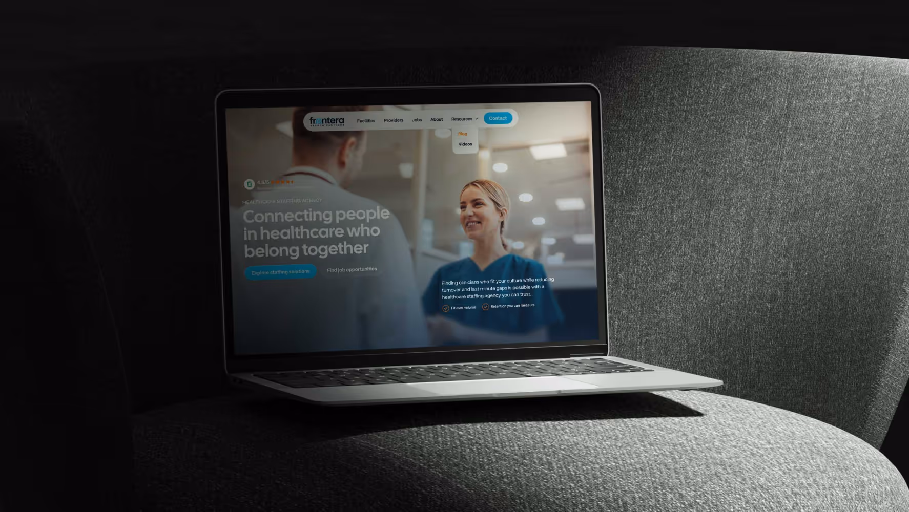
Frontera
Discover how Broworks migrated a healthcare website from WordPress to Webflow, delivering a modern UI/UX and improved performance.
.svg)
Epiq Solutions
Learn how Broworks led a branding refresh and HubSpot website redesign for a B2B product company, improving UX, clarity, and conversion paths