SaaS Onboarding Page Design: Reduce Early Churn From Day One

TL;DR
- Most SaaS churn begins at the boundary between the marketing site and the product, the confirmation page, the welcome email, and the product tour entry point are all website-layer decisions that directly affect activation.
- Behavior-triggered email sequences, segmented confirmation pages, and CMS-powered onboarding content reduce early churn by giving different users the right context at the right moment, not a generic path built for an average user who does not exist.
- Webflow CMS supports this model natively through Collections, conditional visibility, and API integrations, making it a practical infrastructure choice for SaaS teams managing multiple segments without engineering overhead.
Most SaaS teams treat the post-signup experience as a product problem. The marketing site did its job, someone signed up, and now the product team takes over. This is the exact moment where early churn begins to compound. SaaS onboarding page design is not a product-only discipline. The website, confirmation pages, email entry points, and content sequencing that happen in the first 24 to 72 hours are just as responsible for activation as anything inside the app itself. If your website hands off users without structure, context, or segmentation, you are losing people who were already sold.
Why SaaS Onboarding Page Design Is a Churn Problem, Not a UX Problem
Early churn, typically defined as users who disengage within the first 7 to 30 days, is rarely caused by a bad product. It is caused by a gap between what users expected and what they experienced in those first few moments post-signup. According to research published by Wyzowl, 86% of people say they are more likely to stay loyal to a business that provides good onboarding content. The inverse is also true: poor onboarding is one of the most cited reasons users abandon SaaS tools within the first week.
The website is not neutral in this equation. The confirmation page, the onboarding email sequence trigger, the product tour entry point, and any post-login content live at the boundary between marketing and product. Designing that boundary well is a conversion rate optimization decision with measurable impact on monthly recurring revenue.
SaaS onboarding page design refers to the intentional design of the post-signup web experience (including confirmation pages, email sequence triggers, and product entry points) to guide new users toward activation. Effective onboarding design reduces early churn by closing the gap between what users expected at signup and what they experience in the first 24 to 72 hours.
The Confirmation Page: Your First Missed Opportunity
The confirmation page, sometimes called the "thank you" page or the post-signup landing page, is statistically the highest-engaged page a new user will ever see. They just made a decision. Their intent is at its peak. Most SaaS products waste this moment with a generic "Check your inbox" message and a company logo.
A well-designed confirmation page for SaaS does several things simultaneously:
- It confirms the decision with a clear, specific message ("You're in. Here's what happens next.") rather than a vague instruction.
- It sets the next expectation by telling users what they will receive, when, and why, reducing the anxiety of a new account sitting idle.
- It surfaces a micro-action, not a full product walkthrough, but one concrete next step. This could be connecting an integration, completing a profile, or watching a 60-second explainer.
- It segments the user by asking one qualifying question (team size, use case, role) that will shape the onboarding path they receive going forward.
The confirmation page is also the right place to introduce social proof that reinforces the signup decision. A short customer quote, a relevant case study link, or a specific outcome metric ("Teams using our tool save an average of 4.3 hours per week") all reduce post-signup doubt, the cognitive state where churn begins.
From a Webflow development perspective, this page should be built with conditional visibility rules and CMS-bound content so that different segments see different confirmation states without duplicating pages.
Email Sequence Triggers Powered by Website Behavior
The onboarding email sequence is commonly treated as a time-based drip: Day 0, Day 2, Day 5. This is the wrong model. A behavior-triggered sequence, where emails are sent based on what a user has or has not done on the website and in the product, consistently outperforms a time-based drip in activation metrics.
The website is the data source that makes this possible. Here is how the trigger logic works in a well-structured SaaS onboarding system:
- Signup confirmed → Send a contextual welcome email within 5 minutes, not a generic one. Include the specific feature or use case the user signed up for (pulled from the signup form field or source UTM).
- Confirmation page CTA clicked (or not clicked) → If the user completed the micro-action, send a "next step" email within 24 hours. If they did not, send a "here's why this matters" re-engagement email instead.
- Product tour started but not completed → Trigger a "pick up where you left off" email at the 48-hour mark. Include a direct deep link to the exact step they abandoned.
- No product login in 72 hours → Trigger a low-friction re-engagement email with a single CTA and a short proof point tied to their segment.
- First core action completed → Send a milestone confirmation email that celebrates the action and introduces the next feature or value milestone.
- 7-day mark with no core action → Trigger a risk-of-churn intervention email a short, personal-sounding message offering help rather than promoting features.
Each of these triggers requires your website and product to be passing behavioral signals to your email platform. Tools like Customer.io, Klaviyo for SaaS, and HubSpot Workflows all support event-based triggering when connected to Webflow via API or through a middleware like Make.com.
According to Nielsen Norman Group's research on email communication, users respond significantly more positively to emails that reflect their actual behavior and context than to generic scheduled sends. Personalization is not optional in the onboarding sequence, it is the mechanism that prevents churn.
Product Tour Entry Points: Where the Website Ends and the App Begins
Product tours are frequently designed entirely within the app. This misses a critical design principle: the entry point to the product tour should be controlled and introduced by the website, not discovered accidentally inside the app.
A product tour entry point on the website or confirmation page serves three functions:
- It frames the tour before the user enters the app, setting expectations for what they will be guided through and why it matters.
- It allows segmentation at the website level, so users who indicated a specific use case on signup are routed to a tour relevant to their context, not a generic walkthrough.
- It reduces cognitive overload by preparing users before they encounter a full interface. Entering an unfamiliar tool cold is a primary reason users bounce from onboarding flows within the first session.
The mechanics here are straightforward: the confirmation page or post-login website state includes a clearly labeled button or card, "Start your setup guide," "Take a 3-minute product tour," or "Set up your first [feature]", that deep links into the appropriate in-app onboarding flow. Tools like Appcues, Userflow, and Chameleon allow you to define which tour triggers based on URL parameters or user attributes passed from the website.
The website layer defines the context. The product layer executes the tour. When these two are disconnected, users experience a jarring shift in voice and purpose that erodes trust before they have seen the product's core value.
Using the Website as an Activation Layer
Activation, the moment a new user experiences the core value of your product for the first time, is typically considered a product metric. But the website can actively drive activation by functioning as a persistent onboarding layer, not just a pre-signup marketing channel.
SaaS websites can function as activation layers by hosting post-login content, progress indicators, and resource libraries that guide users toward their first value moment. This approach keeps the website involved in the onboarding process beyond the signup confirmation and reduces dependency on in-app tooltips for user education.
Practically, this means building out a post-login or post-signup content experience on the website that evolves based on where the user is in their onboarding journey. This can include:
- A dynamic resource hub that surfaces the most relevant help articles, video tutorials, or setup guides based on the user's segment or onboarding stage
- A progress indicator embedded on the website that shows what onboarding steps have been completed and what remains, pulling data from the product via API
- A segment-specific landing page that users are directed to from onboarding emails, tailored to their use case (e.g., a page for "marketing teams getting started" versus "developers setting up integrations")
This architecture keeps the website as a functional environment throughout the onboarding period, not just a conversion asset. It also reduces the support burden: users who can self-navigate through a well-structured onboarding resource layer submit fewer tickets and reach activation faster.
From a CRO and Webflow strategy perspective, the activation layer model requires tight coordination between CMS architecture, user segmentation logic, and behavioral analytics. It is not a design problem alone, it is a systems problem that starts with how the website is built.
How Webflow CMS Supports Dynamic Onboarding for Different User Segments
One of the most practical advantages of building a SaaS marketing site in Webflow is the ability to use CMS Collections to power segmented onboarding content without duplicating pages or managing multiple codebases.
Here is how this works in a production context:
CMS Collections for onboarding content: Create collections for each content type in your onboarding system setup guides, video tutorials, use-case resources, and milestone emails. Each item in the collection can carry segment tags (e.g., "marketing," "developer," "enterprise") that are used to filter what content a user sees based on their profile.
Conditional visibility for segment-specific states: Webflow's conditional visibility settings allow you to show or hide page elements based on CMS field values. A confirmation page built in Webflow can display different messaging, CTAs, and resource cards depending on which segment the user belongs to, without requiring a developer to build and maintain separate templates.
Dynamic onboarding landing pages: Rather than building a static "Getting Started" page, a Webflow CMS-powered page pulls content dynamically from a collection, allowing your team to update onboarding materials for specific segments without touching the page template. A marketing director gets a different getting-started page than a solo founder, both rendered from the same CMS architecture.
Integration with behavioral data: Webflow sites connect cleanly with tools like Segment, Mixpanel, and HubSpot via embed or API. User attributes collected at signup can be passed to these tools, which then determine what content the user sees on their next website visit. This creates a closed loop between signup behavior, email triggers, and website content, all managed without custom engineering.
For SaaS teams managing multiple segments, verticals, or pricing tiers, Webflow CMS reduces the operational cost of maintaining segmented onboarding content by consolidating it into a single, editable system. The WordPress-to-Webflow migration path is particularly valuable here for teams who have outgrown rigid WordPress templates and need the CMS flexibility to support dynamic onboarding states.
Onboarding Design Mistakes That Accelerate Churn
Understanding what to build is only useful if you also avoid what actively damages early retention. These are the most common onboarding design failures seen in SaaS products:
- Sending a generic welcome email that does not reflect what the user signed up for, what plan they chose, or what they indicated as their goal during signup
- Designing a confirmation page as a dead end no next step, no micro-action, no segmentation, and no social reinforcement of the decision
- Building the product tour entirely inside the app with no website-side framing or entry point, causing cold entry into a complex interface
- Using time-based email drips instead of behavior-triggered sequences, resulting in irrelevant emails arriving at the wrong moment
- Ignoring segment differences and showing every new user the same onboarding path regardless of their company size, role, or use case
- Not measuring activation, if your team cannot define what the "first value moment" is for each segment, onboarding design has no success criteria to optimize toward
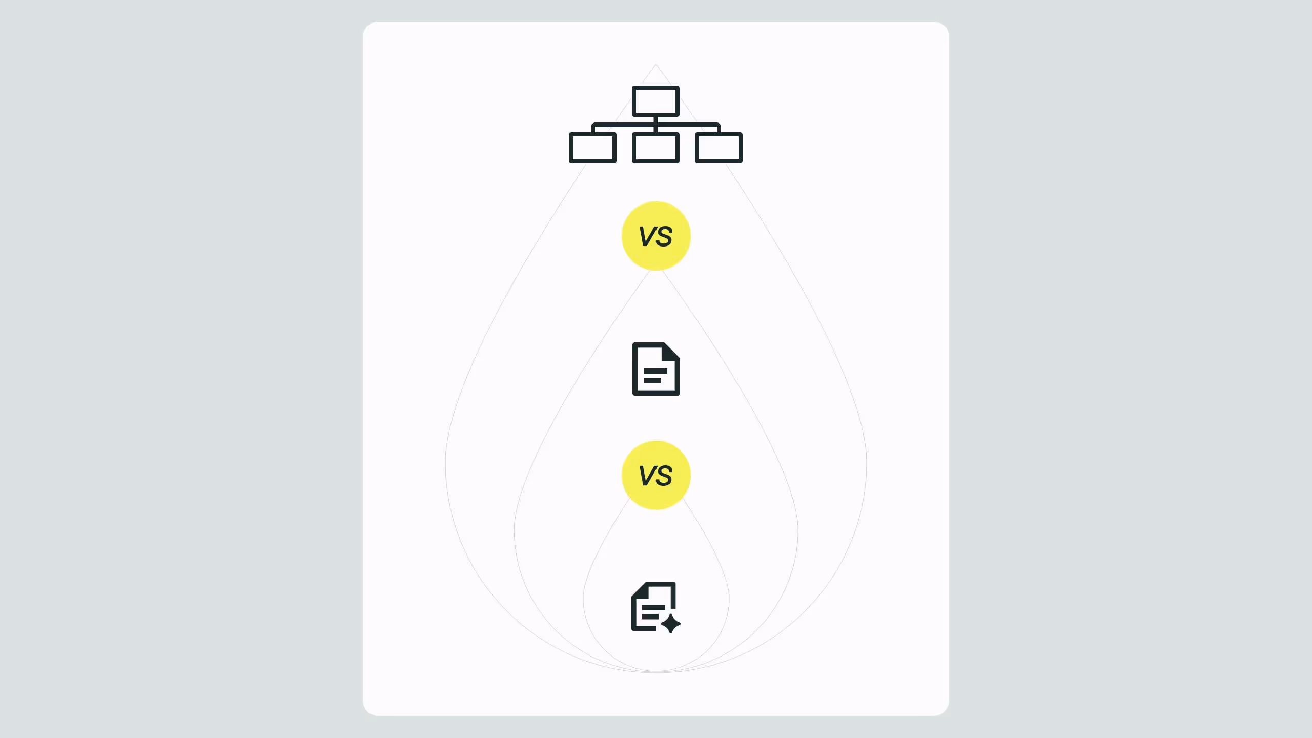
Comparison: Static vs. Segmented Onboarding Page Approaches
The difference between these two approaches is not cosmetic. Static onboarding design treats every new user as identical. Segmented onboarding design treats the website as a system that knows who the user is and responds accordingly. The operational investment required to build the segmented model is justified by its impact on activation rates and the corresponding reduction in early churn.
For teams evaluating this architecture, the Broworks resources library covers CRO, Webflow CMS, and onboarding system design in depth.
.svg)
.svg)