Case Study: Broworks. Brand and Website Refresh


TL;DR
After several years of working under the same visual identity, Broworks decided it was time for a refresh, one that better reflects the agency’s evolution from a general creative studio to a specialized Webflow design and development agency. The new identity embraces a more mature and professional aesthetic while staying true to the brand’s character. The creative team, Stefan Ivic, Tijana Kostic, Stefan Ninkov, and Aleksandar Misljanov, focused on refining color, typography, and structure to align with Broworks’ growth and new audience. The result: a clean, confident brand system and a Webflow-built website that feels both approachable and elevated, balancing brutalist inspiration with functional simplicity.
Check the creative story behind the brand and website refresh we did and why we did it after a couple of years of working with the same identity and approach.
A new design case study is up, and this time it’s us. Welcome to check the creative story behind brand identity design and website design and Webflow development we did for us this time.

Project
For those who don’t know we’re a creative digital design agency, that for quite some time worked with many different design solutions, but like everything in life, we evolved into something a bit different. We’re now focusing mostly on website design and development in Webflow using our well-established process called Design Sprint.
All this drives us to change the way we look in order to be more approachable to our new target audience and clients. We needed to look more serious and professional visually and the website refresh followed up.
We worked on a range of different tasks: creating a solid and flexible identity for the diversity of marketing goals and channels, UI/UX design for the website to make it user-friendly, easy-to-use, functional, consistent, and attractive, followed up by Webflow development.
The creative team for the project included Stefan Ivic, Tijana Kostic, Stefan Ninkov, and Aleksandar Misljanov.

Design Process and Solutions
Having deeply researched and analyzed the market segment and the target audience, the creative team developed several significant points to keep up with our identity:
- Warm (analogous) palette, keeping our yellow main color
- Expressive and functional color contrast
- Emphasized visual accents
- Clean typography with a high readability level, using only one font type
- Photo and graphical content as the primary type of visuals
The logo redesign elegant, recognizable, and readable wordmark, flexible to be used in both online and offline environments for different marketing and advertising objectives.
Another essential and original element of Browroks’s brand identity is the brutalist set of graphical approaches.
We completed this more mature approach with a change in palette. Yellow and dark green perfectly shows the duality of our brand, so we stayed true to our colors. Just as a refreshment, we chose a slightly more muted shade to add elegance.


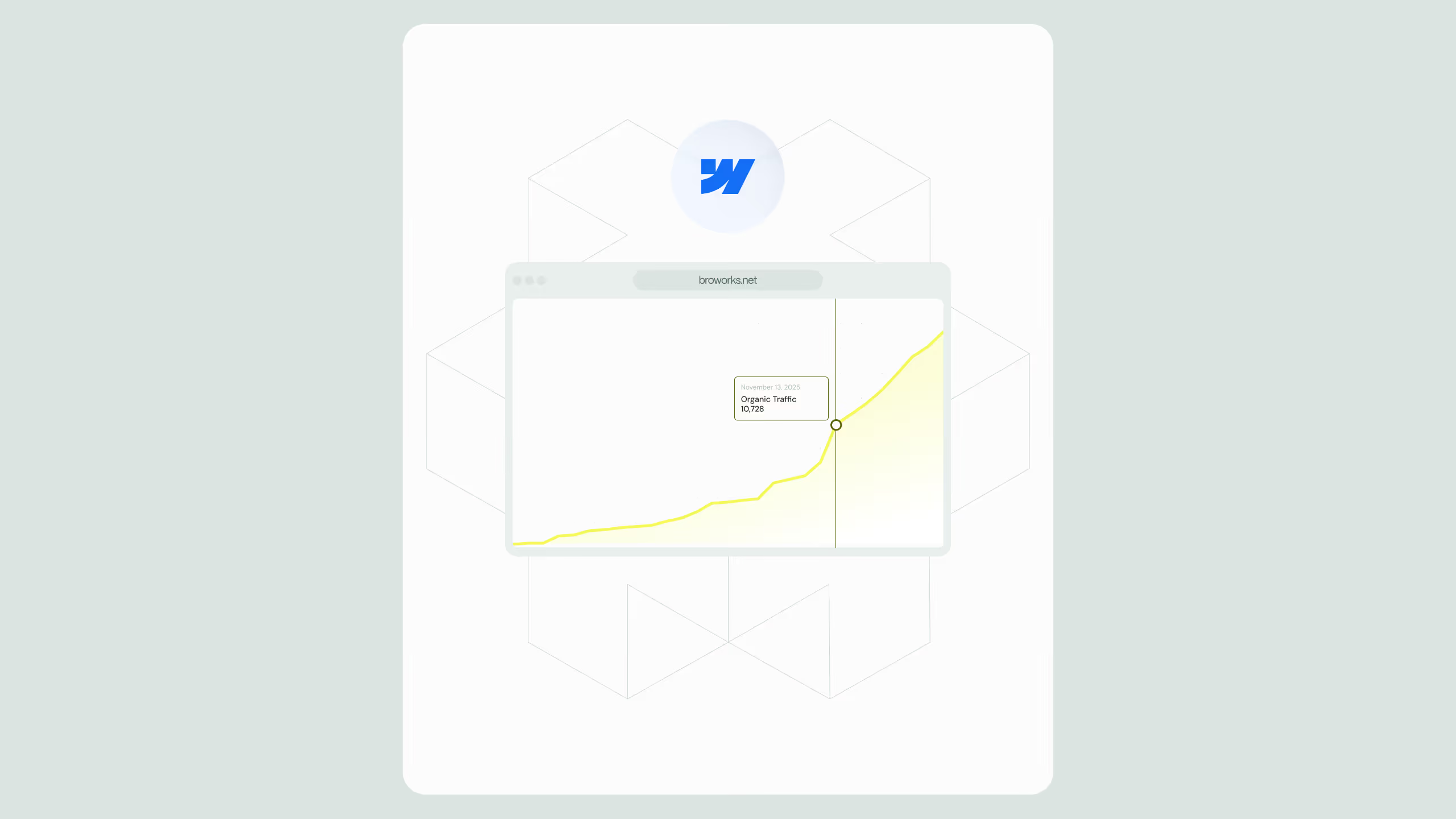
And here’s a glance at the website, neat and informative, with a smart grid and interesting interactions making the user’s experience even better and more fun.


New design case studies from our team are coming soon. Stay tuned!
.svg)
.svg)