
EyeSee
EyeSee Research is a global market research company working with enterprise brands that rely on clear insights and data-driven decision-making. Their website needed to clearly communicate expertise, methodology, and value, while guiding high-intent visitors toward meaningful conversations.
Challenges
EyeSee’s previous website did not fully reflect the depth of their expertise or the sophistication of their research offering. Key challenges included:
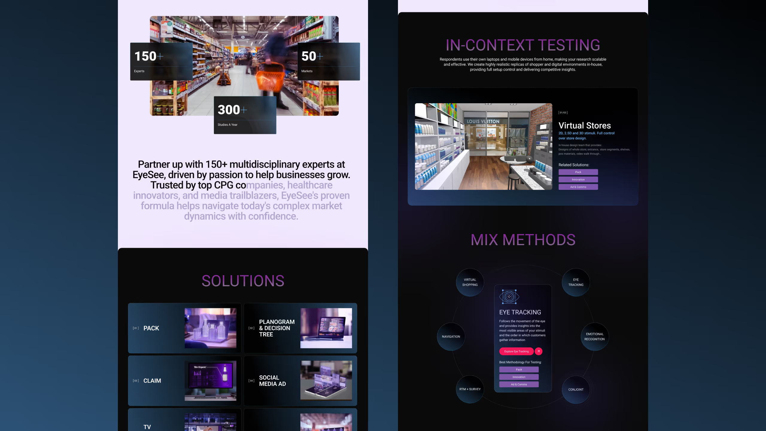
- Complex services that were difficult to understand quickly
- Messaging that didn’t clearly differentiate EyeSee in a crowded research market
- UX friction for enterprise buyers evaluating credibility
- Conversion paths that weren’t clearly defined
For research-led organizations, trust and clarity are critical. The website needed to support education, validation, and conversion, all at once.
How we approached it
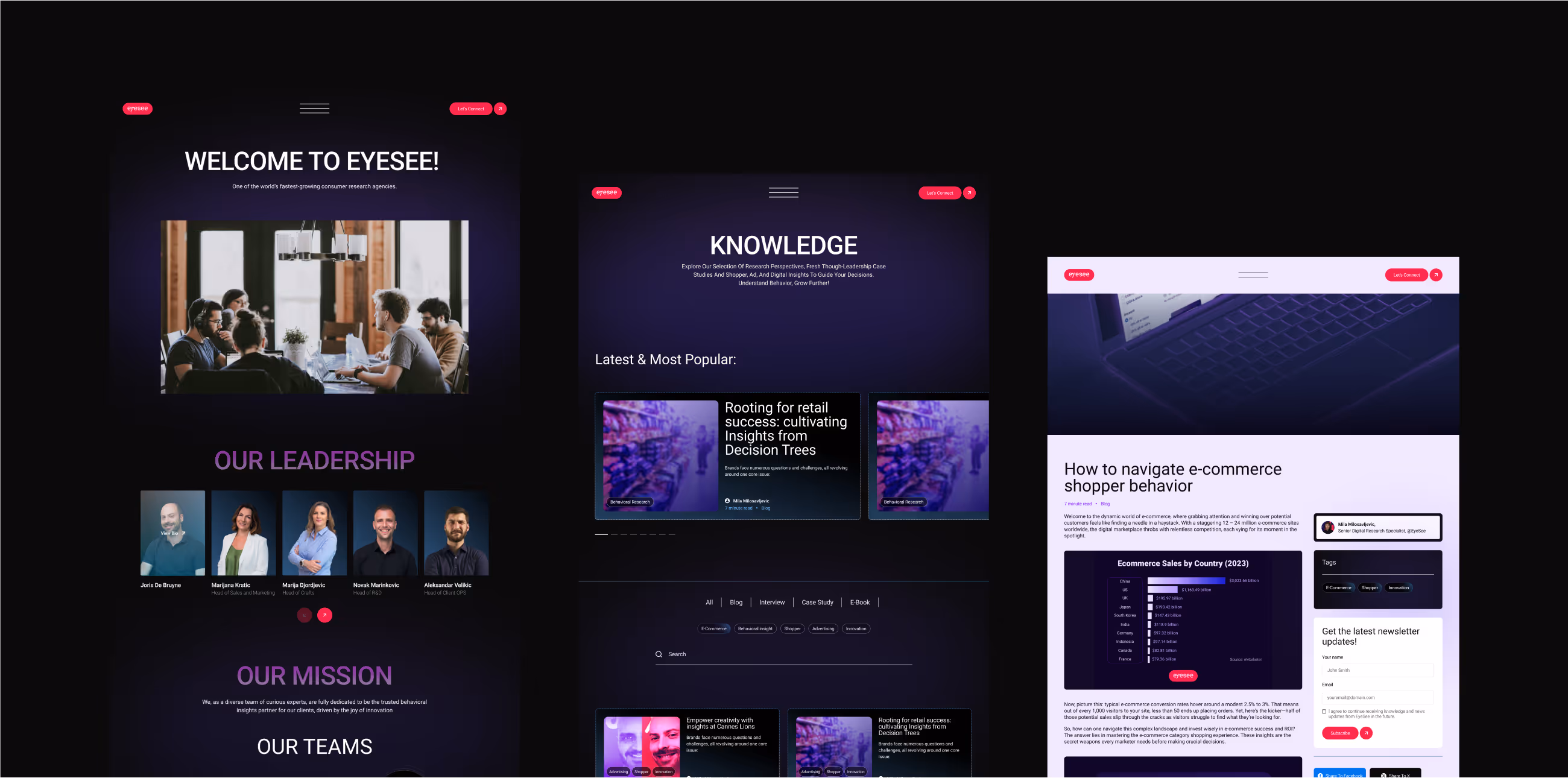
UX & Information Architecture
We restructured the website around how research buyers evaluate partners. This included:
- Simplifying how services and methodologies are presented
- Creating clearer entry points based on buyer intent
- Reducing cognitive load while preserving depth
The focus was on making complex offerings feel approachable and understandable.
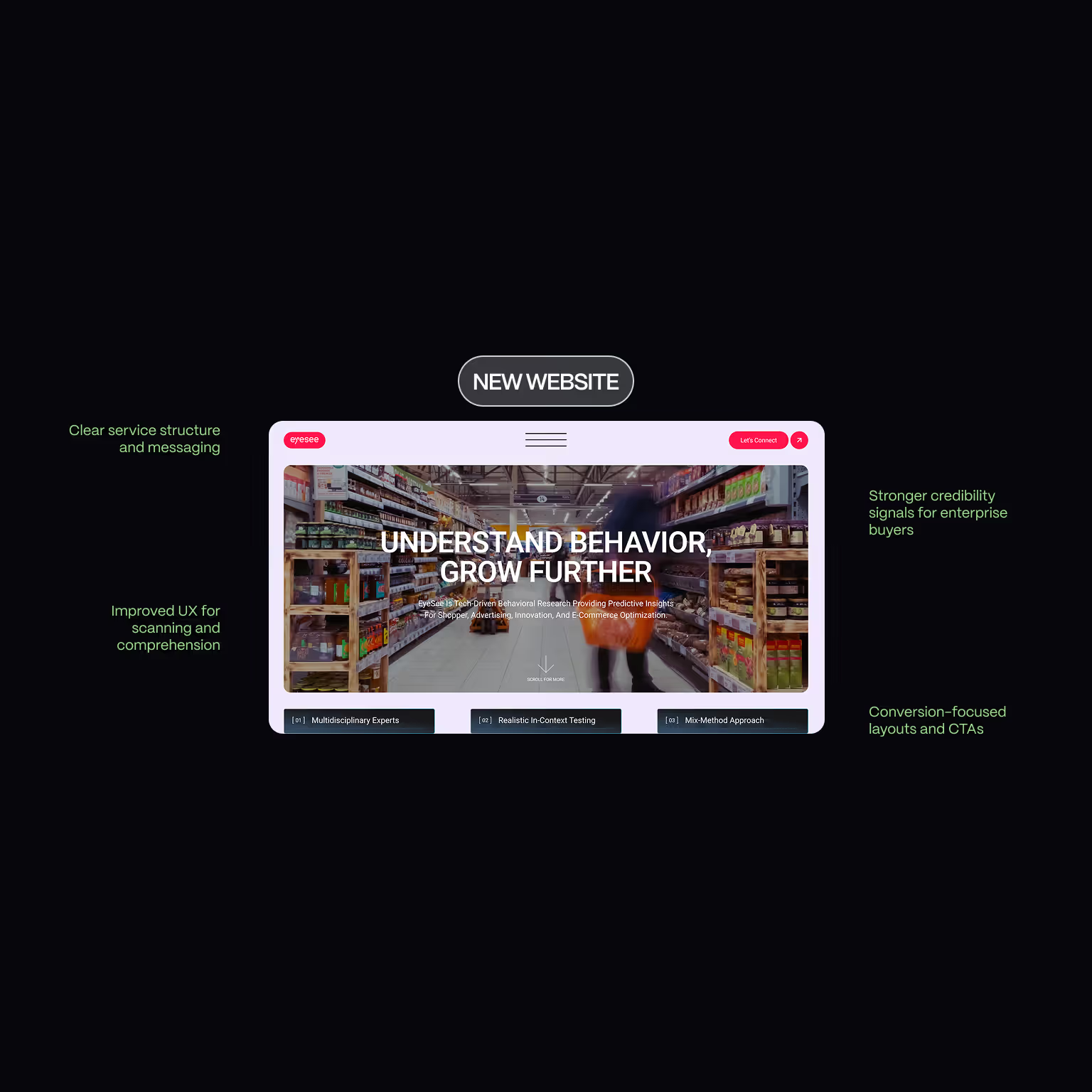
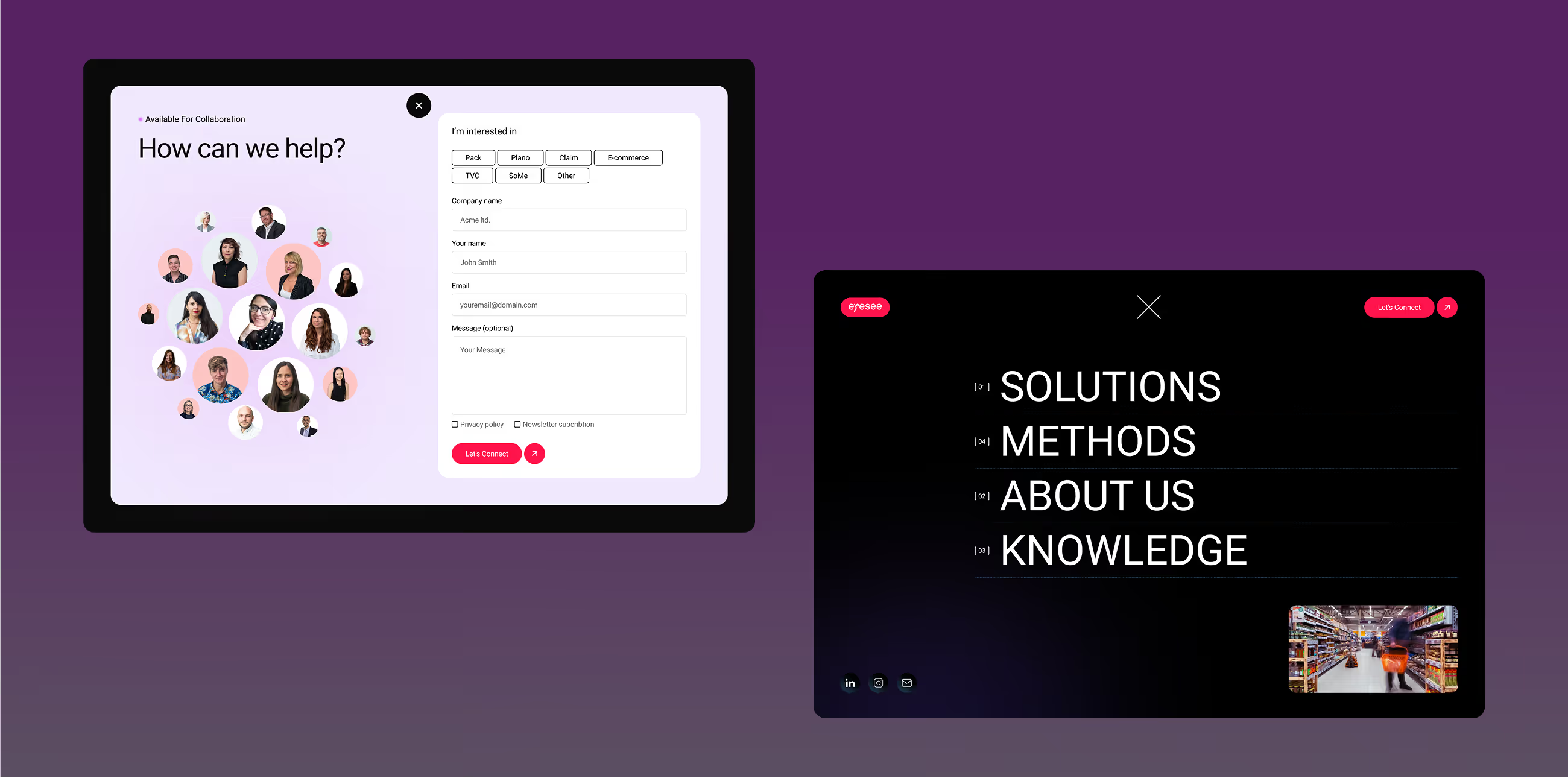
Conversion-Focused Redesign
We redesigned key pages with conversion in mind:
- Clear value propositions above the fold
- Stronger narrative flow across pages
- CTAs aligned with buyer readiness (not forced actions)
This ensured the website supports sales conversations instead of blocking them.
Webflow Design & Development
The website was redesigned and developed in Webflow to provide:
- A flexible, scalable system for content updates
- Consistent design across pages and sections
- A modern, professional interface aligned with enterprise expectations
Ux img

What we achieved
- Clearer positioning of EyeSee’s research services
- Improved UX for enterprise and research-driven audiences
- Conversion-focused Webflow website redesign
- Stronger credibility and trust signals
- Scalable structure for future content and growth initiatives
The website now functions as a research credibility platform, not just a marketing surface.
Gallery

Credits
Art Direction
UX Designer
UI Designer
Webflow Development
Thoughts from our client
“The part that impressed us the most was the initial branstorming and their innovative UX solutions. They understood the brief and kept asking relevant questions for our business that made the brainstorming and new ideas highly relevant. Creatively, they went beyond what we could imagine and showed us way better options.“

Sandra Stojanovic
FAQs about EyeSee Research Website Redesign & WordPress Migration
Q1: Why did EyeSee Research decide to redesign their website?
Q2: What were the main goals of the EyeSee Research website redesign?
Q3: What role did UX and information architecture play in the EyeSee Research project?
Q4: Why was Webflow chosen for the EyeSee Research website rebuild?
Q5: Did the EyeSee Research project include a WordPress to Webflow migration?
Q6: How does the new EyeSee Research website support conversions without aggressive CTAs?
Related cases studies
.svg)
.svg)

Epiq Solutions
Learn how Broworks led a branding refresh and HubSpot website redesign for a B2B product company, improving UX, clarity, and conversion paths
.svg)
Xiphos Systems
Explore how Broworks redesigned a B2B website on HubSpot with improved UX, messaging, and conversion-focused structure.