What makes a good landing page


TL;DR
A landing page is where visitors “land”, but it’s also where they decide. Whether it’s buying, subscribing, or contacting you, the landing page’s goal is simple: conversion. To achieve that, it must be clear, persuasive, and visually focused.
Here’s what makes a high-performing landing page:
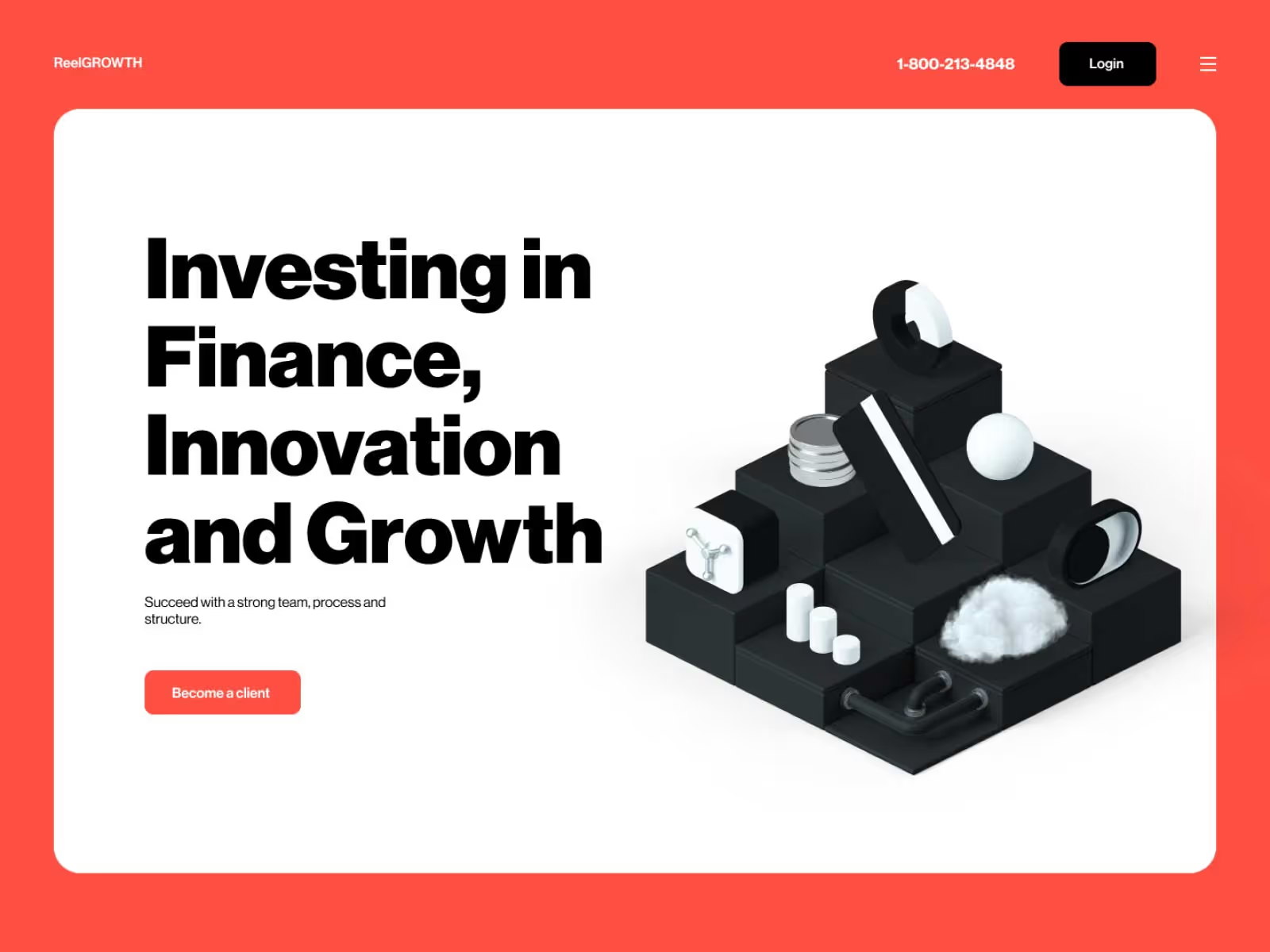
- Strong headline – instantly communicates what you offer and why it matters.
- Concise, structured copy – explains benefits clearly and keeps attention with visual hierarchy.
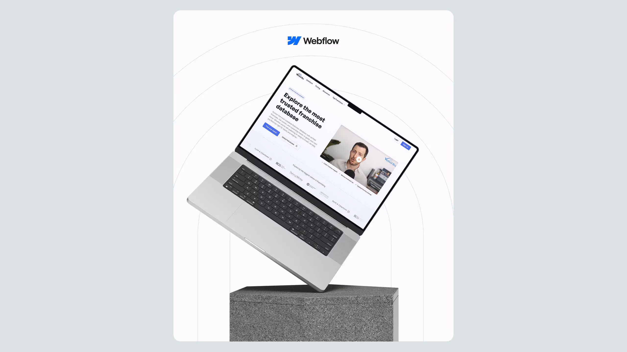
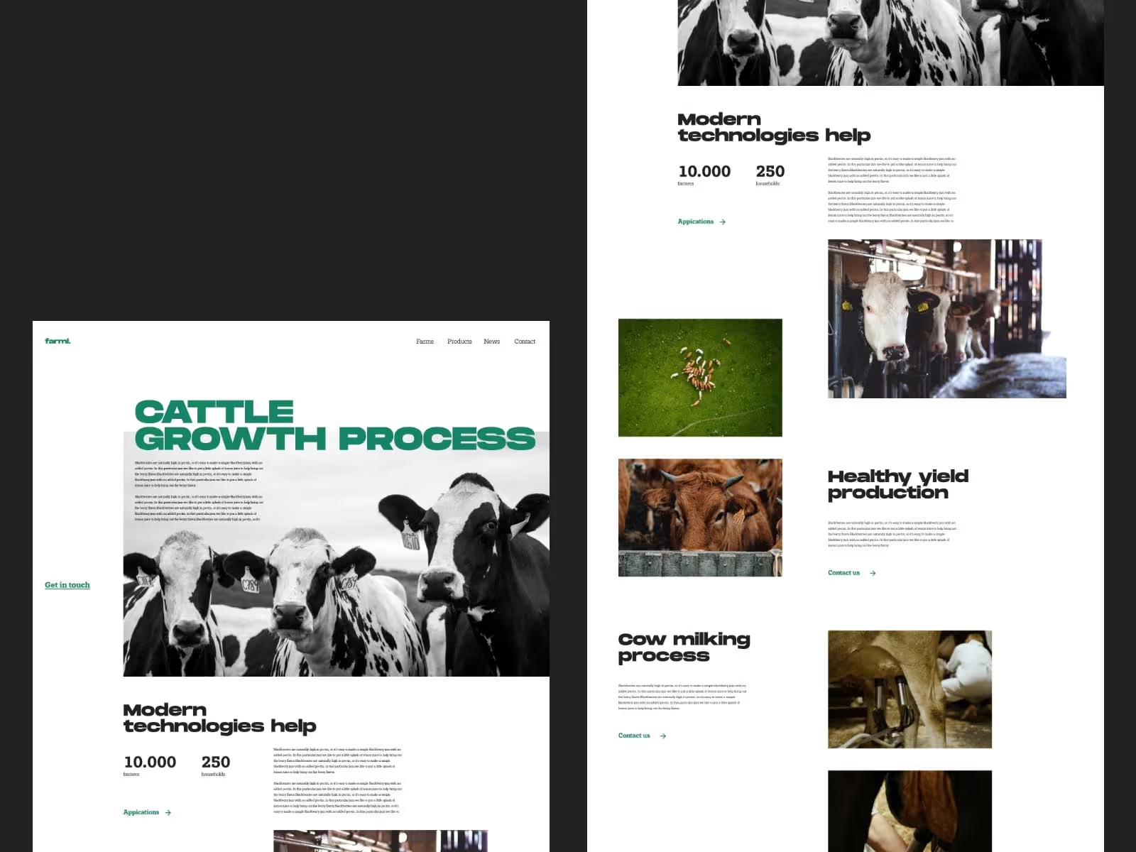
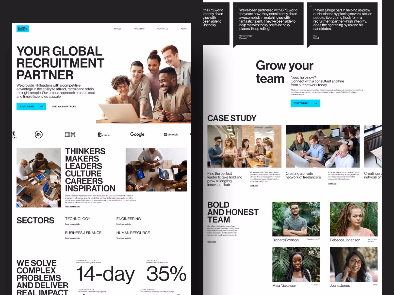
- Powerful visuals – show your product or service, not just tell.
- Effective CTAs – strategically placed buttons that invite action.
- Trust indicators – reviews, testimonials, policies, and credentials for credibility.
- Lead capture forms – short, simple, and optional to keep users comfortable.
- Clean layout – use empty space and focus on one clear offer without exit links.
A well-designed landing page doesn’t just look good, it guides, convinces, and converts.
If your website is where your company is stationed on the Internet, imagine a landing page as one separate room. When a visitor comes across this room, what should he see? Imagine where your product is placed there, how space is organized, what the visitor sees first, and what lasts.
And most importantly, how you want to guide the visitor through the content of that room - your landing page.
In short, what is a landing page?
The page of your website to which visitors land, guided by some previous link.
Simple, isn't it?
However, what is entirely up to you is what the visitor will see there. And whether that will lead to the desired action - conversion.
Some tricks tweak your landing page to make the conversion of your website big. Because it should be highly functional, informative, catchy, and good-looking. This may sound difficult to achieve. Therefore, we pointed out a few tips on creating a good landing page. Here is what we've got for you!
1. Headings
Let’s get back to the idea of the room.
What should first catch the eye of the visitor when he enters a room that is like a shop, gallery, and the like? From everything he sees, he must immediately know what it is about.
For a landing page, it means headings. The heading is the part of the page that stands above everything and says: Look at me! This means that the heading must instantly show what you are offering. Whether it's a product, a service, a skill. The heading must send a transparent message that is relevant to the user. Yes, we say clear and direct, but not blunt. As something users see first the headline has to be catchy, so don’t be afraid to add a bit of humor and catchphrases. As long as it's obvious what you're talking about! For example, questions that users themselves would ask turned out to be good headlines.
Let's go back to the top of this text. Headline - What makes a good landing page? This indicates that the answer to this question, which is above all, lies below. And so, visitors continue to read. Another example is the headlines of our Broworks website. We often invite people to action and cooperation by directly saying LET'S (Let’s visualize some ideas!). If you convince them in any way that the heading is an overture to something relevant to them, you have succeeded. Heading - did a good job.
Tip: Subheadings can also play a role in drawing attention. For example, if the headline is a question, the subheading can easily offer an instant answer as an introduction to further text.
2. Content
Copy
One source of information can be copy, but one needs to know how to create it. How powerful are words? When is the written word most useful for a landing page? When giving information about you and your work concisely and clearly. No matter how much media, video, and images draw attention and entertain visitors, the text explains and highlights important points. How much space a copy will take for itself depends on what your offer is. If you feel that something needs to be explained well and directly to users, then the amount of copy can be bigger. Such is the situation with sales, for example. Anything that involves handling and spending money requires a better explanation because money is an essential human resource. People want to know where the money is going. In addition to writing it, the copy needs to be integrated into other content. Combine it with media and polish the look of the copy itself. What does it mean?
- Effective copy details
Words also have their visual power that can be used effectively on the website. Copy parts are suitable for stylistic adjustment to draw attention to the most relevant sections or navigate reading. Guiding the reader through the text is just as important as good writing because long blocks of copy often do not hold the attention of modern Internet visitors. That is why it is crucial to separate it into smaller, significant parts of the text. Thus, the reader reads them sequentially with ease. If you explain how a product works, you can separate the longer text into paragraphs. Then you can combine those paragraphs with pictures and gifs that serve as explanations.
For the same reason, don't stick to just one font and size of the text. You can enlarge, center, or bold vital parts. You can draw attention to some words using italics. You can simply hierarchize the contents of the copy depending on what is more important, what is an add-on, what is interesting, and the like. Use both lists and bullet points if you can. That can greatly improve the legibility of the copy. This stylization is much better than just leaving raw text on the page. It is more likely that visitors will read it all and understand it better.
Either way, you still should strive for minimalism as much as possible. The concise and stylishly processed copy is legible, light, and clear. And as such, it leads to bigger conversions.
Media
Anything that isn’t text and still tells a story.
Showing a product or service with a picture or video is very effective. For some users, a visual explanation means a lot, and they think it gives a more personal vibe. We are ultimately visual beings, and the messages that come to us through design, image, and motion have a big impact on us. Add images, illustrations, or 3D objects to your landing page, and they will remarkably enrich the content. It all depends on what you do, but make sure that this kind of media targets the essence. Connect with your target audience, give a clear and empathetic message, and show something that people can relate to.
Through this content, you can present yourself, your brand, and your values. That's why the Hiro -mascot of the Broworks team sticker pops up here and there on our website, creating an atmosphere around other content. Whether it is about adding vibe, explaining, interacting, or entertaining, media roles are powerful indeed. Therefore, be careful how you use them and place them because you do not want to send the wrong message.
Call-to-action elements
And now the major elements around which you design the whole story of your landing page. After all, the point is for your users to perform the desired action! Therefore, there are elements such as buttons that should prompt the user to click. Call-to-action elements.
What to do with them? First, they must be well-positioned because visitors must notice them. All the show-off features have to go into call-to-action elements. They usually achieve the biggest conversion when they are below a particular content, a copy that provides information about you and your work. When you introduce people to what you offer, they are more likely to click on the action button. That's why they come after. You want it to be almost freakishly easy to spot, so pay attention to the design of the element itself. It has to look like the action itself! Use colors that create an attractive contrast and draw attention.
Forming an element as a tangible object also attracts people to interact with it. That is what we had in mind while designing the logo for the ACS company. Unrelated to the landing page, but for the same purpose. Once again, why is it important that the call-to-action elements are in the right place at the right time? Because they are the ones who need to lead to the desired action. Whether it is contact with the company, cooperation, purchase, and the like. We will just call it - conversion. And now, it is even clearer what this means for the landing page.
Few more details
- Trust indicators
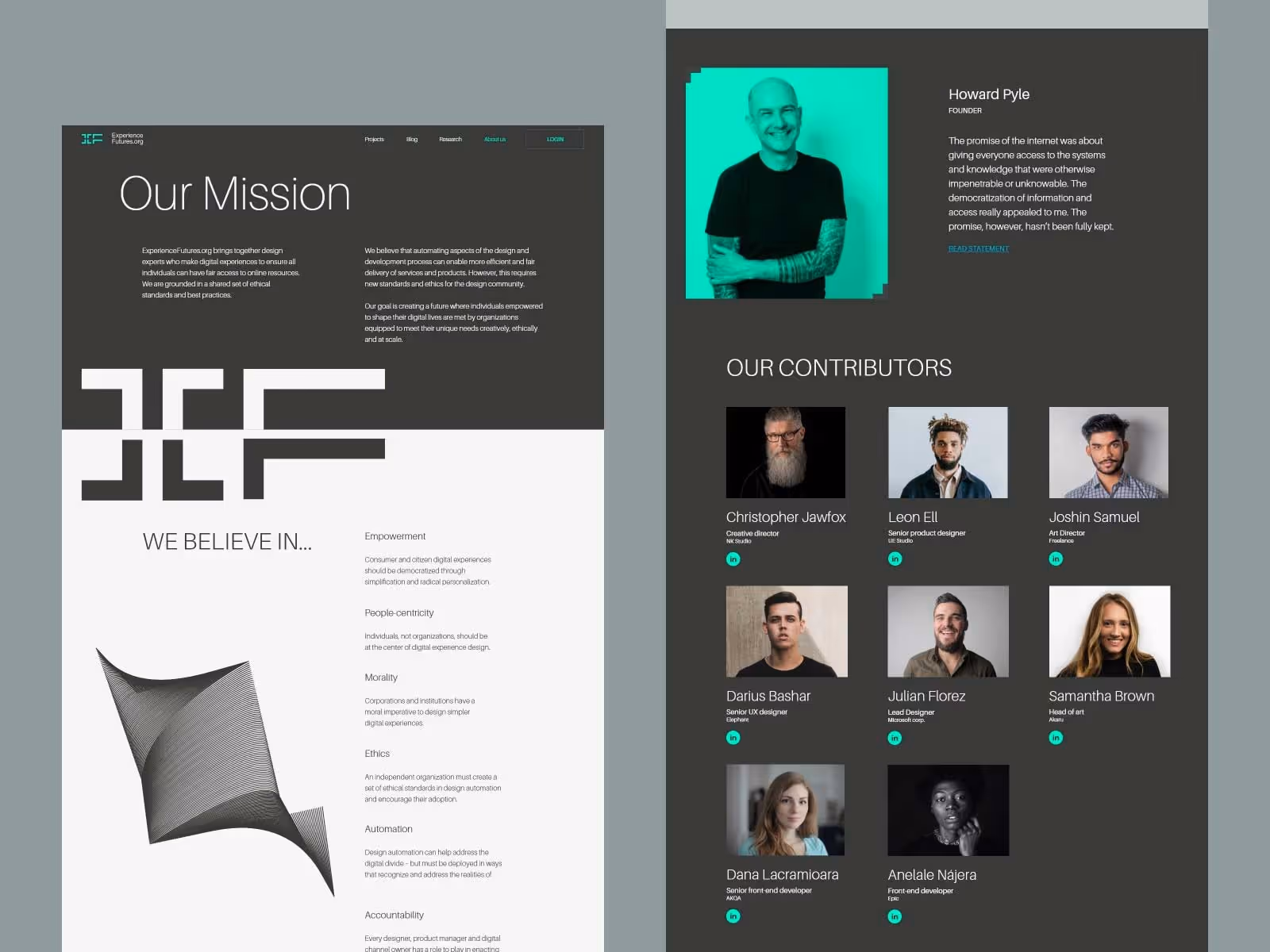
Because people may get to the point where they need to contact you, and they won’t be sure if that’s the right thing to do. Then the results of your work come into play.
You don't have to think of everything yourself, you can simply show what your other clients think about you. Testimonials, reviews, social profiles, policies, trust badges, and mandatory contact information are things that should be discreetly but consistently behind your work. Successful collaborations with other people mean a lot to future clients. Because there is nothing that creates trust better than a recommendation.
- Lead capture form
Overture for feedback from users. These forms ask users to leave contact information, usually an email address, to stay in touch with your content.
Now. That is one useful thing, but it should not be displayed on the landing page intrusively. In other words, you will not just immediately ask the user to fill out the form if you have not offered him something before. That's why it's best to keep these things discreet, like drop-down lists that appear with a click. That leaves the user space to act if he wants. Also, the form should be short and not too demanding.
- Empty space
Empty space is a notable thing that is often ignored. Because simply, it’s a blank space between content. However, what this blank space allows is to draw attention to the rich elements of the content. Leaving space between some parts of the page lightens the page very nicely and makes the content concise. Therefore, do not push all the elements next to each other. Harness the power of simple empty space.
3. The specific design of the landing page
Most of these tips we have listed could be used to create any page on a website. But for a landing page, always keep in mind its purpose, which is to make the user want to work with you. When you actively integrate these elements into the content of the landing page, keep the following in mind:
- The landing page should not have exit links
A landing page is a station from which a user can leave or choose to contact you. Do not unnecessarily insert other links that will take him to another page. Narrow your focus on this page and focus the user only on its content. The landing page should have enough information that further navigation of the user is no longer necessary.
- The landing page should focus on one specific offer
So, don't burden the user with all the possible things that your business involves. Point out to him the shortest path to one specific item you are offering him. Be clear when you do this, from the headline, through the copy, to every visual element. If you always keep in mind what precisely you are offering, all the content elements will guide the user directly to it. That’s how a well-designed landing page should work.
Good luck!
.svg)
.svg)