
5 best fonts choices for web design

TL;DR
Choosing the right font pair can make or break a website’s design. The best combinations balance creativity in titles with clarity in body text. Fonts like DM Sans, Aeonik Pro, Poppins, General Sans, and Neue Montreal stand out for their versatility, readability, and personality. From geometric modernism to timeless grotesque forms, each typeface offers a unique tone for your brand. The key is to prioritize both aesthetic appeal and accessibility, ensuring that every visitor experiences a site that looks beautiful and reads effortlessly.
For most projects designers tend to use fonts in pairs, often combining more creative ones for titles and traditional ones for paragraphs for readability.
To help you decide the best font we’re researched what our and other designers often use.
Let’s take a look to the best of them:
DM Sans (+DM Mono)
DM Sans is not the most popular Google font but it’s super clean and sharp sans serif font, perfect for tech websites especially when combined with DM Mono.
DM Sans font family offers a wide range of variations of weights, widths and styles, making it a versatile choice for web design.

Aeonik Pro
Aeonik Pro is not a free font but it’s worth every penny due to its modern and versatile aesthetics. It’s designers favorite among designers for paid fonts and perfect for multilingual websites because it supports both Latin-based languages and non-Latin languages like Greek and Cyrillic.
Opentype features allow multiple subsets, caps, alternates, tabular and lining numerals, both proportional and old-style.
Although Italics appear oblique, curves and diagonals have been corrected to ensure weighting stays true to their upright counterparts.

Poppins
Poppins is a sans serif font that can handle characters from Latin alphabets and the Devanagari system used by languages like Hindi or Sanskrit. If you’re looking for an internationally versatile font, Poppins is a great choice.
Poppins’ geometric shapes keep the type readable in small sizes, while its modern yet timeless curves look striking when blown up on big screens or mobile devices. It’s perfect for web and UI designs that demand style, clarity, and legibility.
Plus, Poppins' OpenType features offer a ton of potential for customizing text. For example, ligatures can be used to combine two or more characters into one glyph shape – helping designers create more interesting typographic effects without compromising readability or compatibility across browsers and devices.

General Sans
General Sans offers a clean and modern appearance with a bit of retro 1950s feel.
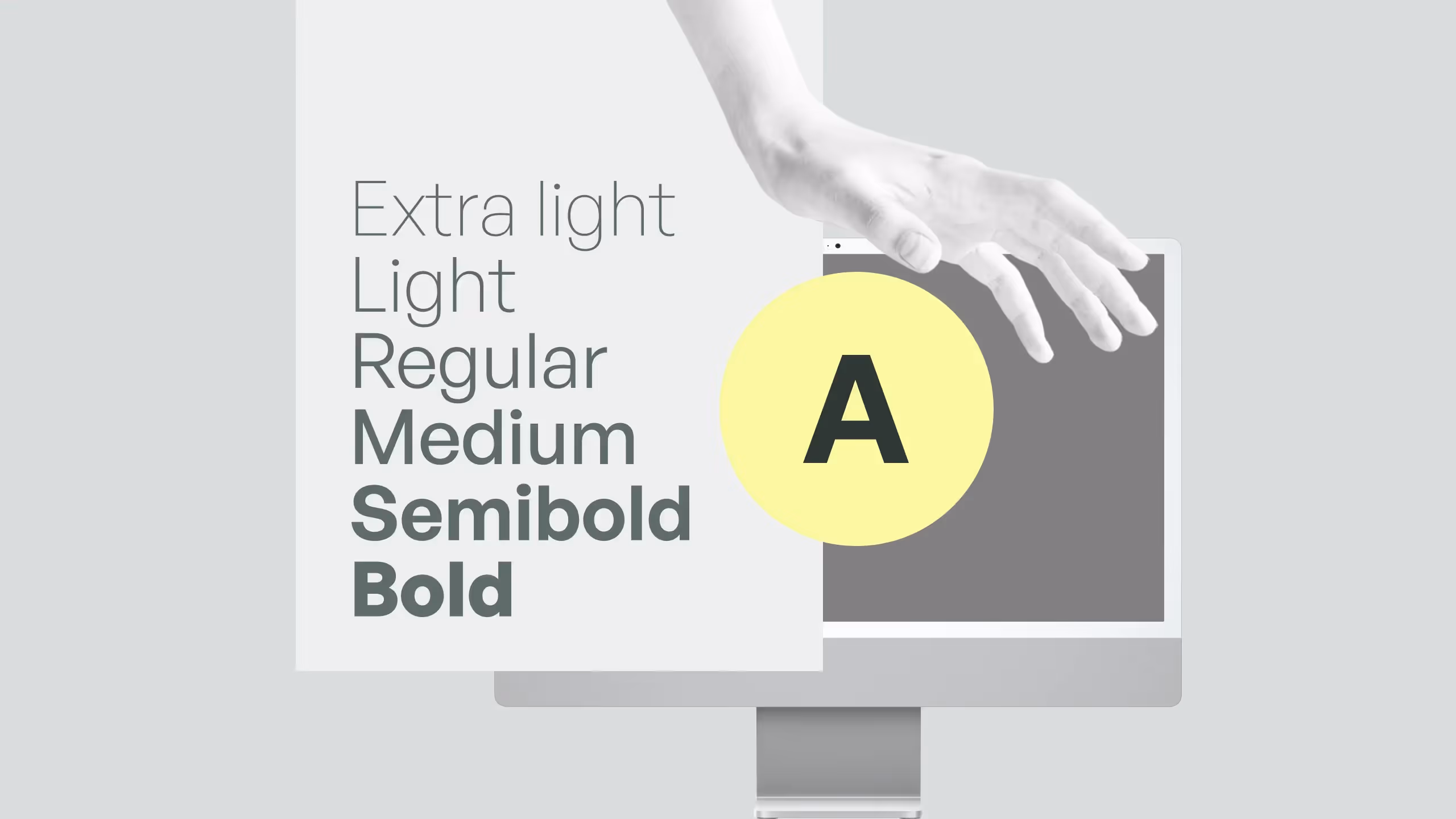
The letters’ apertures are very small, making the counter-forms in typeface feel like they are being completely enclosed within their surrounding characters. The General Sans family comes in twelve weights ranging from Extralight to Bold with complementary italics.
General Sans is an excellent selection for use in branding, or in other kinds of corporate identity design. It may also be put to good use in editorial designs for publications making it a great choice not only for titles but for paragraphs on a website as well.

Neue Montreal
Neue Montreal is a versatile grotesque font with seven weights and a slightly thinner kerning including Cyrillic support. This timeless Sans font was inspired by Montreal city design from Expo 67 to its contemporary effervescent design scene.
Font is not free to use but it has an option to try it for free. It’s great for both branding and website design projects.

Which font is right for your project?
Choosing the right font for your website creates a balance between creativity and accessibility. When selecting fonts make sure to consider not just visual impact but if it’s accessible and readable for all people on the web.
.svg)
.svg)

.avif)