Color design trends in UI design for winter 2021


TL;DR
As the seasons shift, so do design trends, and this winter’s color palettes are all about warmth, optimism, and subtle contrast. From Pantone’s Ultimate Gray and Illuminating Yellow combo symbolizing balance and energy, to the comforting tones of pastels and nudes, the design world is leaning into emotion-driven visuals. The nostalgic Washed & Worn-out aesthetic brings vintage charm, while Glassomorphism introduces modern transparency and depth. Finally, Layered Gradients add motion and atmosphere to interfaces, giving flat designs a refreshing 3D feel.
Together, these trends show a clear direction for 2021’s design landscape: authenticity, softness, and optimism, colors that feel human, real, and full of light.
As we all have noticed, it’s getting a little chilly outside!
Well, autumn is already here, and winter is coming soon. The season change brought something fresh to the world of graphic design, and new trends are popping up here and there.
Accordingly, today we are talking about colors. As color shift happens outside, it brings some new amazing things in using colors in the design. And not just colors! We talk about brightness, shades, and tints. Because you must not ignore the power of coloring and shading!
Simply put - the colors deliver the atmosphere and the whole aura of a visual concept. In particular, for Internet Users, graphic images provide a lot of information about different things - products, services, companies, businesses, brands, etc. And what about the colors? It is the color choice that soothes, entertains, calls to action, and introduces you to what is behind the design.
Colors provide unique information that resonates with our feelings and thoughts. If you pay attention to coloring, you will see that a large part of the design process is trying out colors and shades for your design. After all, coloring is what makes the contrast between your product and the rest of the world. That is why this month's topic is 5 color design trends in UI design for winter 2021.
We want to see what is fresh and trendy in the color palette! Which brands are getting their designs bright new coats and what kind of design will keep us warm this winter!
1. Ultimate Gray & Illuminating Yellow
Let’s start with the color of the year!
According to Pantone "Ultimate Gray" and "Illuminating Yellow" are a combo for the color of the year 2021. And we totally agree on that! This fixed choice of colors showed some perfect contrast that is pleasing and inspirational.
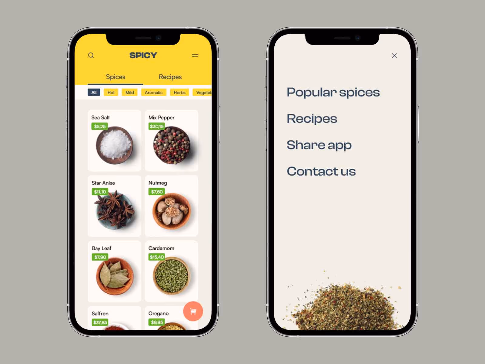
Well, people see it differently but what we have here is Ultimate Gray shade that is a simple and solid background of many designs. Despite being a cool color, Ultimate Gray brings a unique depth into the design. It is soothing, smooth, and serious. And it's certainly not intrusive. The other color in this combination is Illuminating - a shade of vivid yellow. Illuminating yellow is just that, a color that illuminates the design and highlights the details. This color cannot be said to be too bright and aggressive but to be inspiring and sparkling.
Why is this combination so beautiful in the first place? Because the color palettes of these two colors make incredibly balanced tones that give the design different qualities. The designs in the Ultimate Gray and Illuminating Yellow combination look both serious and straightforward but also lively and optimistic. It can be said that these two colors brought to light the qualities that many brands strive for - Stability and Innovation.
Reliability and Energy.
That is why we can see more and more pieces of design, which companies wear in this confident color combination.
2. Pastel Colors & Nude Tones
The next color trend is well known and widely used! Here is why.
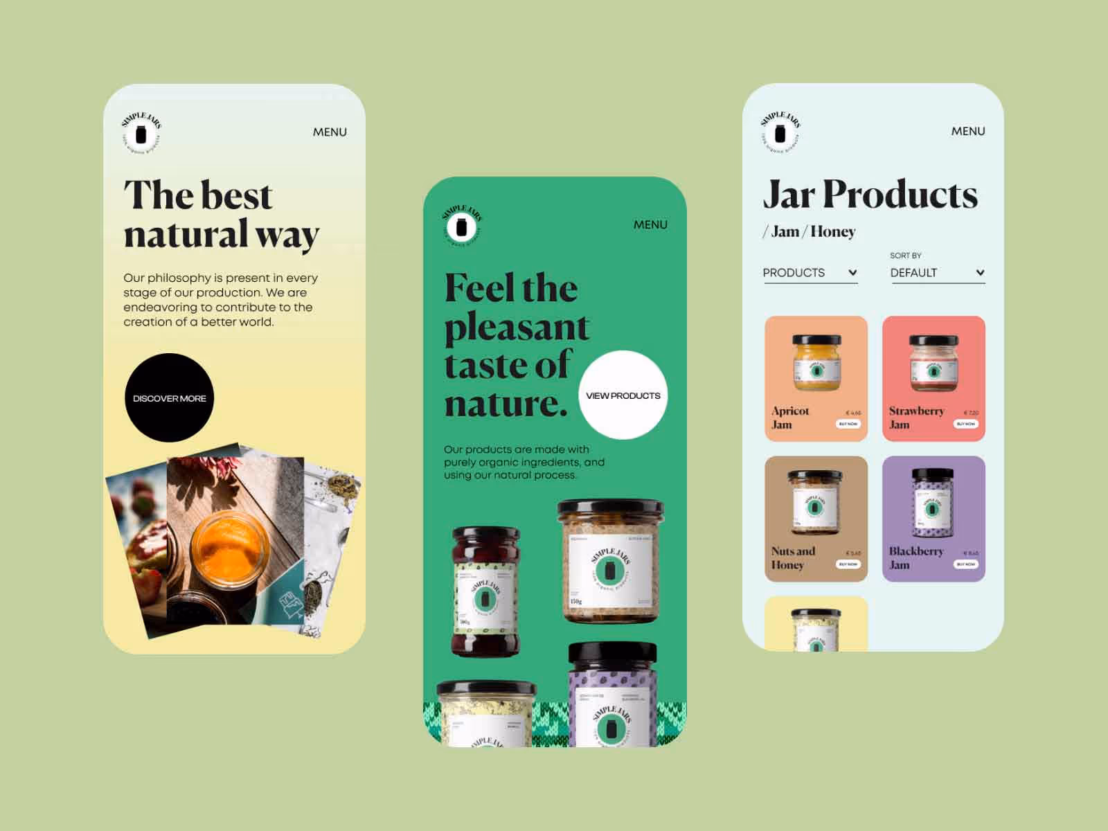
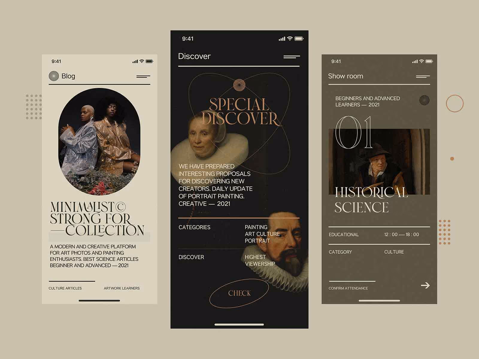
We believe that pastels will never stop being trendy! They found their way into the design so smoothly, and people simply love them! That’s because pastel colors are soothing, calming, and gentle. They are typically used in designs with light contrast and round curves and create a nurturing atmosphere. Yes, pastel designs are so soft that it often feels like you can touch them! Sometimes, that’s all that the human eye needs to see. As such, pastel colors go particularly well with some brands. You will often see designs related to care, nature, health, development, resting, and traveling in beautiful pastels. Whether you choose cool or warm colors, the pastel designs are instantly relaxing the User.
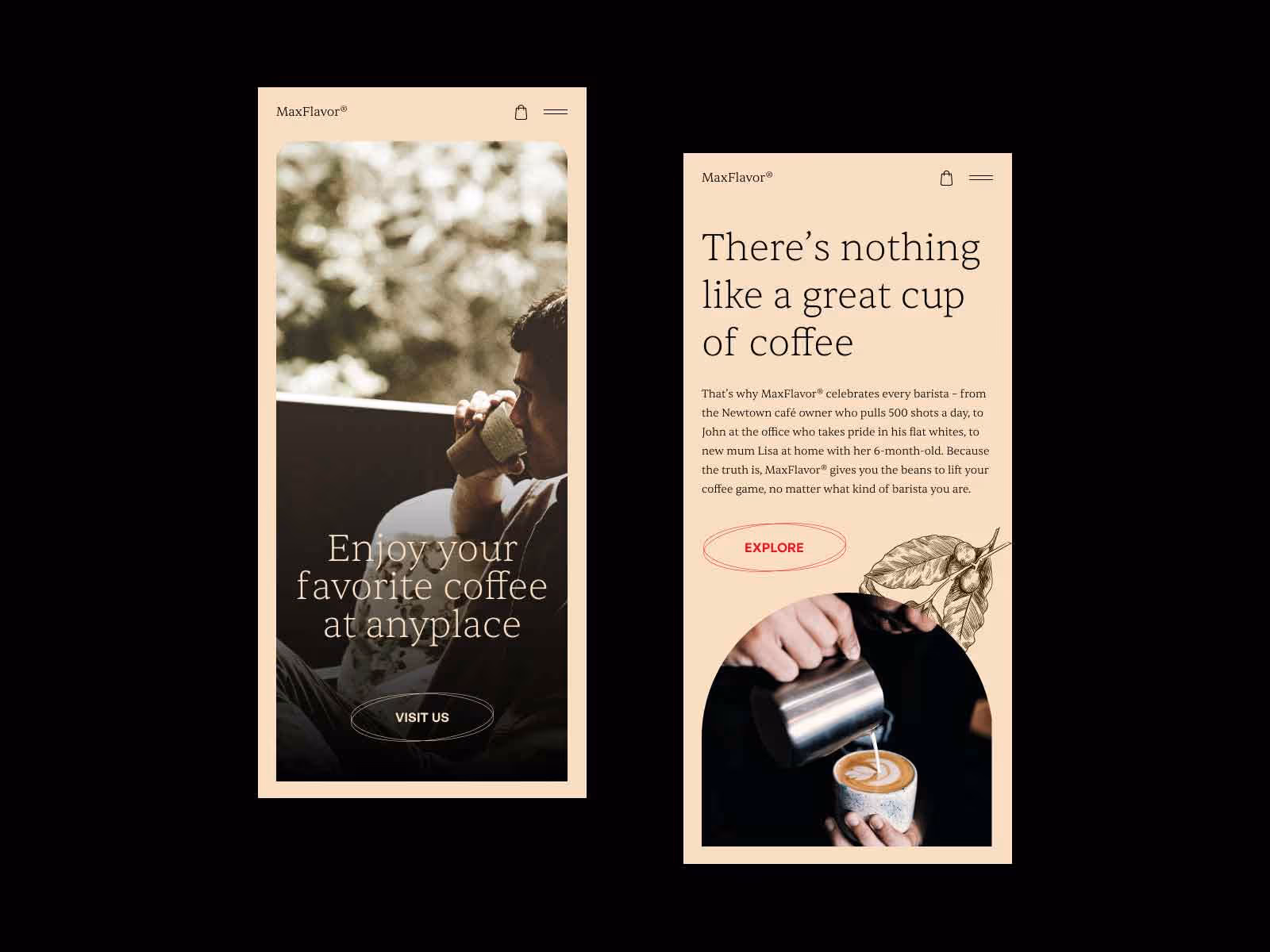
In addition to pastel colors, this winter we are warming up with nude color tones! It can be said that the nude colors are naturally pleasing to us because they are somehow human and familiar. More and more brands want to bridge the distance between Users by providing a visual experience that is friendly and warm.
In 2020 and 2021, human society went through hardships that made a distance between people and reduced excessive physical contact. That reflects in all spheres of life, including graphic design. That is why human skin colors, natural earth tones, brown, beige, have become popular and somehow needed. These color palettes easily communicate with Users. That is why they are used in design that concerns humans and animals, society, and the human body.
So, using natural tones has become a trend in the cosmetics industry, body care, beauty, and fashion. In this way, nude colors have brought a new kind of natural aesthetics to us. And it seems like these natural color palettes will become an everlasting graphic design trend.
3. Washed & Worn-out Look
There is another trend in coloring that competes with bright new designs!
It is a worn-out look with washed colors and sort of a retro vibe. Although it is strange to call this technique trendy, it certainly shows off on many surfaces these days. And what people especially like about worn-out colors is that they look like they've been on the scene for a long time!
Faded colors and ragged design frames give a cool, old-school look. Yes, we say old school, not old. Because Washed & Worn-out designs have proven to be evergreen visuals. Precisely because it looks well-worn, this kind of design looks best on experienced and old-time brands. Washed & Worn-out design represents long working practice, perseverance, and trustworthiness.
Those are some timeless qualities. That is why it is proudly worn by many brands that offer homemade and craft-made products! No wonder. Well, it seems that design ideas don’t always have to be something shiny and refined. There are enduring trends that proudly wear a worn-out look!
4. Glassomorphism & Light Colors
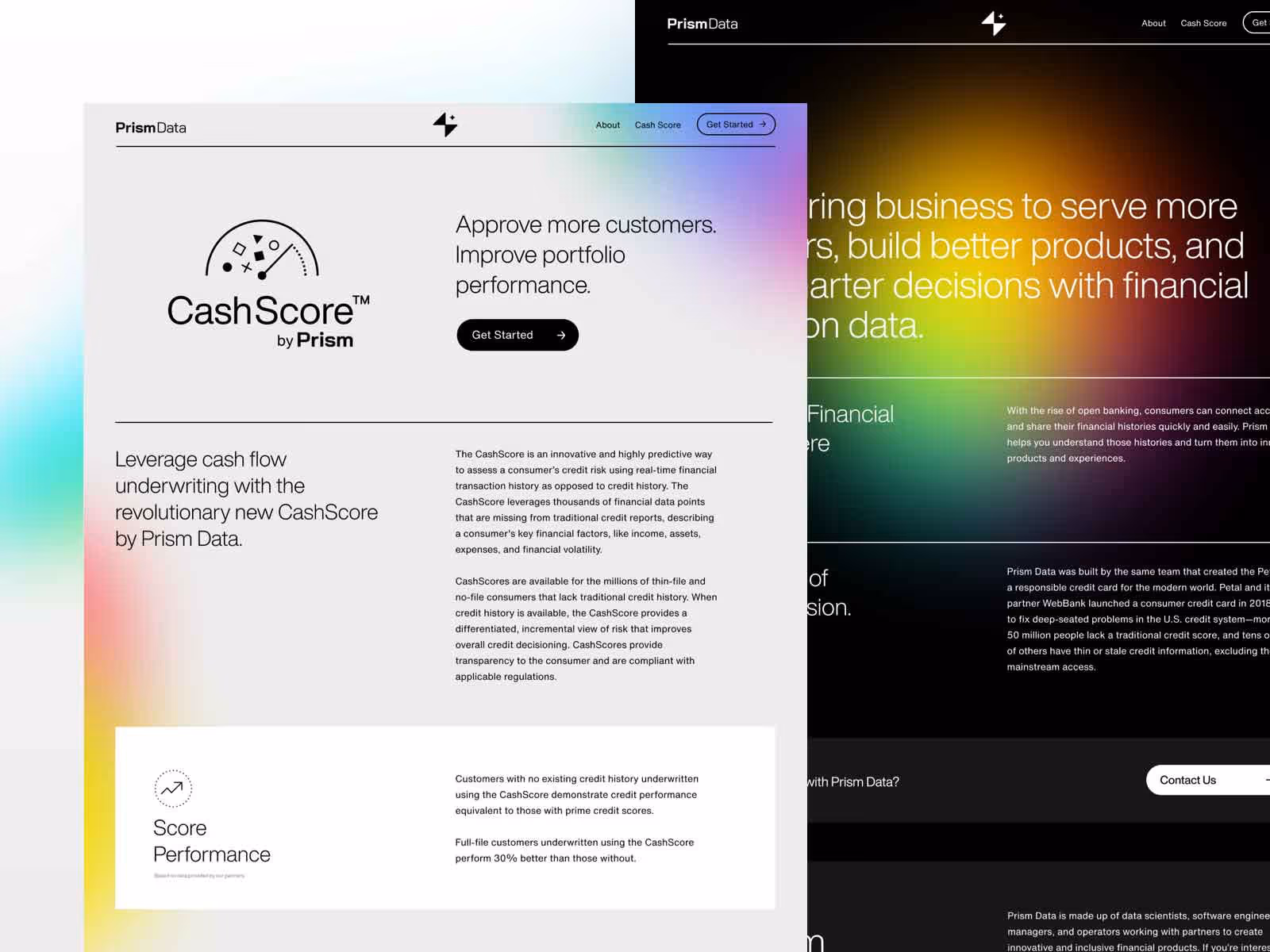
As we have already seen, the desire for light colors in design has become an important thing in 2021. This winter we want a more gentle approach, soft lines, curves, and pleasant colors in the design.
That’s why certain glass-looking designs have become more and more popular.
Glassomorphism is a trend that has been used by some specific brands in UI design, but today it is becoming more widely used. We are talking about designs that are coated with glass-like layers and panels. The colors used in this design are pale and translucent, with minimal contrast and soft edges. So it can be said, that the experience delivered through this appearance is like looking through the glass texture. And there is a great thing about that! Designers use transparency and blurring to emphasize relevant information and categorize components of glass-looking designs.
It means you don’t have to worry about how to highlight something in this even-looking image! Colors in glassomorphism are generally pale-faced and with almost no contrast. Despite that, you can distinguish every part of the image due to the ingenious use of the blurring effect. Blurring some sections or elements in design puts one information in front of another. And the effect is just amazing!
This is a totally new way of making a magical, glossy design that is delivering the information as smoothly as it looks. It’s no wonder it reached the top this year!
People simply love how this glowing trend is, above all, refreshing and sweet.
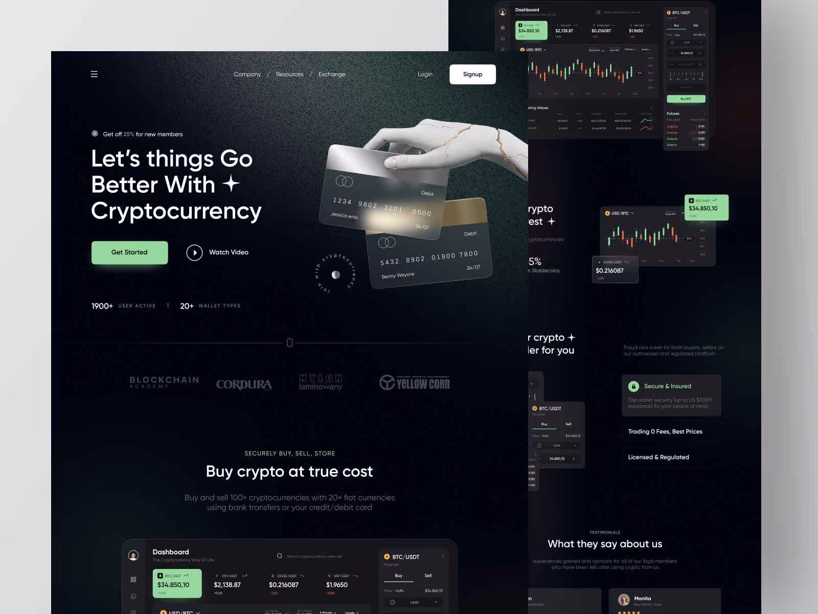
5. Gradients & Layers
And last but not least - Gradients!
And this year we are making the most of gradients in design in a million new ways. What can we do? Color gradients are so handy! One-color and multicolor gradients have long been known and are used to create stunning transitions and atmospheres. With softer and stronger color tones and shade shifts, you can really enrich the design.
But now we have something even better - Layered Gradients!
Multiple layers in an image with a color gradient (of one or more colors) are a trend that has proven to be great this year. First of all, the gradient itself can create a hierarchy in the image. It gives, above all, to the dynamics of the design. Add layers to it, and you will get some image depth!
Not only are the results amazing, but they give you space to further explore this great combination Many have already tried! So, we’re not going to say that layered gradients go well with some specific brand styles. The designs show that the options are diverse. Do you want flattering, bright, and striking? Okay. Do you want gentle transitions, floating shapes, and low contrast? Okay. Everything is possible with Layered Gradients.
So hurry to see how best to use them!
Conclusion
Pretty amazing, huh?
We agree, there are so many new and updated ways to use colors! After all, colors tell us so much, and sometimes we are not even aware of their influence. This winter, we opted for light and optimism, for warm designs, but also for some new ones that push the boundaries. When it comes to coloring and shading, you see that simple changes can bring incredible freshness to the design.
We just need to know what we want to say to the Users. And then, we color that visual message so that every detail speaks to them! We have seen, the possibilities are as diverse as the color tones.
So, keep shaping and shading!
.svg)
.svg)