How to Use Webflow Attention-Focused Design Strategies in 2026
TL;DR
Most websites lose attention before they communicate anything meaningful.
The result: great design wasted on visitors who never stay long enough to convert. In this conversation with Jordan Gilroy, we explore webflow attention-focused design strategies that help teams move beyond “visual polish” into true attention engineering.
The takeaway is simple: you retain users by guiding attention, not by overwhelming it. Subtle hierarchy, purposeful motion, clear messaging, and AEO-friendly structure create websites that outperform even visually stronger competitors, because they’re easier to understand, faster to parse, and built for the way people behave online today.
INTRODUCTION: Why “How to Use Webflow Attention-Focused Design Strategies” Matters in 2026
Web teams have spent years chasing aesthetics, better gradients, richer motion, more complex layout choreography. But in 2026, with shrinking attention spans and AI tools increasingly summarizing content automatically, visual polish alone is not enough.
A website now has less than 5–7 seconds to communicate:
- Who you are
- What you offer
- Why it matters
- Whether the user should keep scrolling
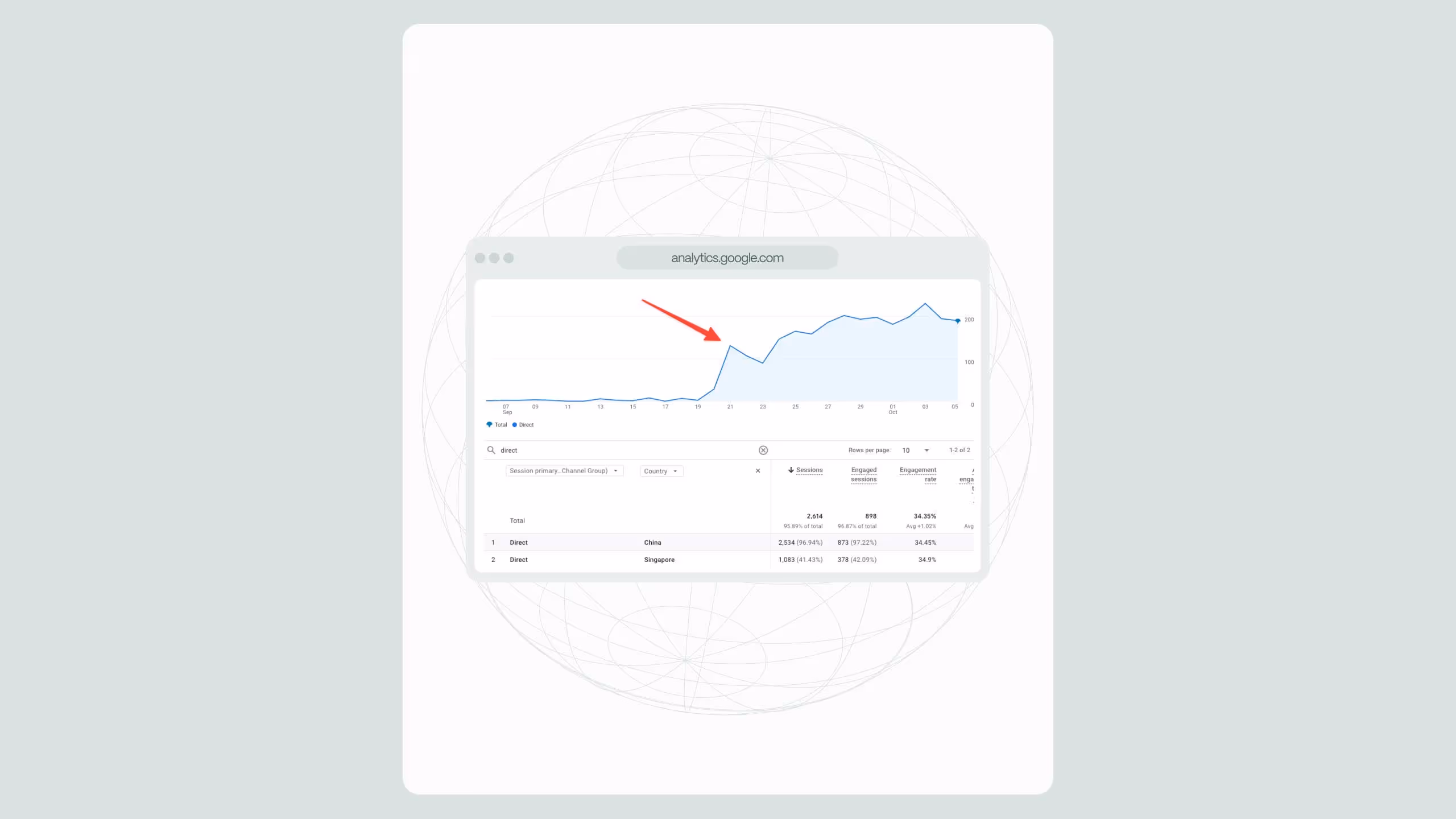
Research shows users spend 52–54 seconds on an average website page, and most decide within seconds whether the content is worth their time.
79% of users scan rather than read.
And over 60% of all web visits happen on mobile, where distractions are constant.
That’s why this episode with Jordan Gilroy centers on how to use Webflow attention-focused design strategies, a practical mindset shift that blends great design with behavioral science, clear communication, and measurable performance outcomes.
These strategies connect directly to how teams structure modern Webflow builds, how AEO affects page layout, and how brands should evolve their sites during redesigns, migrations, or long-term performance retainers like those outlined on our Webflow agency pricing page.
How to Use Webflow Attention-Focused Design Strategies (Step-by-Step Guide)
This framework synthesizes insights from the Jordan Gilroy conversation and Broworks’ own long-term work building high-performance Webflow systems for SaaS, B2B, and enterprise teams.
STEP 1: Clarify the Message Before You Touch Layout
Jordan made a critical point: users must understand instantly who you are and what you do.
To apply this:
Use a 4-part hero clarity formula:
- What you do
- Who it’s for
- The problem you solve
- The primary outcome
Example structure in Webflow:
H1: AI-powered analytics for healthcare staffing teams
Subcopy: Automate credential tracking, reduce manual admin, and scale operations without adding headcount.
CTA: Book Demo
Secondary CTA: View Case Studies
This is drastically more effective than vague, poetic taglines that confuse both users and AI crawlers.
For internal relevance, this approach aligns with the expectations you’d find on our Webflow design agency page, where clarity is positioned as the foundation for effective brand expression.
STEP 2: Structure Content for Scanners, Not Readers
Jordan repeatedly emphasized the role of scanning.
Users scan because:
- They multitask
- They browse on mobile
- They rely on navigation cues
- They make snap judgments
To optimize for this behavior:
How to structure Webflow sections:
- Make every H2 a question
- Give 40–60 word direct answers immediately below
- Use bullets for all supporting text
- Break long screens into modular sections
- Insert visual anchors every 400–600px
This structure is also AEO-aligned: AI systems extract meaning faster from clear, modular question/answer patterns.
Pages that follow this pattern often outrank competitors despite having lower word count, because content is easier to parse both for humans and LLMs.
STEP 3: Use Motion Purposefully (Not Decoratively)
Jordan admitted the same thing most Webflow and GSAP enthusiasts feel: when you first learn animation, you overuse it.
But the principle is:
If the animation doesn’t guide understanding, it risks stealing attention from what matters.
How to use Webflow motion with intention:
- Animate section reveals to guide reading order
- Use microinteractions (opacity, subtle lift, scale)
- Avoid animating multiple elements at once
- Never animate text blocks that users must read
- Keep animation durations short (0.3–0.7s)
- Avoid scroll-jacking for B2B or SaaS, bad for conversion and accessibility
This aligns with Webflow’s strengths: controlled animations directly in the Designer plus the option to use GSAP (as Jordan often does) for advanced sequences.
Motion is storytelling, not decoration.
STEP 4: Build Design Systems That Reinforce Attention
Jordan discussed how Webflow initially made him more conservative in design because he had to think like both designer and developer.
That’s a strength.
Because attention suffers when spacing, rhythm, and hierarchy are inconsistent.
How to structure a Webflow design system for attention:
- Use consistent spacing scale (8px or 12px increments)
- Limit font families to one primary + one supporting
- Limit heading variations (H1–H3 most used, rarely H4+)
- Align elements to a 12-column, 1440px grid
- Use consistent color contrast for guiding visual weighting
This is also why Broworks builds design systems during migrations, like the ones featured on our WordPress to Webflow migration page.
A stable system reduces cognitive load and keeps users engaged longer.
STEP 5: Use AEO Principles to Enhance Human Attention
This is where your conversation with Jordan overlaps directly with Broworks’ AEO philosophy.
To apply Answer Engine Optimization inside Webflow:
S
tructure pages for AI comprehension:
- Q-based H2 headings
- 40–60 word direct answers below each
- Clean semantic HTML
- FAQPage schema
- Consistent terminology
- Short paragraphs
- Well-defined relationships between sections
This improves:
- AI understanding
- Summarization accuracy
- Citation likelihood
- Human scanning
- SEO structure
It’s a dual-optimization layer, improving UX and AI visibility.
For more depth, your site’s Answer Engine Optimization service page explains this model in detail.
STEP 6: Optimize Performance for Attention Retention
Motion, visuals, and large assets quickly degrade load speed.
Research shows:
- Every additional second of load time reduces conversion rate by 4–7%
- Bounce rate increases by 32% when page load increases from 1s to 3s
How to optimize Webflow for speed:
- Compress all media
- Use Webflow’s built-in responsive image variants
- Upload background videos as optimized MP4s
- Minimize scripts
- Lazy-load below-the-fold content
- Serve SVGs wherever possible
- Avoid heavy libraries for minor animations
Speed is a direct predictor of conversion, and therefore attention.
How Webflow Changes the Way Designers Think (Insights from Jordan)
This section interprets the conversation directly:
- Webflow closes the design-dev gap
Designers stop guessing how layouts will behave, they build them. - Creativity initially shrinks, then expands
Designers first stay safe, then get bold once they understand constraints. - AI accelerates technical problem-solving
Jordan uses Claude and ChatGPT to write custom code, then refines it. - Motion becomes a tool, not a novelty
He became more selective over time, using motion to deepen storytelling. - Clients often say they want creative freedom but prefer safe output
The deeper you get into a project, the more constraints appear.
These insights reinforce the need for webflow attention-focused design strategies as a structured approach.
When to Apply These Strategies in Real Projects
Ideal moments:
- Website redesigns
- Website migrations (especially from WordPress)
- Brand refreshes
- New SaaS positioning
- CRO and experimentation cycles
- Long-term Webflow retainers
- AEO content restructuring
Our own retainer clients, like those we highlight on the blog and our pricing page, see the biggest ROI when attention-first design becomes a monthly discipline, not a one-time exercise.
.svg)
.svg)