10 key things to know before starting a project in Webflow


TL;DR
Before you open Webflow Designer, plan your build like an engineer. Import all assets first, structure CMS collections early, and stick to a style guide like Client-First by Finsweet to maintain scalable classes. Reuse elements, design responsively across breakpoints, and QA in multiple browsers, especially Safari. End with SEO, accessibility, and Editor setup. The goal isn’t just a functional site, but one that’s maintainable, accessible, and ready for growth from day one.
In this article, we’ll review basic things that you need to know before starting a project in Webflow. Packed with some tips and tricks.
Webflow is growing and becoming one of the best no-code CMS platforms on the market. It helps us create websites way faster than we ever imagined and without knowing too much about code. But even if it’s simple to use it, it’s not that simple to build a proper website. There are rules to follow in order to have a functional, accessible, and SEO-friendly website. In this article, we offer you to review 10 key things to know before starting a project in Webflow.
Import everything
The very first step would be to import everything you can in Webflow, before starting to build it. This means uploading compressed images and videos, Lottie files, fonts in WOFF or WOFF2 format, colour styles, and pretty much everything else that you might need for a project.
This is of course not a must as a first step, but it’s a very practical thing to do since you’ll not need to think about this stuff anymore and can focus on building the website itself.

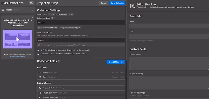
CMS collection
Right after uploading everything for your project, the next step would be to create a CMS collection and import all data there. The reason why you should do this now is to make it easier to work with CMS templates later.
Remember, 50% of all work is preparation, which is why it’s important to prepare carefully and with maximum focus.
One more useful tip here is to try using as less custom fields as possible and to add help text wherever you can while creating a collection. That will make life much easier for your clients later while uploading content in Editor mode.
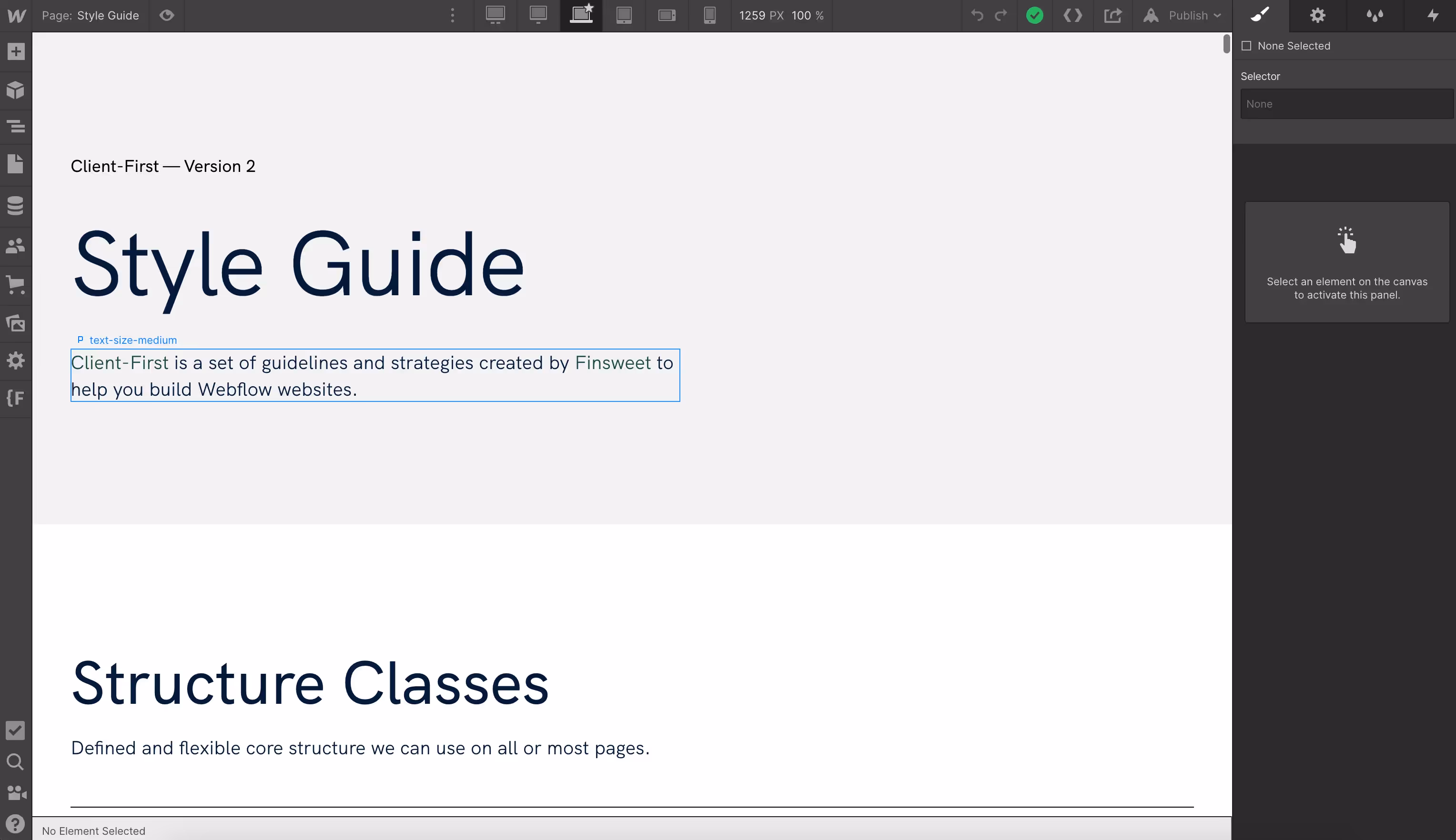
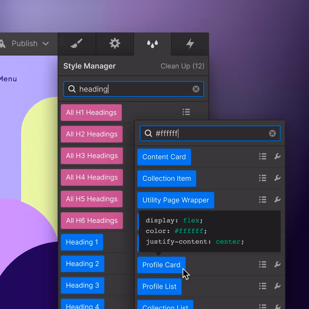
Use style guide
You can use just about any style guide or create your own, but I suggest using the “Client-first” style guide created by Finsweet. It is not just because it’s the best style guide for Webflow out there, but mostly because classes are all premade and perfectly organized to cover all essential elements you’ll be using. Of course, you need to add some of your own classes, depending on the project, but most of them are all there. They also have a Chrome extension with additional helpful features in Webflow, so make sure to check that on their website.
I wouldn’t suggest not using a style guide at all, not even for a one-page website since it can make your website much harder to structure and organize.
Reuse elements
This is an obvious thing to do, but it needed to be mentioned. Reusing things like classes, typography, and colours is something that can save you a tone of time if something needs to be edited or updated on the website later on, but most importantly it’ll create less unnecessary code, which means the website will be lighter and faster.
The style guide is the best way to help you with this, so again make sure to use it.
Website responsiveness
Having a mobile-friendly website is a must in the web world today, but that is not enough, your website needs to be responsive for as many devices as possible. Luckily, in Webflow, you can see most of the popular devices and adjust your website to that.
The most important breakpoints are:
- Desktop
- Tablet
- Mobile landscape
- Mobile portrait
The best practice is to work on website responsiveness simultaneously while working on a desktop, since it’s much easier to do it element by element than to do the whole page at once, especially if you see some things will not work that well on mobile, as on desktop, and you need to refine that area. How this part will be done it’s up to you, but the point is to save as much time as possible and not do double work.

Browsers check
This can be a part of the SEO setup or QA step, but we wanted to give a separate step for this since it can cause many issues and should be done separately. As we know, most browsers are working the same, except Apple’s Safari. That one is showing things a bit differently and since a large number of people are using it, we need to make sure the website is working perfectly there as well on both desktop and mobile.
Some of the issues we run into are that Safari is interpreting the CSS rule overflow hidden differently from other browsers. Normally overflow hidden will not affect elements that are fixed positioned as they will be regarding the viewport. Safari on the other hand will keep the hidden behaviour even when the element is fixed resulting in not displaying it. Therefore, make sure to pay attention to this.
Another thing is to avoid a negative z-index since it can cause unexpected behaviour on some browser's versions.
SEO setup
Our recommendation is to do this as the first or the last step. We suggest leaving this as the last step simply because you want to make sure everything is ready to go live and nothing else will change.
In this step, make sure to do the following:
- Compress all JPEG and PNG images in Webflow to WebP (smallest image format)
- Make sure to have only one H1 per page
- Minify JS and CSS code
- Turn off “Made in Webflow” badge
- Upload “Favicon” and “Webclip” images
- Add “Title tag” and “Meta description” for all pages
- Give images descriptive alt text
- Clean up all unused classes and animations
QA
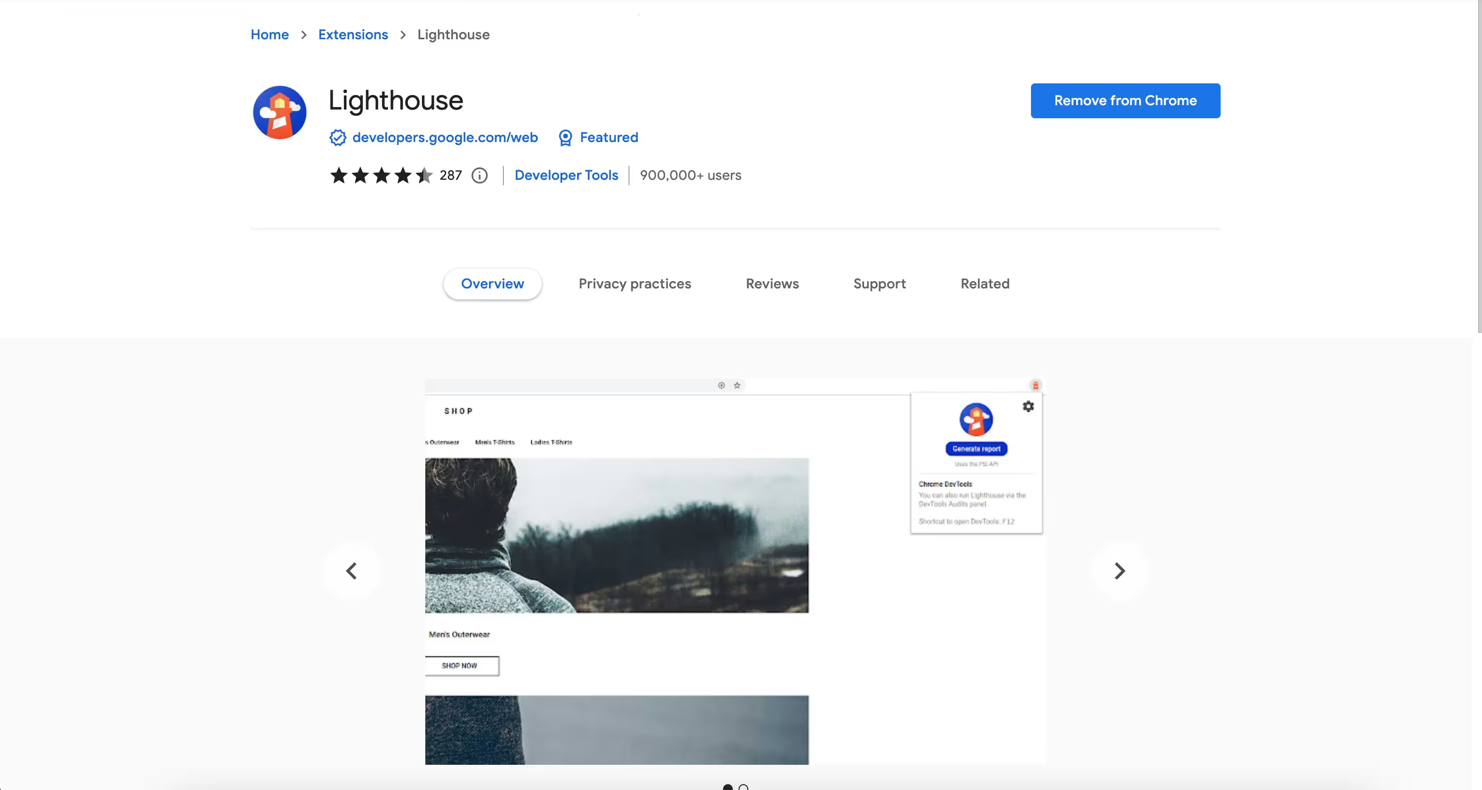
This is a very important step to make sure everything is working smoothly and is accessible for everyone. To do that you need to double-check if you completed all the steps from SEO setup, all buttons and links, and unique and meaningful, page speed index is 90 or over on both desktop and mobile.
Our recommendation for website performance check is a Chrome extension for Google Lighthouse since it’s the most accurate checker for that.
Accessibility
This is an important step to make sure your website is accessible to everyone. One of the best websites to check if your website is accessible is wave.webaim.org.
Some of the things you should pay attention to in order to make sure you’re website are accessible is to check the contrast ratio of text color and background color, and graphic components and background color. You can easily check this on the Adobe Color website on the “Accessibility tools” tab. If you have forms make sure to have a text placeholder outside of the text input field. The button text needs to be large enough for everyone to read, and make sure all the links are working.
There are many more things you could check to make sure you're website is fully accessible and you can do that by checking websites like wave.webaim.org
Editor mode
This will be the final step of this article, but it’s no less important than the rest. In this step, our advice is to learn how this mode is working exactly and transfer that knowledge to your clients. This can be very useful for them and they will be very grateful for it, it will also help you earn some points in clients' eyes and look more professional.
Certainly, this is a list of some of the things you should know or follow while building a website in Webflow, but it is not all of the things you can or should do. Every project is custom and different, which means we must build our way through it manually, but we might want to use the things aligned in this article to help us on the way.
.svg)
.svg)
.avif)