Case Study: Sevou. Logo Redesign for Game Streamer


TL;DR
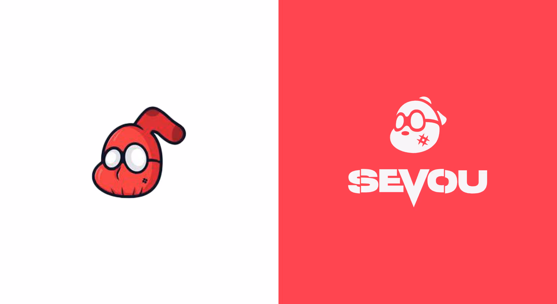
For popular streamer Sevou, whose mascot Spoidermon was already iconic, our mission was to redesign his logo without losing its recognizable identity. The goal was to refine it, to make it more professional, legible, and adaptable while preserving its quirky charm.
Starting from the original design, we analyzed what worked (the character’s energy and red-sock concept) and what needed improvement (shape consistency, readability, and proportional balance). Through iterative testing, we refined the head, glasses, and sock angles, maintaining the signature 3/4 view that defined Sevou’s character.
Using the Golden Ratio and a structured art direction, we created a simplified yet bold mark that works across different backgrounds and sizes. Typography became a key element of the brand: a modified Monument Extended Ultrabold font was reshaped with sharp cuts and strategic balance adjustments, giving Sevou’s name a strong, confident look.
In the end, the redesigned logo and custom typography created a cohesive, modern identity, one that reflects Sevou’s playful yet powerful persona, ready for expansion into merchandise, social platforms, and streaming visuals.
Seeking new solutions for Sevou’s old logo and the various stages of the design process.
For someone who is known to a wider audience, it would be said that not much advertising is needed. But such thinking would be unwise. As a streamer, Sevou has gained a reputation for skillful gaming, and now he is followed by a bunch of fans on the Internet. However, the terrain of every gamer is somewhere online, so it is always necessary to be remembered and to stand out with some trademark. From Sevou’s gaming practice, at one point his mascot Spoidermon appeared. A real omen for his profession that became recognizable and showed that good advertising of his qualities is very important in the online market.
Our job as designers was the following: to redesign his already existing logo, making it more legible and professional, but in a way that respects everything authentic about it.
Project
Thoughtful redesign of logo and typography
Client
Sevou wanted to take his playing to a higher level and start streaming for his fans. He contacted us to redesign his logo and name into one good sign of recognition among a crowd of players.
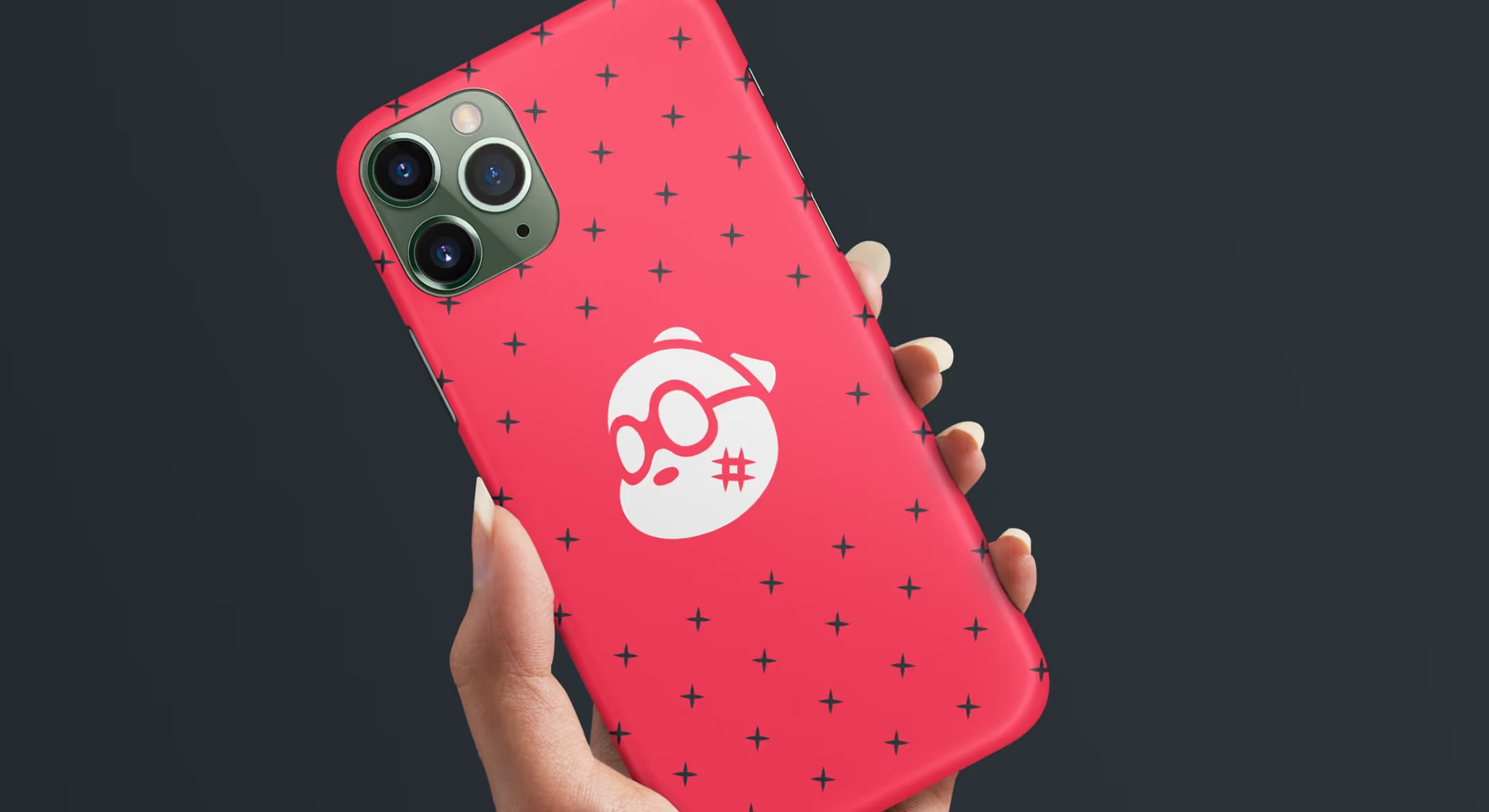
Among other things, our logo attracted his attention because our mascot Hiro has that same dose of playfulness as his Spoidermon. We immediately saw that it is one of the main elements of his logo and that it makes him very personal.
The head in a red sock has a goofy appearance that had to be retained during the redesign. Besides, some other characteristics, such as colors, were to stand stable in design, but there was also a lot of space for better shaping and refining of the whole concept. The logo should have been made more legible on various backgrounds, in different sizes, but also neat in appearance. It should become more on-point with simplified elements and just the right amount of details.
Design Process
Since we did not start from scratch, we had to proceed from the existing situation and find mistakes and space for possible improvements. We agreed on which elements we want intact in the redesign because they fully serve the purpose and which need to be removed or changed.
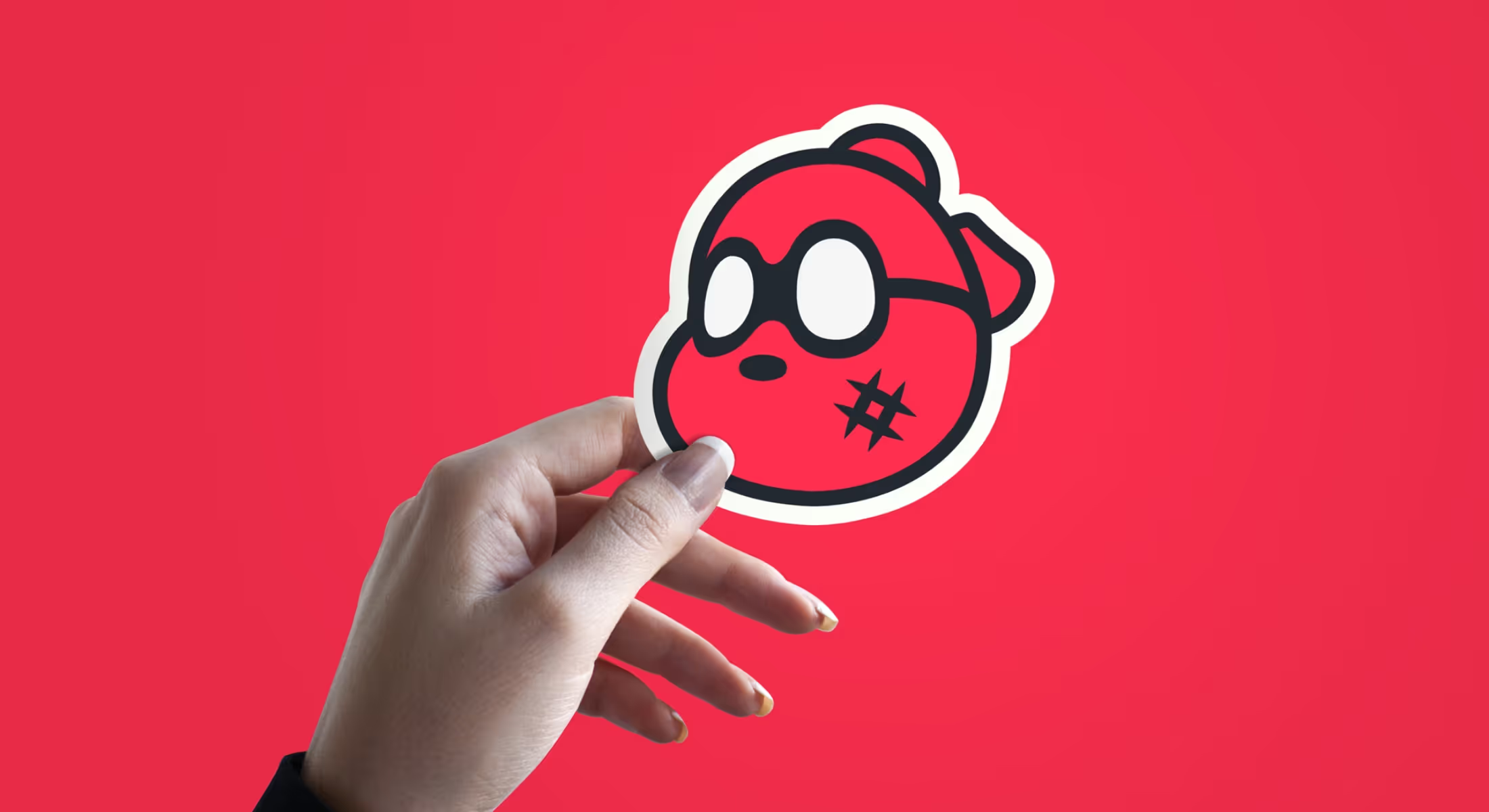
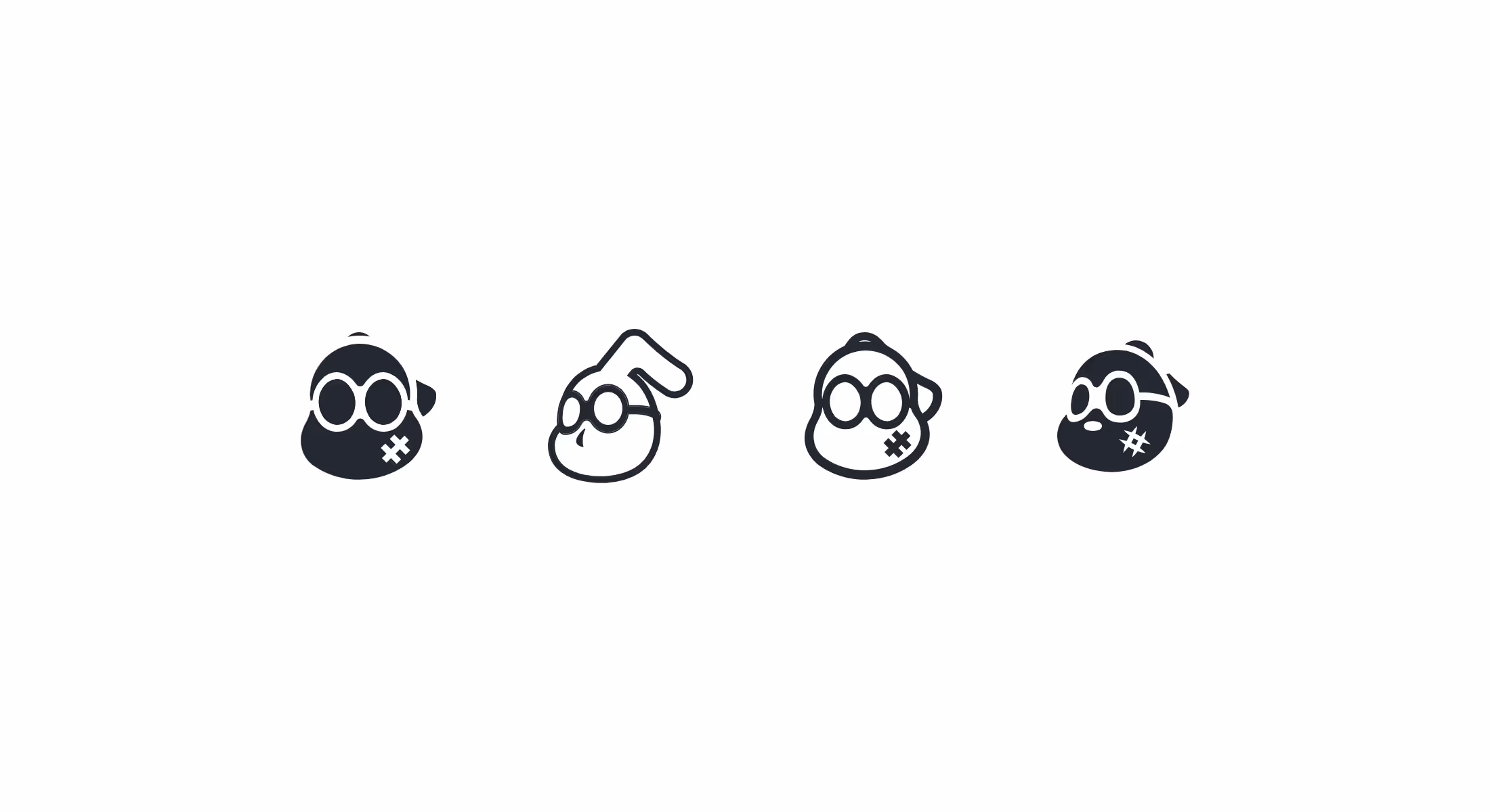
It has already been said that one of the main achievements was to make the logo legible and easy to notice. The old version of Spoiderman's head looks like a cartoon character, which is good. The problem was that it did not have a clear, simple shape, so it was not easy to distinguish it in the background. For that purpose, the first step was to reshape the three main elements, the head, the glasses, and the sock.
This had to be done with the utmost care, with a good dose of change so that these elements would not take on some insignificant shape. The logo is the head in a red sock with glasses - and it has to stay like that.
One of the first versions got chubby cheeks, glasses drawn with a little more symmetry, and the sock positioned differently. With each new step, we got more options that were subtle transitions to the best version.
The reshaping was accompanied by a change in the angle of view, and we thought that the front view was the one that could offer a clearer picture. For the sock feature, it was necessary to choose a better angle so that it is still visible but can withstand a flexible change of outline. It turned out that the risk of moving the head until the moment of losing touch with the old design was grave. In the end, the logo kept the 3/4 old view because it best supports the idea of recognizable design.
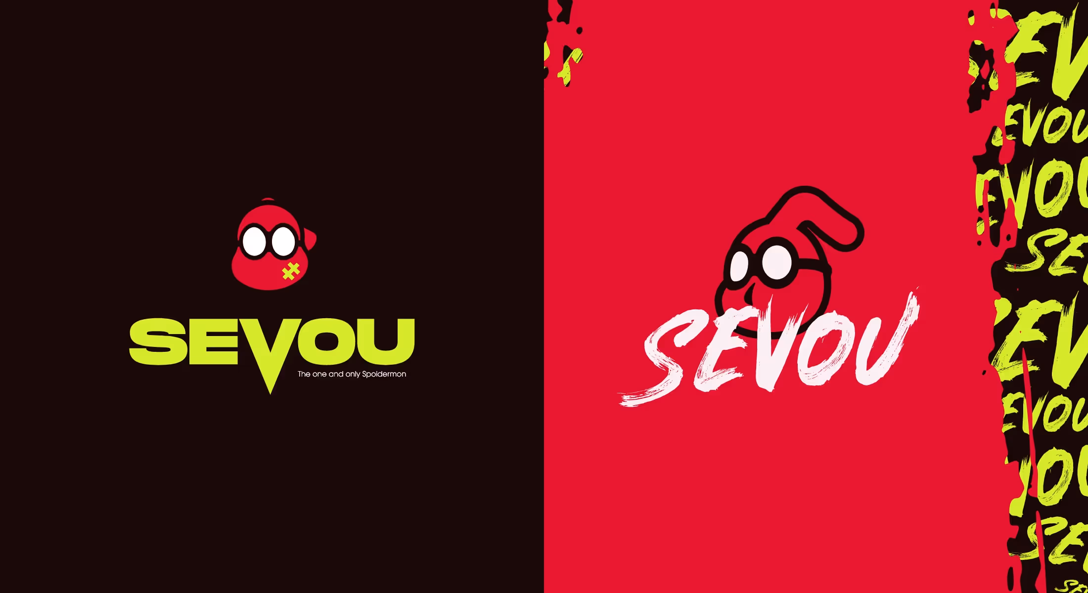
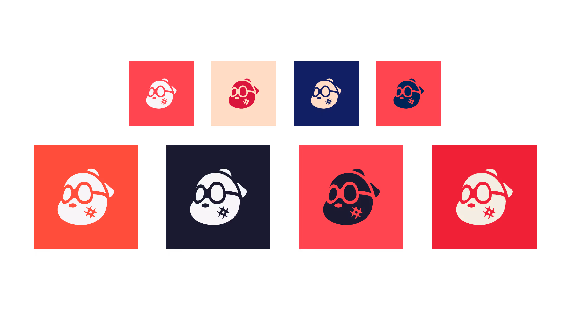
All this time, we were playing with strong coloring, outline colors, thickness, and subtle shaping of small parts! Like buds of creative work, many creations emerged and went to the limits of modern and bold looks, sort of like posters and graffiti. Each was good in its way, but that did not mean that each suited Sevou's logo and name. So, we carefully singled out three variants in the best shape and submitted them to our client for testing and feedback. Sevou chose a style that set our Art Direction - something that would be noticeable in its simplicity and not too flashy.
The hashtag-like mark on the cheek has undergone extra refinement because it looked too showy and thick. As it is a supporting element, a simple tear on the sock, the ends of the lines were thinned and sharpened so that it better contributes to the overall look.
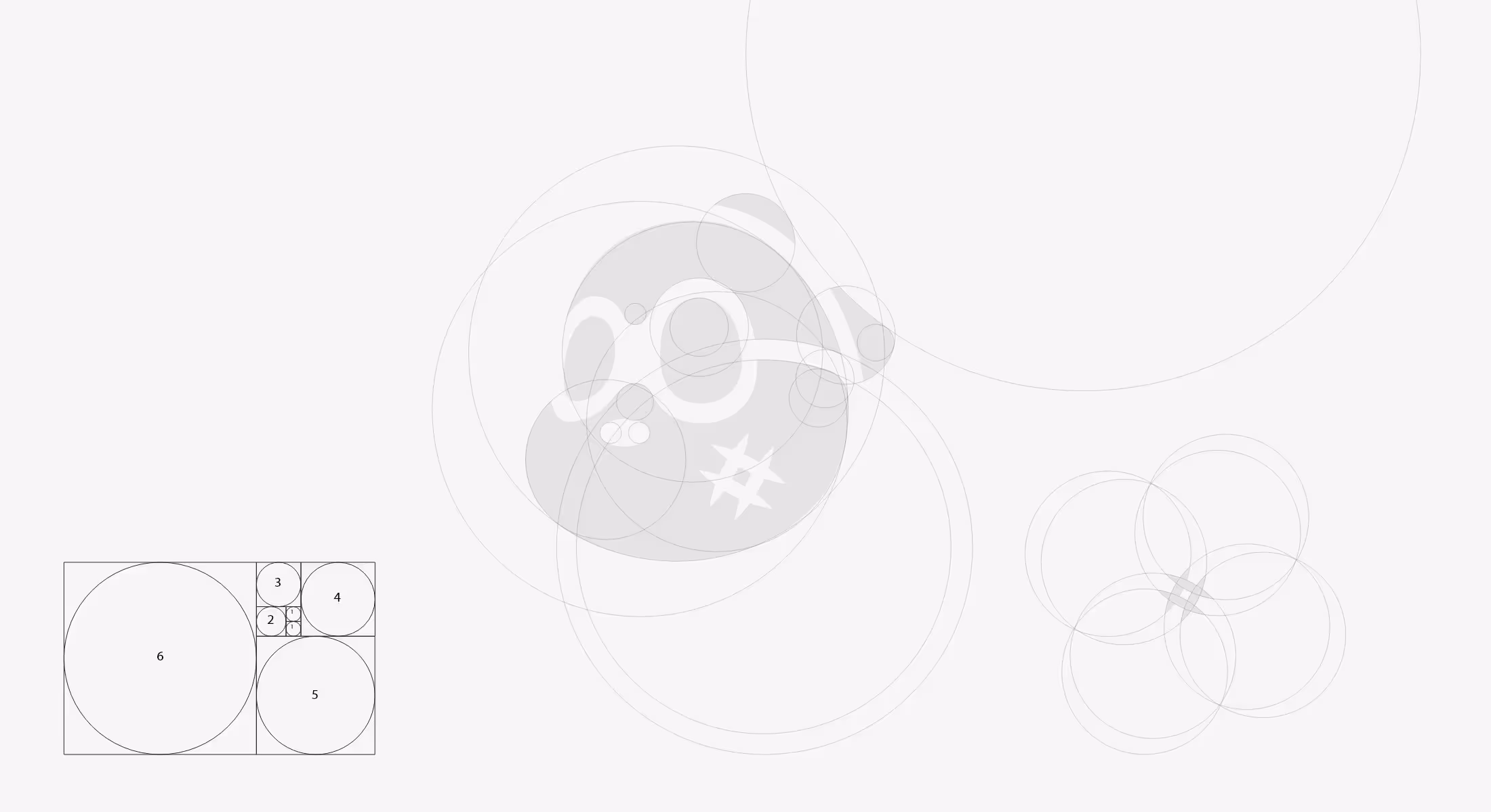
Testing was the key. That way, we slowly came to the most promising version, which was conceived as simple and straightforward. In this phase, the logo was ready for fine-tuning and more testing. It was the right time to implement the Golden Ratio rule, to correct even the smallest mistakes, and make the logo perfect in shape and proportions.
As we approached the grand finale, a sort of a prototype became a white head on a red background with thick outlines. It was a specimen for exploring combinations of colors that go with the client's brand style - shades of red, dark gray, orange, navy blue, and the like. The logo in this color palette showed great flexibility and that could expand its use.
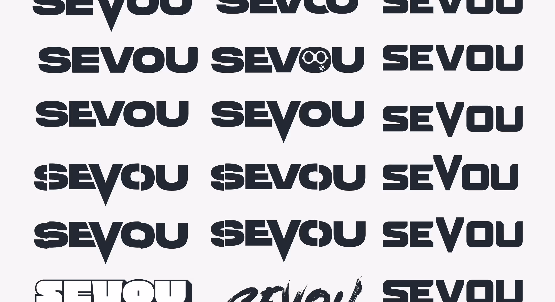
The next important step was working on Sevou’s typeface as it carries a significant role in the whole concept and enhances the brand.
Analyzing a form of differently designed word strings served as great inspiration. We observed all good details to come up with something that had strength in expression and specificity in appearance.
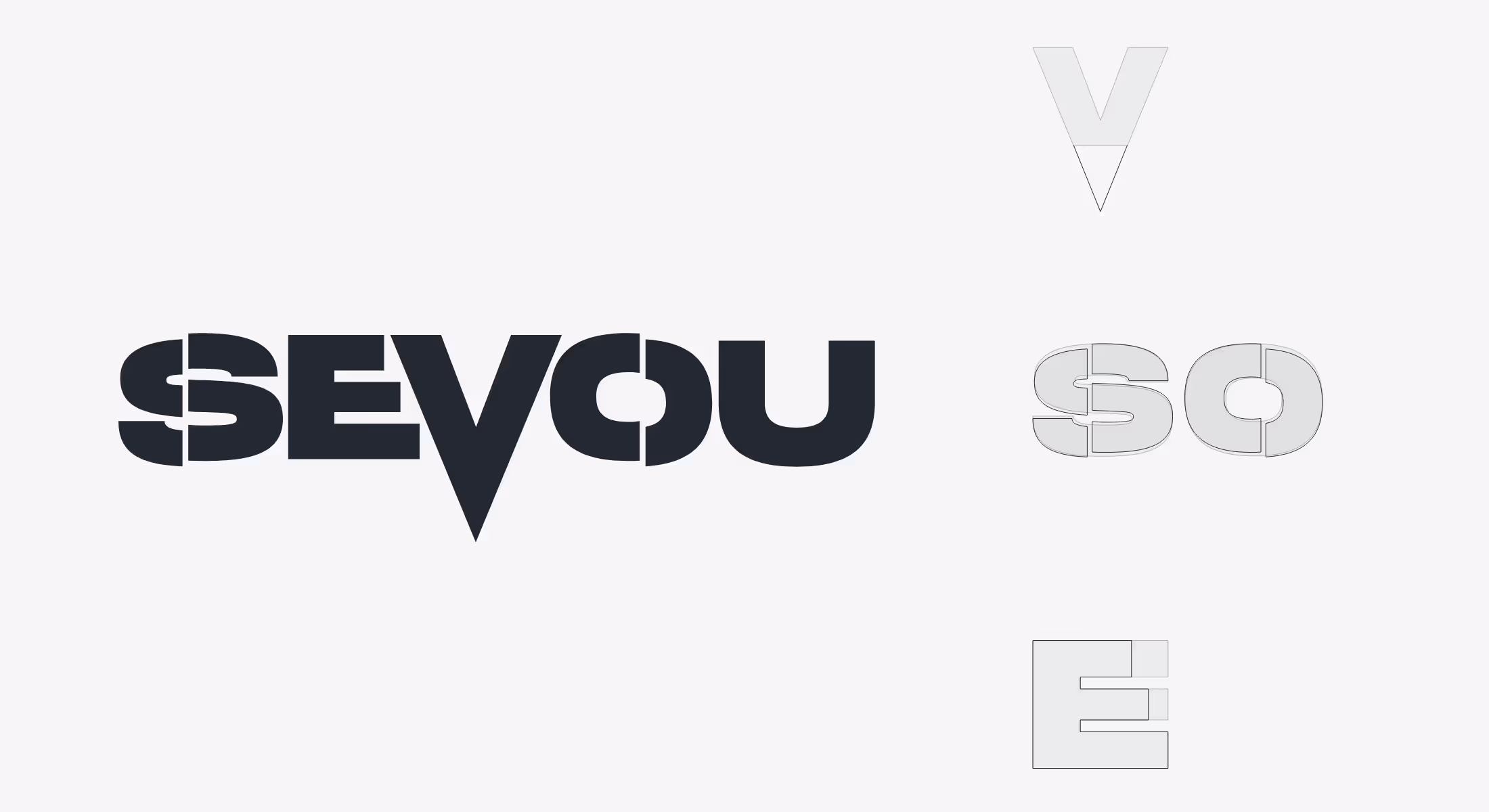
Such was the Monument Extended Ultrabold Font with the potential to become what we were looking for. To make it a part of our concept, it needed to be reshaped into something more personal, so we started by adding sharpness to the letters. The letter V, positioned in the middle, made a trip out of the line that achieved a pleasant balance and gave the name a cunning look. The perfect timing and place to show the full potential of V shape in this word string.
Next, we made “cut” through S and O, increasing the spacing between their parts and adding an impulse. Now only a glance at Sevou's name revealed his confident persona. That fitted perfectly into his identity, whether the name appeared with the logo or alone.
The typeface has come to life, holding more expressive power.
For achieving perfect stability, we moved the upper and middle parts of the letter E to balance the presence of all the elements in the sequence.
Working on details as such is what tightly bonds all the features making the whole picture more convincing. It’s a delicate job but with incredible effects.
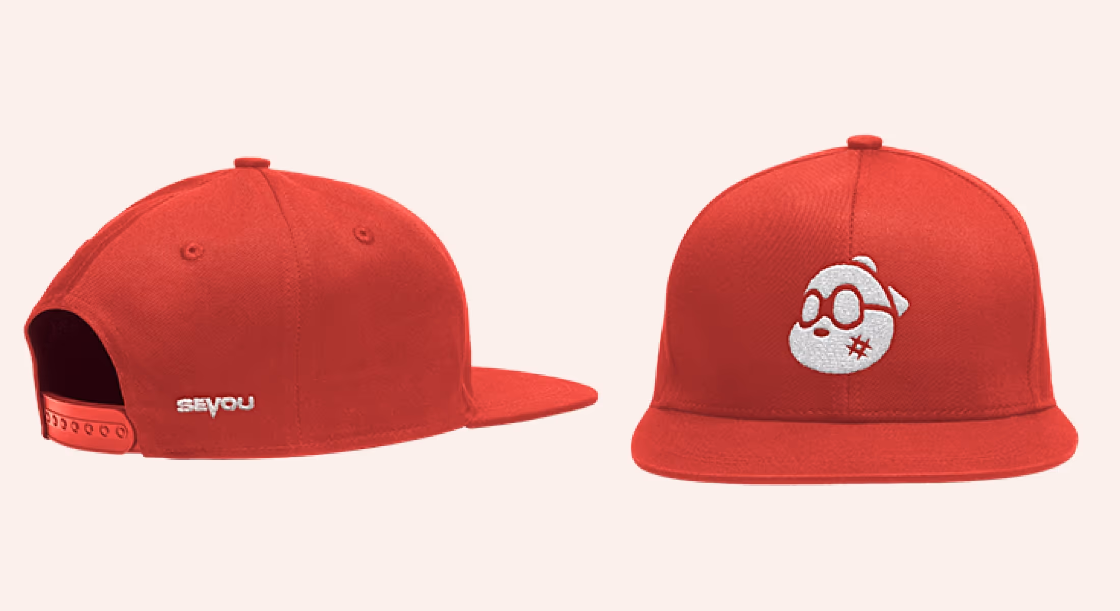
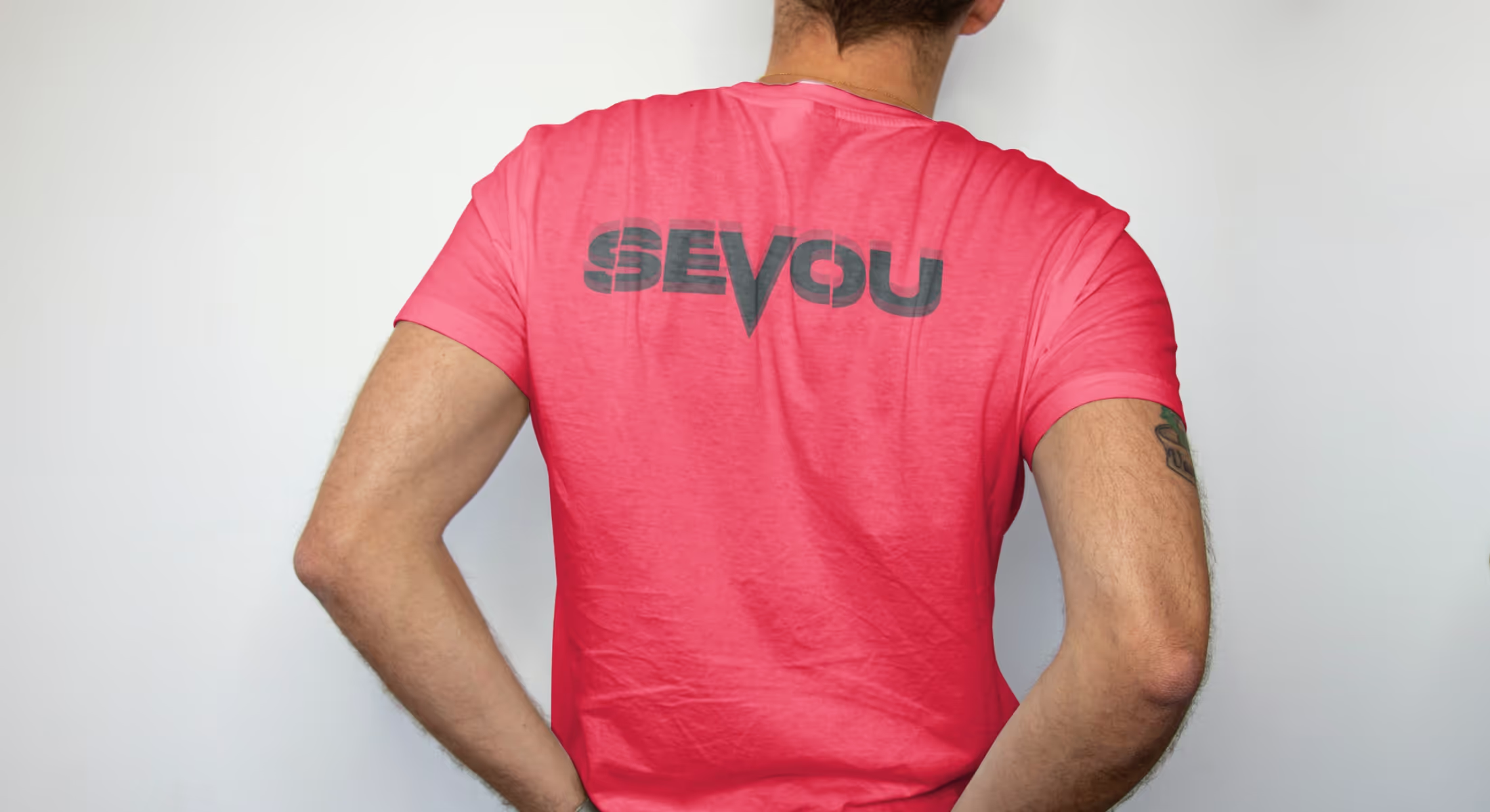
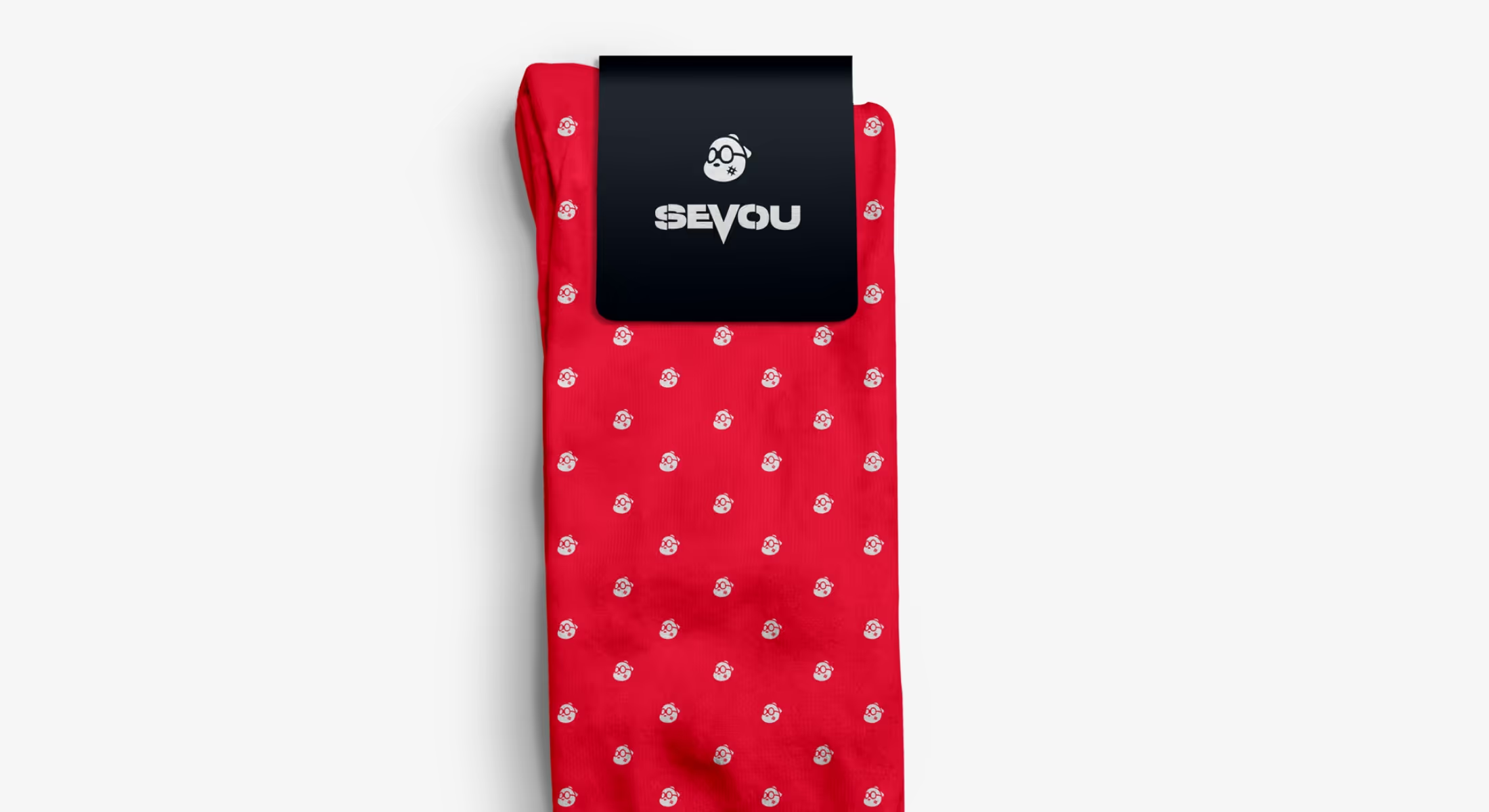
Therefore, in the design process, we focused not only on the logo as a whole but also on individual elements and typography. That enabled each part to be used separately, carrying all the weight of the concept's meaning. For instance, this typeface appeared on T-shirts and sock scratch on patterns in a way that fans can always recognize Sevou’s character in it.
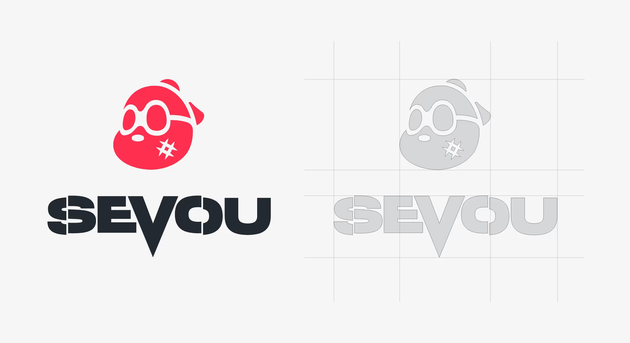
Lastly, the Fibonacci sequence-based grid. Another testing tool that comes when all other work is done. With it, we get to see a perfectly weighted design - a version that we readily put in front of the client.
.svg)
.svg)