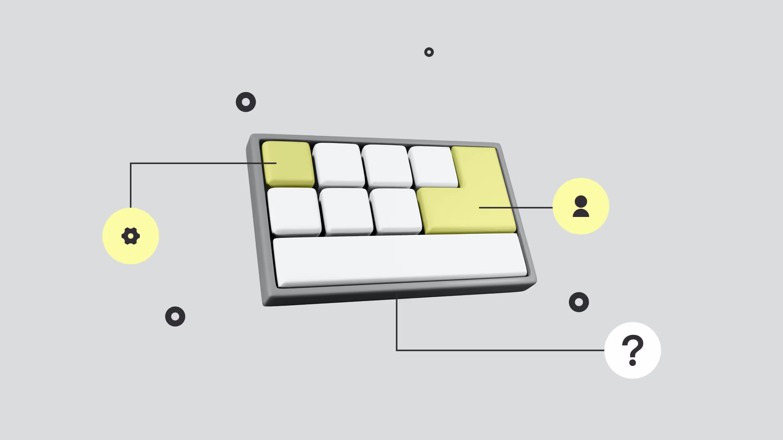
7 basic types of buttons in UI design

TL;DR
Buttons are the smallest yet most influential elements in any UI, they’re the gateway between design and user action. From floating action buttons that drive core engagement to subtle ghost buttons that suggest alternatives, each type serves a purpose in interaction hierarchy. Understanding their roles, visual prominence, feedback, and function, helps balance clarity with creativity.
The takeaway: treat buttons not as decoration but as decision-makers; the smarter they’re designed, the smoother your users’ journey.
Every designer should know the essentials of a well-packed Webflow website or app! Those are catchy headings, quality content, graphics filled with relevant info, and engaging looks.
Okay. That is what we need for effective web pages and successful communication with the Users. But, did you know that the biggest part of communication and interaction are the smallest parts on the page - buttons with various purposes.
They are here, there, and everywhere in the UI design. And, for a reason! That's because buttons are usually the elements that draw the most attention with their call-to-action looks!
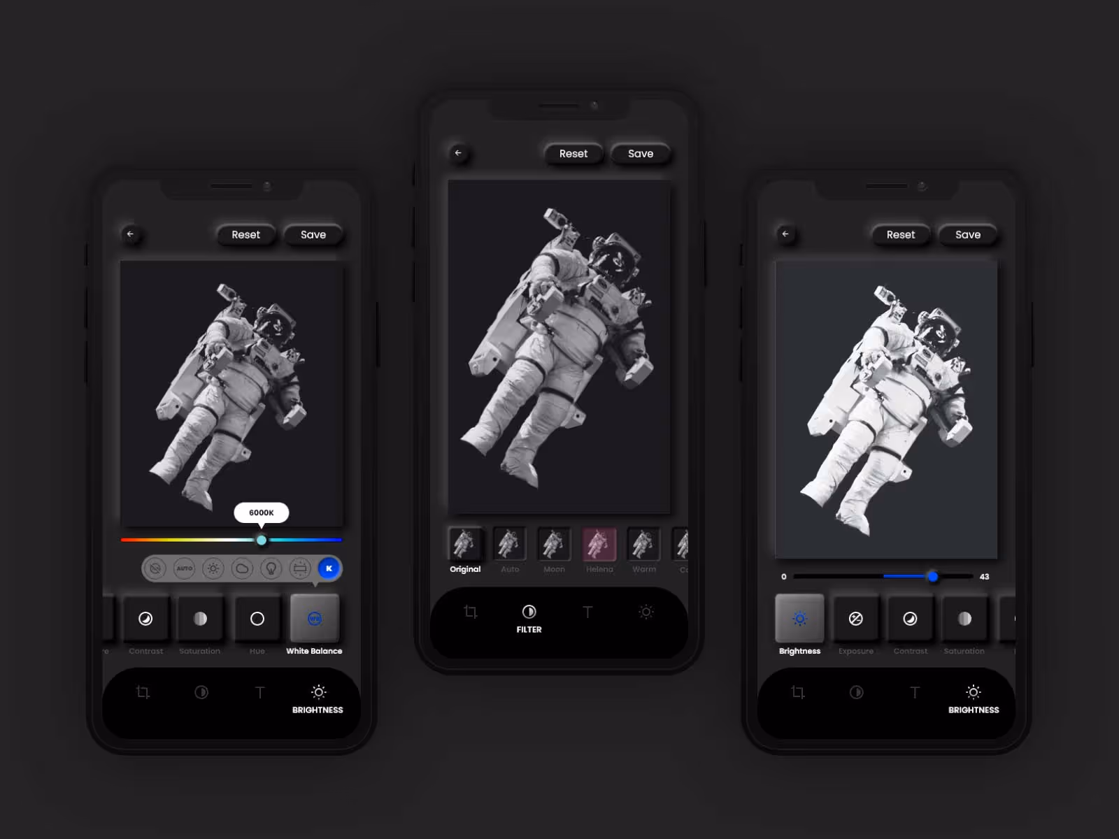
Also, we made a super cool button interactions completely free to use, make sure to check it out!
Yes. These little elements have a similar purpose as links - to take the User somewhere, to let them start or finish some action, or to make a decision. Needless to say, that is the most important thing on the web because when you add all of your precious content on the site, you want someone to do something with the info you provide.
You want the User to make a purchase, to try and contact the owner, to find out something relevant and useful, etc. And elements that lead Users to such actions are precisely buttons. All-different-kinds-of-buttons. Because they have such an important role, we ninjas of Broworks did a little research on how many different types of buttons exist, and how people use them.
We were really curious to find out where lies the power of such simple shapes in design, and we hope that you are too. Here comes the list of the 7 basic types of buttons in UI design.
Ready for action?
1. Floating action buttons
Floating action buttons are somehow the carriers of primary information. How? Well, these FAB buttons are placed over the whole content of the page. They are basically floating over the content and draw the attention of the visitor. You simply cannot miss those! It’s because they have an appealing design and they appear on top of every layer of the page. Sometimes, they even follow you around! Well, how to use these persistent little elements of design? It’s obvious that they should communicate the most important information to Users because they are the most catchy of them all!
So, FAB buttons should trigger the action that is the most relevant for the website or app. In other words, FABs are used to indicate the most expected action of an interface. Where should it lead, depends on what is the purpose of the site or app. But, for example, FABs can be buttons that stand for:
- Save, Create, Edit
- Send, Reply, Contact
- Share, Archive, Report,, etc.
Even though they call to some primary action, they rarely include text. These important buttons usually come in circular shapes with icons of a simplistic design.
2. Filled buttons
These are the most effective call-to-action buttons. But, shouldn’t all the buttons trigger some desired action? Of course. Filled buttons stand out with their bold design, which is easily noticed in the content. They are filled and highlighted in colors because Users should notice them as soon as possible and, of course, click on them! The filled design of these buttons makes them the core CTA buttons, and that’s why Users mostly interact with them. So, it’s all about the emphasis.
What you should keep in mind, that filled buttons draw and keep attention. Therefore, they should be used to call to some significant action! They are different from FABs mostly because they have a rectangular shape and their design usually includes text with a direct message. In terms of their purpose, filled buttons are not always a call to common or expected action.
In any case, behind these core CTAs, there is always something vital for a website or application!
3. Ghost buttons
Ghost buttons are also called naked or empty. That's because they simply look like that - outlined button with text or icon that has a shy look and delicate colors.
Now that we've told you what they look like, you're probably wondering who needs these pale elements of design. But, believe us, they are very useful! Ghost buttons provide some secondary info. As we have already said filled buttons are used to call for the main action. Well, ghost buttons often go with them and call for some side action. It's something you don't want to bring to the fore, but you still want to emphasize it to some extent. Ghost buttons are ideal for secondary content.
The design of the ghost buttons is elegant and unobtrusive. People will first see the filled and bold CTA, and then they will eventually see their ghost companion with some secondary information. Ghost buttons usually give you something like another choice and more options. So as we can see, hierarchy is also important with elements like buttons!

4. Raised buttons
Raised buttons are interesting elements because of the visual experience they create. These buttons usually look like they can be pressed, literally. How cool!
Shown as keyboard buttons, raised and three-dimensional. With their appearance raised buttons are giving a direct message - Click Here. Well, is there a better way to get someone to click? Precisely because they are good at any situation and go along with a variety of content, you can raise any other type of CTA button. This will further attract attention and set this element apart from the rest. In addition, you can use the potential of raised buttons to contribute to the overall design look. It can be said that their distinctive appearance makes everything look more interactive and ready for action!

5. Dropdown buttons
Ah, that one-click that solves everything!
Dropdown buttons are just elements that Users can click to reveal or hide content. And it helps so much to relieve the whole site and clean the look of the design! These buttons can have text or an icon that always says that some content is hidden. These usually are lists with items with which the site is organized and better presented to visitors. By clicking this button, the User can explore all corners of the site or hide an entire section so that it does not take up too much space on the page.
That’s why dropdown buttons are miracle workers that allow a page to contain a lot of content, without overloading.
6. Hamburger button
Here’s one thing we all know - a button we call Menu. A hamburger or Menu button is an element that stands somewhere at the top of the page. It provides information about the content and organization of the site. Many do not think of it as a special type of button because it stood out as a special and always necessary part of any UI design.
The hamburger button is actually a dropdown button, but with a specific purpose, which is to display the Menu. This is a must-have element for every site and app, and not purely because of the tradition of its use. The hamburger button helps Users navigate, relieves the page, and can look quite fancy. So, be sure that this main element of navigation is well-polished like any other design element!
7. Toggle buttons
Here’s one compelling way to let the User make a decision!
Toggle buttons are interesting groups of buttons that represent options that the User can select. This is a great way to get answers to some questions that you ask on the site. Also with the help of these buttons that offer more options, you can make it easier for the user to do the searching. In that case, they will filter their search with a few clicks on certain toggle buttons. It’s just weird how toggle buttons didn’t flood the entire internet! Indeed, we believe that their potential has not yet been fully exploited.
So, consider using them in surveys, site games, searches, and wherever Users can choose one or more of the options given by these buttons! And as for their looks, they can be plain and elegant or immensely cute! Toggles contain icons or labels, so you can choose how you present the options they represent. After that, all that remains is for the Users to think and click, which is usually very interesting for them!
Conclusion
Here! We have seen that buttons on websites and other interfaces can be different in appearance and function.
We have the serious-looking and simplified buttons, we have the fancy-looking ones, buttons with or without text, the vital and complementary buttons, etc.
The bottom line is that they are all extremely useful They make it easier for users and everyone who works on the site to use and maintain the site. It can be said that buttons are small vital points around which the entire content of the site revolves! However, what you need to know is that there is a hierarchy between them that needs to be followed.
Buttons are the brains of a website, and that’s why you also need to be smart when you add them to your site and design their appearance!
.svg)
.svg)