6 Web Design Trends in 2022


TL;DR
Web design in 2022 blended technology, tactility, and timeless simplicity. Holography and 2D/3D mashups pushed visual depth into new, immersive territory, while expressive typography proved that words could carry both meaning and design weight. Geometry reemerged as a grounding force, structuring layouts with clarity, and “Fun Informatics” made data playful through animation and color. The Japandi style closed the loop, balancing Japanese serenity with Scandinavian restraint. The insight: design moved beyond aesthetics to emotion, turning interfaces into sensory, story-driven experiences.
Hello fellow designers and design lovers!
Here comes what we have all been waiting for since the beginning of the year.
We warmed up, took a break from the holidays, started new projects, and started discovering the freshest ideas. We boosted creativity and let our imagination run wild in creating new designs. Yes! But are we all aware of the latest and greatest trends in web design that have appeared in 2022?
Finally, Broworks dug and explored these trends! We analyzed and tried new modern directions in UI and UX design. Our last blog, 5 Big Design Trends in 2022, was about some general topics that affect design. Feel free to explore that too! And now, we give you the sum of 6 Web Design Trends in 2022 that concerns popular UI design styles and elements. Believe us, they are a real breath of fresh air for this year's projects!
Let's see what's trendy!
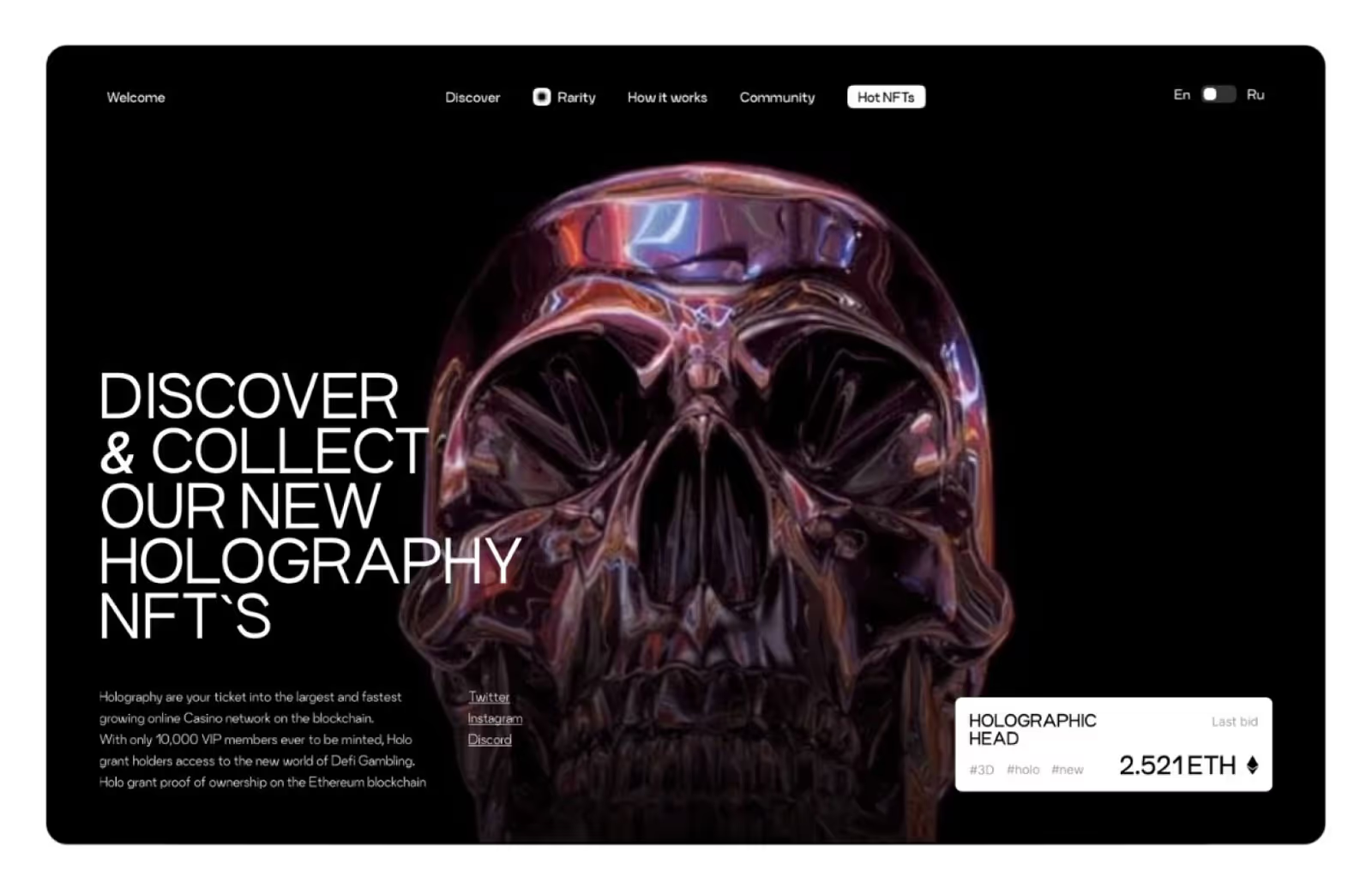
1. Holography
Right from the third dimension comes the trend - holography! And it brings with it a great hype.
We have been in the cyber mode for some time, leaning towards futuristic designs and high-tech style. If you are one of the tech lovers, then you will be delighted with the holography that started covering and coating various web designs! Holography in design has come through last year’s trend of glassmorphism. We were all in love with sleek glass structures and transparent panels. But this year's trend brings something even more mesmerizing! In holographic design, the elements look like shimmering projections of light!
More precisely, holograms are images created when light is reflected from an object and projected into a 3D figure of that object. This effect is truly fascinating, to say the least, wherever you see it. Now, these holograms are being incorporated into the freshest designs to give an even more powerful look and captivate Users!
The holographic design gives a glittering touch with its bright elements, so that’s enough to literally make itself a spotlight!
Any color palette in holography looks flattering, but designers are somewhat more likely to opt for cool and icy colors (shades of blue, gray, green, etc.). And there are, of course, neons! A whole rainbow of neon colors rushed in as a trend right behind this glowing style. Well, as you might guess, the most common carriers of this design are, of course, brands related to IT technology, engineering, fashion, art, and all kinds of design!
The digital experience experts went a step further and animated the holograms creating an even more mesmerizing look. That is why an even wider audience fell in love with this trend. So, one thing is for sure. For your next design, you won't go wrong if you add some flowing elements from this holographic collection! As we are not ready to give up a design trend that literally makes us shine, we hope it stays at the top in the future.
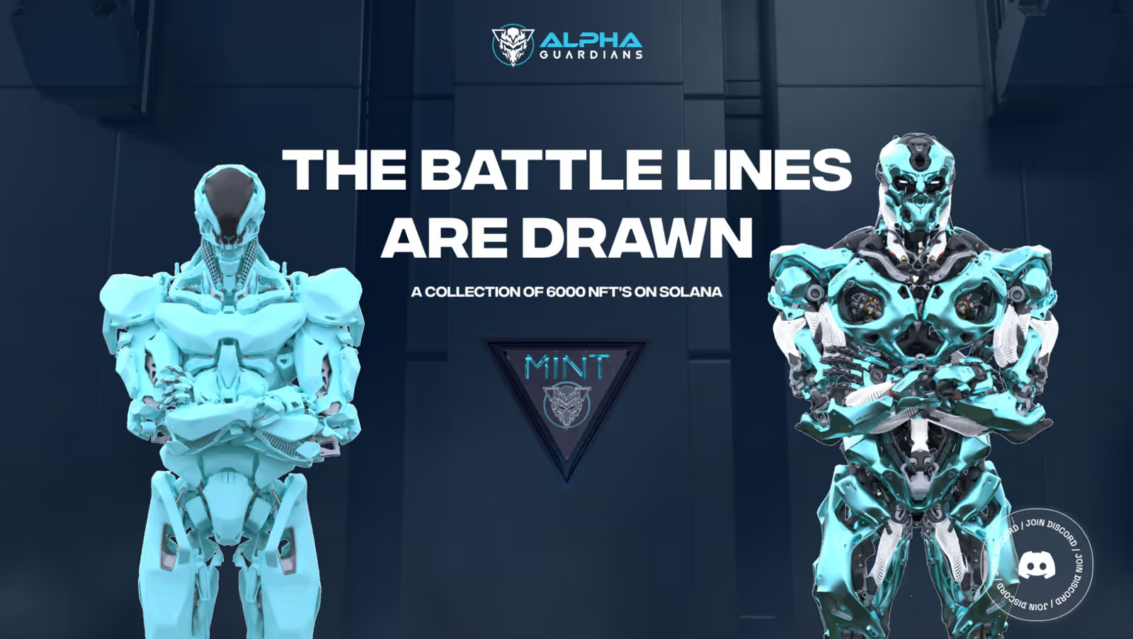
2. 2D/3D Mashup
The next design trend this year is the curious mixture of 2D and 3D elements in the same concept!
Some people prefer to work in 2D, some in 3D. But this year, there are people who can't or won't decide between the two! That's how we got a 2D and 3D mashup as a leading trend in 2022! And we must say, the results of this mashup are magical. The first thing you can see in 2D/3D mixed images is the different perceptions of image depth. That is because 2D and 3D elements give different viewing angles to the figures. Together they can assemble an image that seems to have multiple layers. One layer is the elements we see only in their two dimensions, and the other layer is the elements we see in all three dimensions.
It’s basically like merging two different worlds! Besides, designers can decide to play with shadows and different shades of figures. That could affect the impression of depth, flatness, position, and weight of the elements. Both 3D and 2D.That sounds kind of complicated, but it’s actually fun and pretty easy to process.
Some of you may have doubts about messing with dimensions. Like, isn’t perceiving 2D and 3D elements, at the same time, in the same design a bit tiring for the eyes and brain?
Well, it turned out not to be!
Not only is it easy for us to see things through different dimensions, but it also turns out that these mashup pictures are very entertaining for the viewers! Sometimes these 2D / 3D designs look like intriguing visual puzzles with a very pleasing appearance. Web designers realized that and introduced 2D/3D element game to their latest design solutions! It seems that has a stimulating touch. This mix of elements often gives a very engaging visual story that draws and keeps the User's attention by its unusual appearance. Sometimes, people even need to figure out the relationship between the 2D and 3D elements of the picture. And they enjoy unraveling that beautiful story!
So, what can we say? These mashup visuals speak for themselves. If 3D elements have proven to be engaging elements, with 2D / 3D mashup we have twice as many possibilities.
The charm of this design trend is that it gives multidimensional, complex images that are wonderfully light and satisfying.
It is clear why it is in the top 6 trends this year!
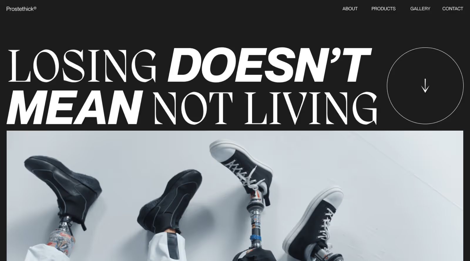
3. Expressive Typography
On our next stop, we have some BIG news! This trend is not about what, it is about how. How can you use really large typography in your precious design? The great thing about typography is that it portrays both words and visuals. So, you can add some text to your design that looks aesthetically superb!
What more can we wish for? Well, this year we wished for even larger typography and even bolder messages. And we’ve got some amazing results showing that words can rule the concept!
So, expressive typography is a technique that makes words the main part of the design. Mostly by enlarging them. Your text then becomes a central visual element and can have many interesting features of an image.
First, the idea is to capture most of the screen and steal all the attention. The bigger, the better. With expressive typography, you will know that everyone got the message! It’s crazy how this simple move made such a big difference. You can use expressive typography whenever, wherever, just make sure that you chose the right words to highlight. Otherwise, you will end up pointing out some phrases that are not relevant to anyone.
Second, you finally get to use many fonts that look better bigger than small. Some designers actually started seriously experimenting with the shape, colors, and shadows of typography now that they know it can dominate the picture. So we have our text in 3D, flat and semi-flat, unusually positioned, and even animated!
Besides, this trend goes well with any style and is easy to transform and adjust to your fashion. In effect, a lot of wordplays are on the table! So, next time you have something BIG to say to your audience, consider some literally big typography solutions!
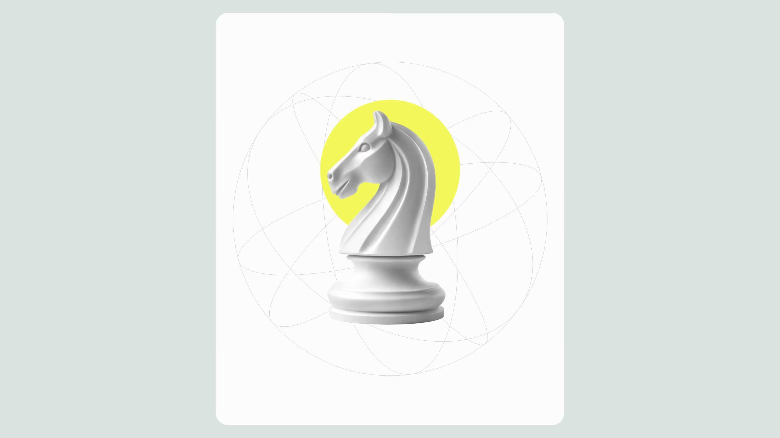
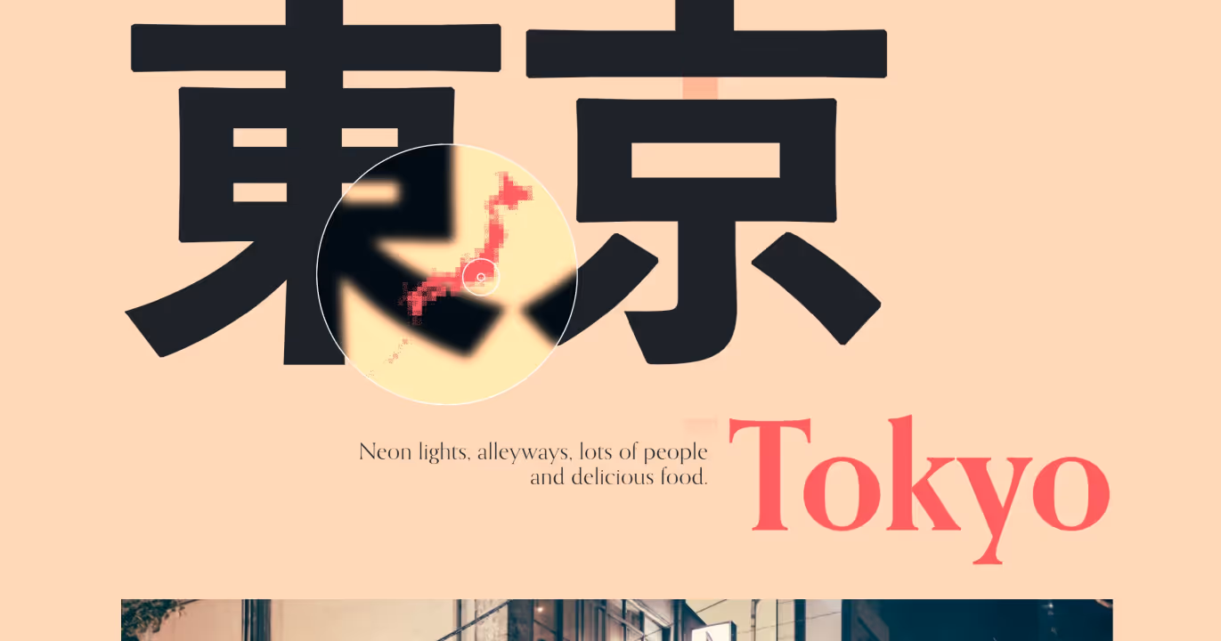
4. Geometry Effect
Geometry is never giving up! All you fans of regular shapes are gonna love that geometry is still hip in 2022. It’s so obvious why. Geometric figures have a lot of potential because they are usually simple shapes that can give dozens of different combinations. That well has not dried up yet. So, this year too, one of the leading trends in web design is the geometry effect.
Being fixed shapes circles, triangles, squares, and lines are so simply formed. Yet, if you mix them together in many different ways they can assemble anything but regular images! Today we have geometric patterns and beautiful puzzle-like visuals with a very obvious geometric structure. That structure transparency adds a special beauty to it. And, as combinations are endless, they can match any design style you prefer!
Can you imagine the effect obtained by coloring these building blocks in all the colors of the rainbow? You can truly make mesmerizing patterns shading carefully every piece of it. That’s why the geometry effect is popular in psychedelic designs, for creating abstract concepts and optical illusions. Be it a modern, high-end, or old retro look, geometry fuels any fellow trend. But, in 2022, designers found yet another way to use the simple power of geometry!
They started looking for geometric structures in already formed pictures. So, now is rather trendy not just to form pictures by arranging regular shapes, but to try and find geometric regularity in the structure beneath a picture. Like through the eyes of a bee! Designers are now seeing the design as a puzzle.
Experts tend to show that every image we see can be based on the geometric structure. Made of smaller parts that deserve to be seen on the surface! So, apart from a captivating look, geometry can give an engaging touch to elements of web design. It turns out that elements such as circles and squares are there much more than we notice, and we tend to naturally look for these familiar shapes. Therefore, 2D or 3D geometric forms can be used as CTA elements and help the site’s navigation or similar.
Squares or boxes, circles or balls, we bow to all these omnipotent figures! As it seems, we may have just scratched the possibilities geometry provides. Therefore, let’s reserve a place for geometry in design on the next year’s top list of trends as well.
5. Fun Informatics
Ever wanted to have fun while learning? This year brings a revolution in the presentation of big and important data! Spending a lot of time and money online, browsing services and products, of course, we want to know more about it all! Many apps and websites finally included information and data about their business, offers, customers, and accomplishments. All that for gaining more trust from Users by letting them peek into their statistics. And everyone appreciates it!
Knowing more about the product you want to buy and the people who sell it is only fair. So, any kind of analytics, explanations, descriptions, and other precious info should be transparent in every user interface. But, is it really transparent? Extensive info and plain data can be very exhausting to process. Nobody wants to spend all day reading about statistics, really.
That’s why some incredible design experts brought fun to the infographics!
It means, less text, more amusing content! Illustrations, icons, images, jumpy animations, audio, and video explanations, and many fun effects! Yes!
Fun Infographics brought so much relief to UI design because they are easy to process and fun to interact with. We get to learn and get info while enjoying these appealing and motivating graphics! And when you truly have fun while learning, you just want to learn more. Bingo! Let's just say how swiping textual info with visual one once again proved that we can easily obtain knowledge through images. By images, we mean suburb designs.
Well, how did it go from scary to airy? This trend mostly uses colors to categorize the content. You can easily spot what is what. The design is often based on geometry which gives the clear organization of data. Infographics have great effects and mini-animation that help you focus on important details. And they usually give you bite-sized material packed in the finest design!
Info + Graphics = Educative Playground = Design Trend!

6. Japandi Style
Ukiyo-e art influence
And last but not least we have…
Something old, something new, something borrowed and a new point of view!
It’s an amazing mixed trend called - Japandi!
Japandi stands for Japanese + Scandinavian design style we first met through interior design. Well, UI design welcomed this style too and, now it reached the top of all trends. We are talking about a hybrid trend of two minimalistic styles. The Japanese wave brings a warm, cozy vibe, and nature-based design, while the Scandinavian style adds a modern, sleek look with the reduced color palette.
But, how does it actually fit in UI design? On websites and apps, Japandi showed as a minimalistic, flat design with traditional art features. This style is also called the Ukiyo-e-influenced style, named after an old art technique from the Edo period in Japan (17th century).
Today, we would describe this trend as 2D, with obvious baselines and rich coloring. Maybe it sounds so simple, but it resulted in beautiful, unique art!
First of all, the Ukiyo-e style is like authentic visual storytelling! Pretty handy in UI design too. So, today designers use the dramatic look that Ukiyo-e brought to vivify many designs. Yes, it’s about 2D style trying to compete with modern 3D waves. But, let us tell you, although Ukiyo-e design has a limited perspective, it gives the brightest perspective on life! It’s literally filled with bright and vivid colors! Its structure and unique palettes give some unshakable calmness to the whole image. Like that look is only natural!
So, seeing Ukiyo-e as part of web or app design always gives the feeling of composure and peace. Even when there are no elements of nature in it, this trend looks completely organic and genuine. In the modernized version, it gets the coolness of contemporary design! More modern, sharp shapes and currently popular elements or motives.
This Japanese tender vibe and Scandinavian refined minimalism will make your design as light a feather! It truly fills any design with purity and effortless sophistication.
Fresh as a mint, it really proves that beauty is in simplicity.
So, do you feel the breath of the past wisdom and modern class? We do! And we hope for the Japandi style to evolve and follow us for a long time!
.svg)
.svg)