6 Top Tips for CTA Buttons in Web Design

TL;DR
CTA buttons may look small, but they drive your site’s biggest outcomes, clicks, conversions, and engagement. A strong CTA blends smart design and psychology: use brand-aligned yet contrasting colors, legible fonts, and clear shapes that signal interactivity. Pair creative, audience-tailored copy with intuitive placement (top and bottom of pages) and responsive mobile design.
The key insight: the best CTAs don’t shout, they guide, persuade, and feel natural to click.
Have you ever wondered how important those little buttons on your website are? Because they are. And, if you haven’t paid them much attention until now, here is an excellent place to start.
What is a CTA Button?
A CTA Button is short for the Call-to-action button. It’s a command or action phrase in a form of a button that lets the reader know what they should do and what they can expect once they click the button.
It’s a simple way to not only keep the reader on your website but to convert them from a reader into a potential buyer.

Why would you use a CTA Button?
You may use CTA buttons for different goals.
For example, if you have a newsletter, you can use a CTA button to get people to subscribe to it.
Maybe you’re offering a free demo for your product, so you can use a button to make website visitors get the free demo.
Perhaps you want them to stay on your website and read more about a certain topic you covered, which means you can send them to a different page through a CTA button.
Of course, if you’re selling something, you would use a CTA button to put the product in a shopping cart.
These are just some examples from the top of our heads. The reality is that the possibilities are endless.
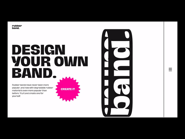
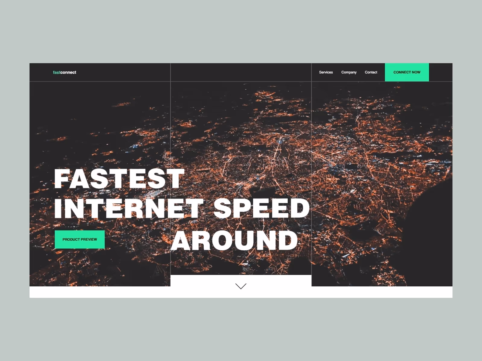
Tip one: Color
Back in the day, there used to be a debate on what was the best color for a CTA button. Believe it or not, it was between only two colors: green and red.
If you think of some pushy, in-your-face selling websites, you can probably conclude which color won (red. It was red.); however, as we all know, technology and trends move fast and nothing is ever as simple as picking between red or green as a work-for-all solution.
So, what should you use?
When you think about choosing a perfect color for your CTA button, take a couple of things into account:
- Brand colors
- Color matching
- Contrast
What are your brand colors? Can you use a color that will complement your branding yet stand out?
Think of color psychology and - even more importantly - think of color theory. It comes in handy not just for choosing the color of your CTA button but for everything else surrounding web design.
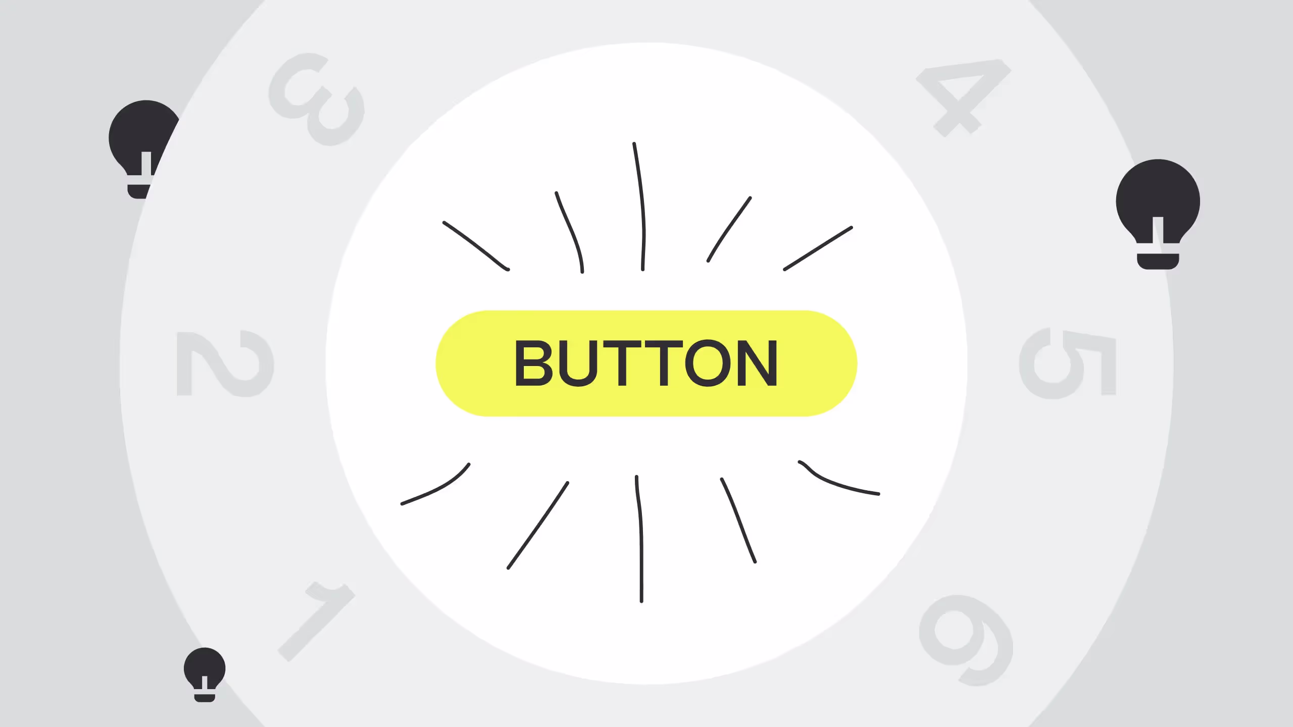
Also: don’t outline CTA buttons. Make them solid.
Tip two: Font
Pick a font that is familiar and easy to read. This goes for the whole website, but it’s also important for your CTA button.
Familiarity and legibility of a CTA button font are especially important as they work in favor of what the CTA button is there for: to be read quickly and prompt action.
What are some of these easy-to-read and familiar fonts? Here are some examples:
- Open Sans
- Montserrat
- Roboto
- Playfair Display
- Lato
- Merriweather
- Helvetica
Would you agree? Are you using some of these or some other fonts for your website?
Also, a bonus tip: make the text slightly bigger than the rest of the webpage copy. Not too big, though!

Tip three: Interesting copy
If we were to ask you to give us an example of some CTA buttons, the odds are you’ll list some of these:
- Learn more
- Buy now
- See more
- Subscribe now
- Add to Cart
And you’d be right. These are short, sweet, actionable CTAs. They are also incredibly boring and everywhere. The trick to an interesting CTA button copy is not only in the very button copy but also in the copy that precedes it.
Let’s do a quick exercise:
Say you own a cloud-based animated video creation platform. You can subscribe to it and create easy-to-make animation videos for your business.
In your research, you see that your target audience is people in the HR business. On the blog named “How animated video can aid you with your HR challenges”, you write something like this:
“Animated videos will convey your message in a fun and innovative way and will help people remember the information you want to convey.
Does this sound interesting to you?”
Now, the CTA button can be something like: LEARN MORE
OR, it could be something more interesting, as in: YES, I WANT TO BE FUN
Of course, depending on your target audience and the product or service you’re selling, think about whether this type of creativity could win your audience or do the opposite.
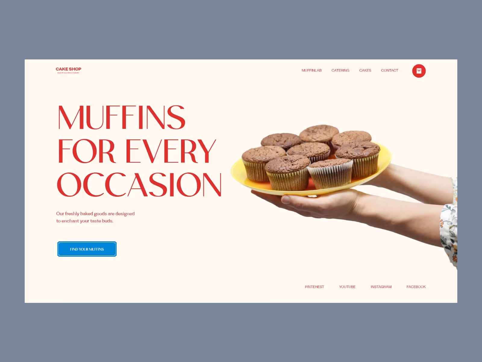
Tip Four: Make it hoverable and clickable
Sometimes you do everything right: a bold color, smart copy - but the button is just not clear enough.
In order to prevent any confusion, we suggest making hoverable.
Create a quick animation that will let website visitors know this is something they can click on. Make it change color, slightly move, or simply bold the text.
Giving it a clickable design means making it a round, ovular, or rectangle shape people associate with buttons.
Tip Five: Positioning matters
When we imagine CTA buttons, we usually imagine them somewhere at the bottom of the page, or near the product.
But if you’re writing blogs or landing pages for your website, more and more research shows that you should use CTA buttons before the reader needs to scroll, so somewhere at the first half of the page - as well as at the bottom of the page.
Don’t be scared to use more than one CTA button per page, but make sure that they complement each other and the rest of the content and that they do not compete with each other.
Tip 6: Think Mobile
You probably already know this, but we will like to say it anyway: think mobile first.
This is how Google sees your website too - it checks to see if it’s well optimized for mobile rather than desktop.
If this rule applies to your website pages, it also applies to the CTA buttons. Make sure that they are visible, check where they are positioned and if it makes sense. Google will thank you!

Conclusion:
Let’s repeat these tips one more time!
If you want your CTA buttons to be awesome (and to do the job they’re designed to do) then:
- Make sure they pop up but in a color that makes sense
- Use a font that is easy to read, familiar, and slightly bigger than the rest of the text on the webpage
- If/whenever you can, be creative with the text used on the CTA button (and everywhere else)
- Make your CTA buttons clearly clickable: make a hover animation or make a button-like shape for them
- Add CTA buttons at the first half of the page, as well as the bottom
- Think mobile-first
Have you seen any cool examples of CTA buttons? Do they apply these tips?
.svg)
.svg)