5 things every designer should know about white space


TL;DR
White space isn’t wasted space, it’s an active design element that defines structure, balance, and focus. Whether macro (margins, paddings) or micro (line and letter spacing), it helps users navigate content effortlessly. Used well, it creates hierarchy, improves readability, and adds sophistication to your design. The right balance between filled and empty areas doesn’t just make a website look cleaner, it makes it feel easier to use and more trustworthy.
At a time when many people are worried about what to put on the page of their website, we advise you on how to get rid of as many things as possible. What kind of advice is that? Practical!
Ever since the active use of white space in design appeared below, above, and between elements, we have realized the lack of objects can be useful. Previously, white space may have been just a wasted space where you haven’t figured out what to put yet. But today, it is an active element of design. This is simply because in some places on the page it is good to have nothing - except white space.
We will explain to you why.
White space, blank space, empty space
Names for spaces without objects vary but are most commonly called white space. However, the first thing you need to know is that it doesn't have to be white. Although, it often is.
If, for example, the background color on the site you are creating is not white, then this empty space will not be white either. It is not about the color of the space, but about the fact that it does not contain any objects, that it is empty.

Macro and micro white space
Well, if you already know what white space is, you’ve probably noticed that designers leave it at the bottom or top of the page, on the side, and between larger objects. That is exactly the macro white space, and it includes:
- Margins
- Gutters
- Paddings
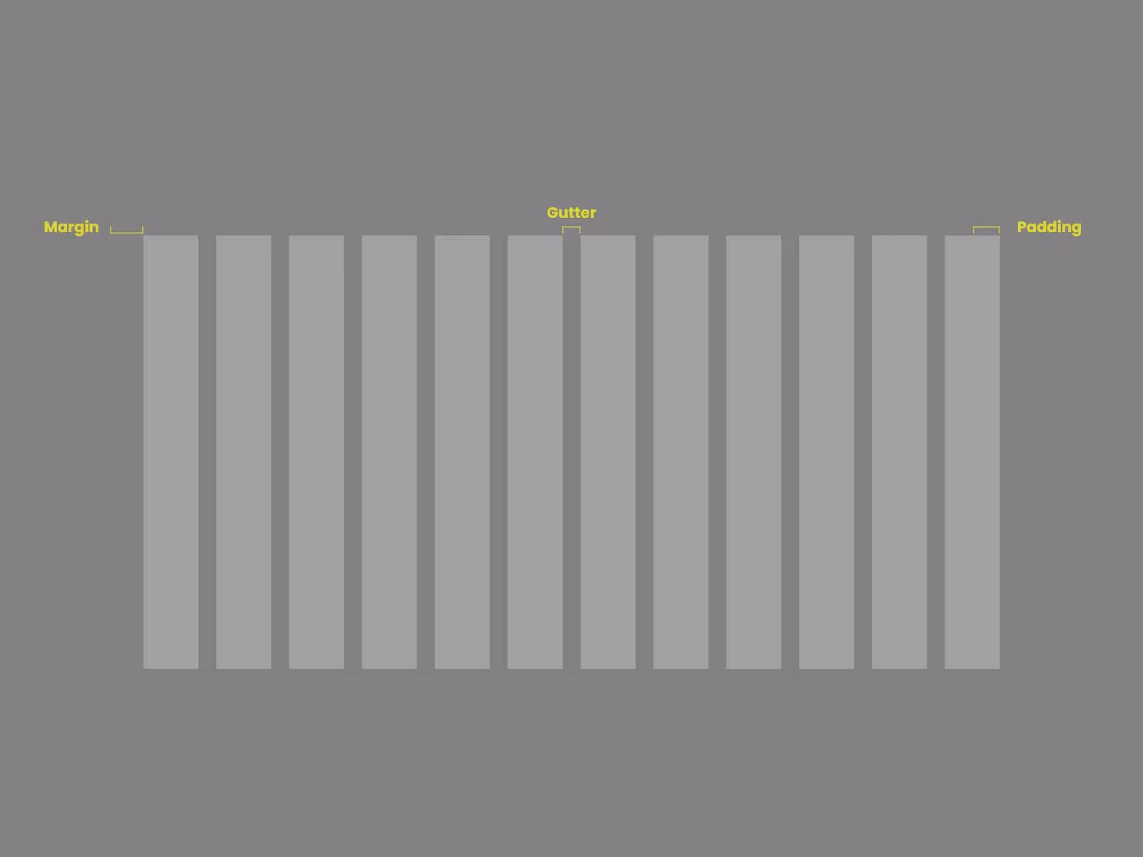
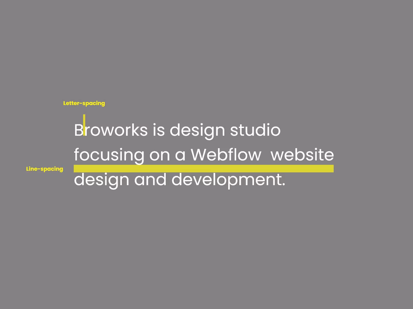
However, don't forget that spaces between lines in the text and spaces between words are also considered empty spaces. This small but important space is called micro white space:
- Line-spacing
- Letter-spacing
Both macro and micro white space are essential for the overall experience of the site. That is why we reveal to you 5 things that you need to know about white space!
1. Overall hierarchy
Everyone wants to see a site where the objects are finely balanced. Everything seems to be in place, the image is compact, and the overall site experience is pleasant. How is this achieved?
There is no special trick but just a smart use of white space.
By adding gaps you can clearly yet unobtrusively separate elements and thus improve the organization of the site. The space you use among the objects singles out some of them or categorizes them as additional. It helps every User to find his way on the page because the empty space divides the information into important and less important. Examples of this balancing between data and gaps exist everywhere. White space is a pretty handy thing that can create symmetry or asymmetry on a page. So it is not difficult to fit it into the design of any site.

2. Setting focus
By surrounding an element, white space emphasizes it. In a way, this object is on a pedestal, and no other element threatens to steal the attention of the User. Don't be afraid to separate some objects from others because they can hold the User's attention longer. The users will focus their attention on a certain part of the page because there is simply nothing else nearby.
That is a very subtle way to draw attention without making the design pushy in any way.
White space creates invisible boundaries between the elements, which do not bother the User, and that is its true power.
3. Grouping objects
It’s not just a matter of adding distance between elements! If you get carried away with too much white space, the content may become disconnected. In case you do not know how and when to use empty space, the content of the page may fall apart.
The secret is in a good balance between adding and removing whitespace.
Namely, objects that are close to each other are perceived as a group or as a unit. Those objects that are distant, separated by a gap, will be perceived separately. You can make good use of those facts!
If you want to group some elements, use less white space between them. Users see such groups as a meaningful entity, so try to make sense.
This way, you can separate what should be viewed together from what should not. And it’s all about the amount of white space!
4. Optimizing text
This is where the micro white space we talked about comes to the fore! Small spaces between the lines in the text can do a real miracle. Well, you can certainly remember situations when you corrected line-spacing in a text and were amazed at how much easier it is to read. The same goes for letter-spacing.
Precisely this line and letter spacing improve legibility.
The point of adding this micro white space within the text is to unload it. There is a possibility that the site has quality content, but no one wants to read it because it looks like a chunk of text. Then, whether someone will read the text depends no longer on the words but the empty space.
On the other hand, do not overdo it. If you want to unload the text by adding white space, be moderate. If you spread the lines and the letters too much, the text will be illegible. In addition, the overall visual experience will be distorted.
Therefore, it is best to add and subtract white space in doses. Optimal line spacing is between 120% and 145% of the point size.
5. Improving style
White space has a share in the design style itself!
As we have already said, playing with white space, separating and grouping the elements, affects the overall look of the site. Many sites that use a lot of whitespaces in the right way look lightweight. In addition, they are not less informational and unclear. Websites like this are very popular today because they are pleasant for searching and emphasize the most significant things in the right place. Most importantly, whitespace performs its role and works very sophisticatedly on the overall appearance.
This is not just the case with websites.
You can look at any design work, for example, a logo design. Negative space, as white space is called in logo design, is often used by designers who know that more or less. They use this negative space to make the logo structure more elegant, so these designs have a simplified, high-class look.
You can use this white space just for an elegant look in web design or any other type of design.
So, tap into the multi-useful power of the white space!
.svg)
.svg)