8 Tips on How to Master Your Figma Project


TL;DR
Creating a clean Figma-to-Webflow workflow isn’t about rigid rules, it’s about structure that scales. Broworks uses a 10-step process to move from sketching to production: start by exploring concepts freely, then define reusable components and styles for text, color, grids, and effects. Organize pages and layers so developers can navigate fast. Prepare optimized images and element states (hover, focus, pressed) to prevent rework later. Finally, build a Rich Text system for CMS templates. The takeaway: disciplined setup in Figma makes development faster, collaboration clearer, and end results more consistent.
Having a perfect way of working is individual and differs from person to person, from company to company and in this article, we’ll cover how we at Broworks, organize, structure, and prepare our projects in Figma for development in Webflow. So, let’s dive into it!
There are a couple of stages in this process which we split into ten, to make things a bit easier to digest, so here they are:
- Sketch & Explore
- Components
- Styles
- Pages
- Layers
- Preparing Images
- Element States
- Rich Text
1. Sketch & Explore
In this very first stage of our process, the best way to go is to start by sketching and exploring on a separate page in Figma until the art direction is confirmed. This is probably the best way to do it in order to keep your project clean or organized. If you start organizing everything at the beginning there are high chances that things might change later during the process which can be time-consuming even if you created components and everything else.
Looking for the right approach at the very beginning will also help you have a better understanding of how things will go and keep you less stressful.
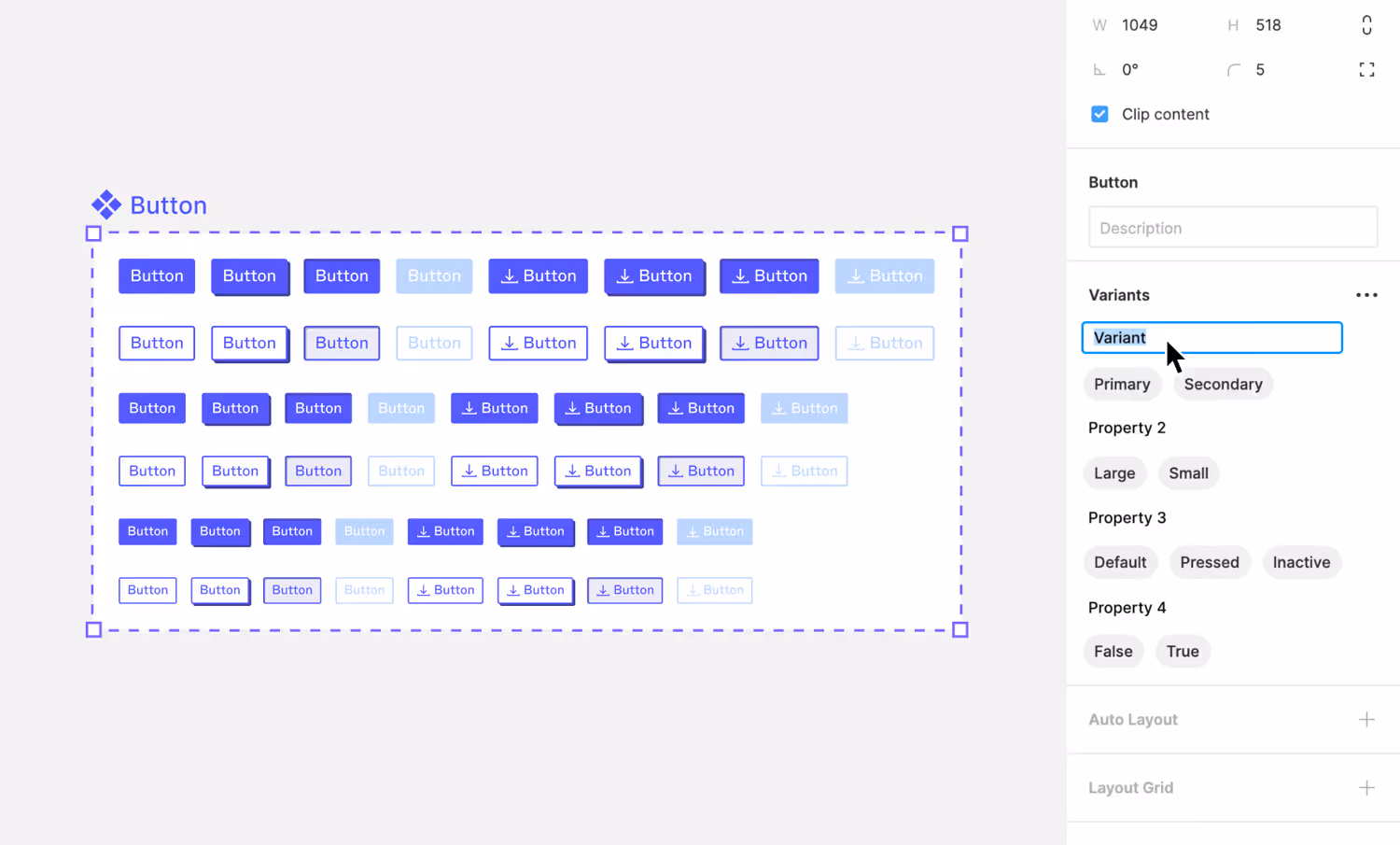
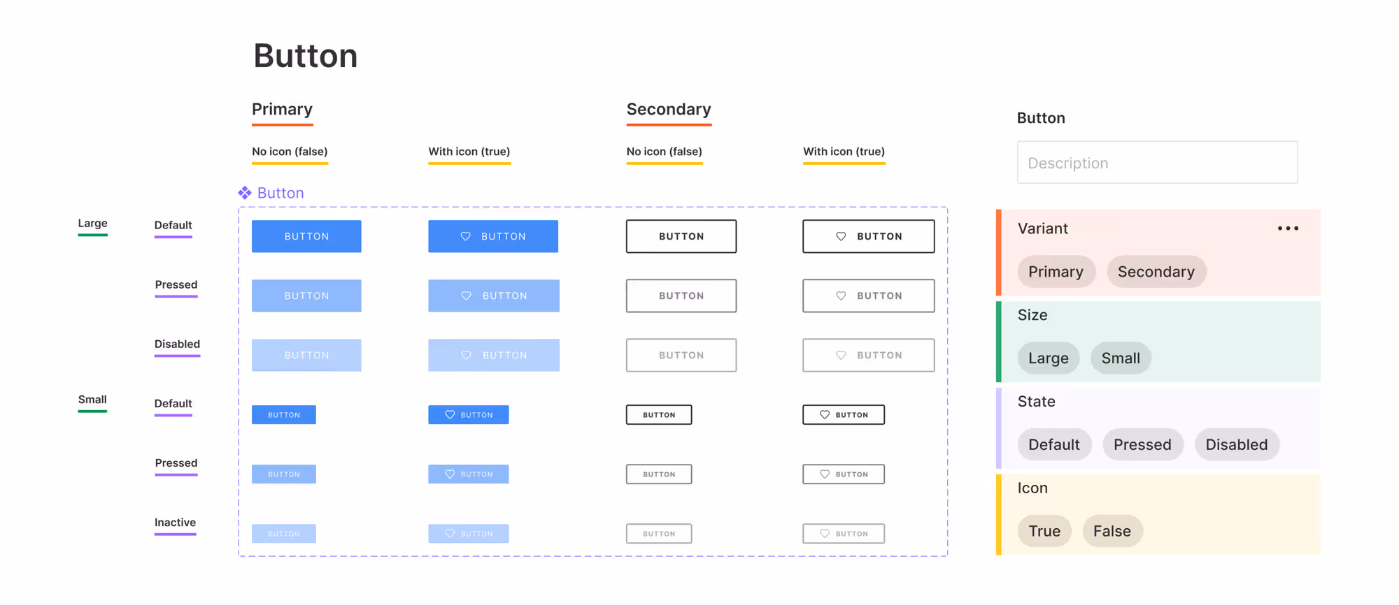
2. Components
Once we established a clear art direction, we should start lying out our content and create assets that are easy to use and update. When we do components the best way to create them is for elements that we use the most, such as buttons, header, footer, forms, portfolio, and all sections we will be using across our design. This works in a way that we create one main component, which we can duplicate wherever we need it. If you edit a duplicated version of the component, the effects are going to apply only to that single component, but if you edit the main one, the effect will be applied to all others. By clicking on the “Assets” tab in the top left corner you can have access to all main components at once.
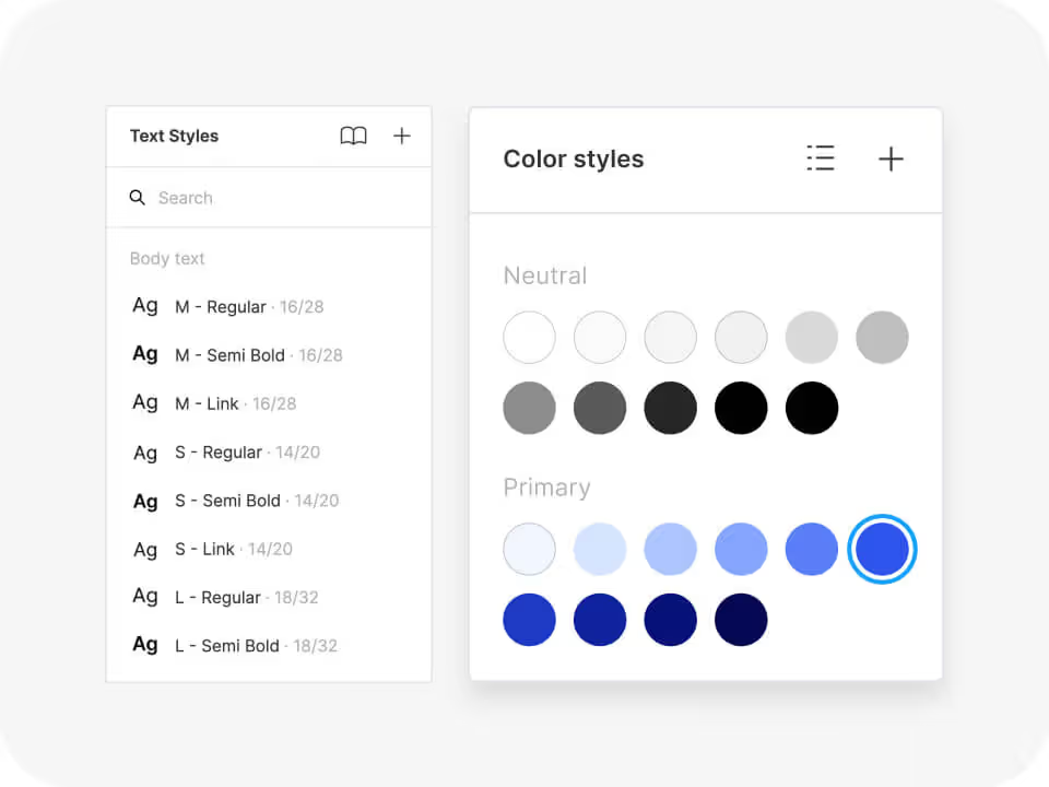
3. Styles
We can split this into a couple of different styles that we use:
- Text styles
- Color styles
- Grid styles
- Effect styles
Styles we use similarly like we use components but the difference is that we create them only for these specific things mentioned above. They work almost like folders that we can label and even put style within a style for even better organization. From there we can apply them for every element that belongs to that group and if at any moment we need to update any of that, updating it on one will be applied to all with the same style. All styles are located on the right “Design” tab and you can see them all at once if nothing is selected.
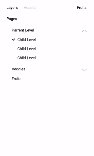
4. Pages
Pages are stored on the top left bar with the title “Pages” on it. In there, by clicking on the “+” icon, you can create as many pages as you want. Using pages is a good way to organize your project by having them for different purposes and labeling them differently. For example, you can use them for organizing stages of your project, such as, “Moodboard”, “Wireframe”, “Mobile design”, etc. That helps us focus on one part of the project only without too many things around distracting us from what we need to focus on.
5. Layers
We all know that designers who label their layers in Figma are almost non-existent, but doing that can help both you and others (especially developers and project managers) find what they are looking for faster if they don’t have “Edit” rights in your Figma file. Other than labeling them it’s also very useful to group elements that belong together for easier, cleaner, and more organized projects.
6. Preparing Images
Designers, very often, put images in certain shapes using “Mask” and even more often by using a certain shape and placing an image in it. Even though this is super convenient for a designer to do, it’s very difficult for a developer. In our team, the designers' responsibility is to prepare and export images in their original size by compressing them as much as possible to keep the overall quality and keeping it in their original size. We’re doing that because that way developer can manipulate this image in Webflow however he wants to achieve the same effect as in design. Keep in mind that every image should be in JPG format (if it doesn’t have a transparent background) with a maximum of 300KB.
7. Element States
Every project has elements that require different states, depending on their usages, such as buttons, forms, text link, and link block, pretty much everything that is a link or that do something when you hover or click on it. But it’s not just hover and click, here are all the states that interactive elements should have:
- Current (non-active state)
- Hover
- Pressed
- Focused
- Visited
All interactive elements should have all these states and therefore designer should prepare all that before the project proceeds with the development.
For the forms, you’ll want to create at least success and error messages to not face default design once users run into these.
8. Rich Text
Not every website has this, but when a website has templates, such as a blog and portfolio, you’ll need to create rich text. This includes creating an artboard page with the following:
- Cover photo (if needed)
- Titles from H1-H6
- Paragraph text
- Ordered and unordered list
- Quote text
- Image/Video placeholder with caption text
- Text link
You need to keep this separated since in development, especially in Webflow, templates have separate classes that you need to style and sometimes H titles don’t make sense to be the same size in the template text as you’re having them on a website, so it’s always better to create this for every project.
.svg)
.svg)