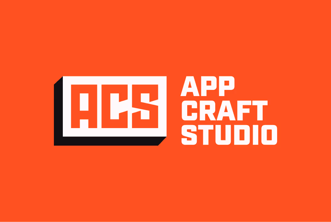
Case Study: App Craft Studio. Brand Identity

.avif)
TL;DR
App Craft Studio, a visionary app development team, sought a brand identity that mirrors its inventive and interactive spirit. The challenge was transforming simple initials (ACS) into a logo that conveys stability, innovation, and the immediacy of “one click.” Through geometric refinement, a tactile button element, and a disciplined color and typography system, the design achieved both clarity and motion. The result, a scalable, consistent identity across print, digital, and social touchpoints, proves how thoughtful structure and adaptability turn a logo into a living extension of brand philosophy.
Designing the logo and other brand identity materials of App Craft Studio for branding their innovative work.
When we see something that other people do not, it makes us think that it is something minor or irrelevant, and we cannot see the potential. We, humans, are such beings who need support to thrive, so the real gift is to be one of those who see room for improvement where others do not. App Craft Studio is one such great team of tireless visionaries.
The ability to implement an invention from a raw idea to a finished, useful product is just one of their qualities. Their motivation is the constant sharing of ideas among people, and their expertise is in developing applications that improve social life. By pushing the boundaries of technology, they show us that devotion creates products that people were not even aware they needed.
On the other hand, we designers strived to brand this team of geniuses with the most professional design by which they will be recognized.
Project
The transparent design of the App Craft Studio brand identity in the form of a logo, email signature, social media cover, business card, and style guide book.
Client
Working on the brand identity of ACS included a synthesis of their driving values, serious reputation, and our design abilities and imagination. The plan was to make something classic looking and legible in a way that users instantly get the idea of everything App Craft has to offer. Inspired by the enthusiasm of their team, we got a lot of ideas on the spot and buckled down to show their concrete work in the design dimension. Our way of crafting has kept pace with theirs in creating a simple yet influential piece of design.
Design Process
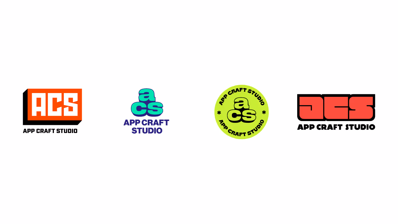
The process begins when ideas start to emerge in some significant form. At their request, the mold for the logo became the letters ACS - the initials of the company name.
That was the most perfect, transparent option that could serve as a symbol of the pretty straightforward approach of the company.
Anyhow, letters themselves may contain the essence of the brand but had to undergo a serious transformation in order to become a logo. To emphasize - a logo as part of branding gives much more than words because it aesthetically conveys a visual message. These initials had to go from an unconvincing look to a more impressive one. Therefore, we added elements to this primarily simple concept that gradually made it of better quality.
Defining a Logo Icon
First, stability. What do we want to point out to clients if it is not a stable team of hard workers? This core value of the company had to become a distinct part of the logo, so we did reshaping of the elements by giving the letters more pronounced edges and corners.
On the one hand, the shape of the letter became distinctive, but now it was necessary to avoid a sort of blank look. We had to work on the personal character of the logo, which would contain another mattering trait of the company - interactivity. We can say that our starting point was the integrity of an ordinary cube, which we wanted to achieve by refining letters and adding a button-like element behind them.
A small change and concept already looked more specific.
One click solves everything
Sometimes, for delivering the best presentation on the Internet, it is enough to follow users' feedback and their way of using some product. In the case of ACS, this means observing the way customers use their applications when all responses to requests are obtained through a click. Similarly, we wanted to convey the pro-active energy of ACS to users through sort of a visual click. Thus, the logo icon got this interactive form and a kind of call-to-action impression that should guide users through the whole idea and work of ACS. This way, the concept has gathered all the essentials under a new design, and it was time to take a look at the typography.
Typography and Planning
For wordmark, we chose the Industry font that fitted well with the design of the initial letters that we were customizing. However, most of the work here was positioning and resizing of contents. In this stage of the process, we had to go beyond the box and pay attention to the widespread usage of the conceived logo.
The creative rules that shape the elements of brand identity
The design was supposed to be perfectly presented on smaller and larger surfaces, screens, and different contexts so that it does not lose the main features of its appearance. In other words, all parts of the ACS branding had to be thoughtfully designed in a single organization of elements and colors. Let’s take a look at how different lockups have complied with this.
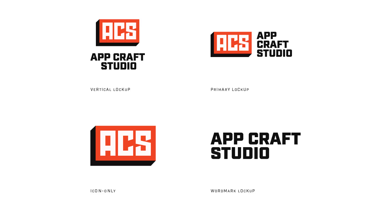
The primary lockup consists of an icon and a wordmark on the right side of it. Making it ideal, we played by the rules of spacing and proportions. So, for example, the wordmark is precisely three times smaller than the icon, and its vertical center aligns with the right corner of the icon.
Vertical lockup is designed in a way to be vertically efficient and for contexts more suited to central lockup. It's seemingly simple organization is also planned by some regularities. For example, the font size is used as a dimension in spacing and the like. For a neat look, it is crucial to determine the geometric regularities on which the design idea is based. It gives the design a touch of professionalism in its appearance.
In addition to this, some variants require icon-only or wordmark-only lockup, which we also readily provided.
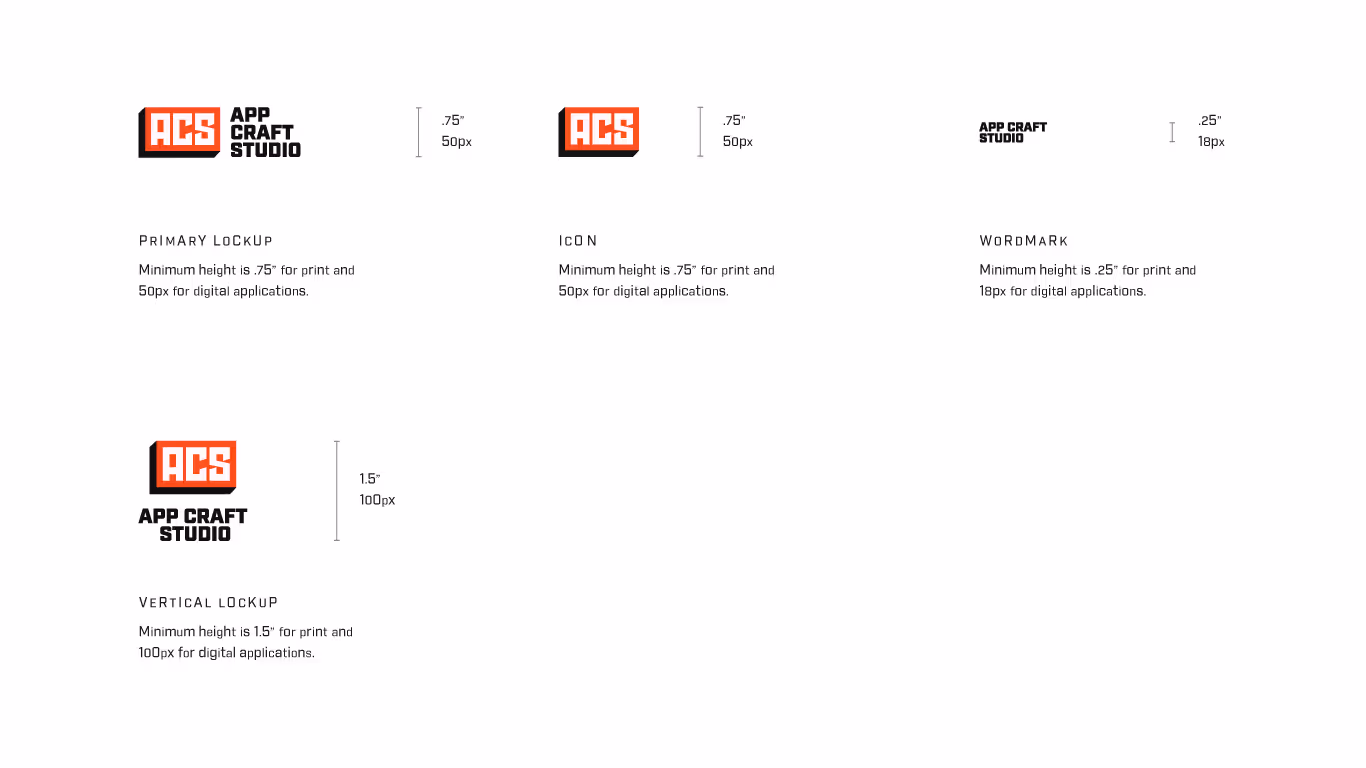
Here we have also determined the minimum size of the logo and explored different size options for various purposes. We analyzed how to design all lockups so that they can be seen on both billboards and mobile phone screens in an unmistakably legible appearance. Because being noticed is the greatest achievement for a brand identity.
Color Palette
It was not the end of customization because all the previous parameters of the work can apply to the use of colors.
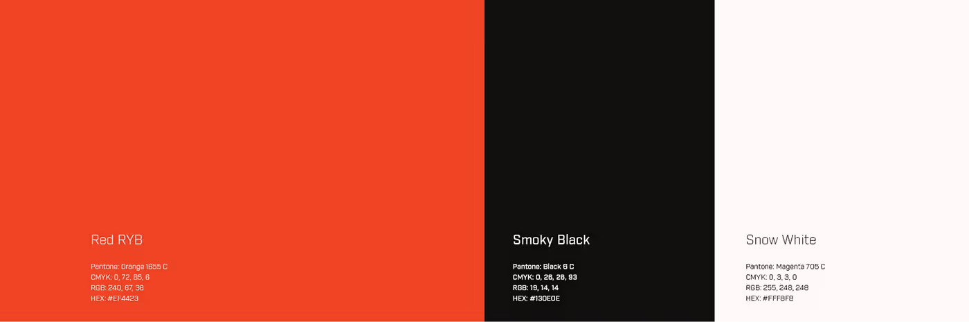
Colors on the web are most easily recognized and associated with the company they represent. We carefully manipulated them to make the logo fit in many contexts, so we used white and black - the most common background colors. On the other hand, we displayed authenticity in Red RYB color that is tightly bound to ACS online presence.
Although a consistent color palette is a powerful sign of recognition, on the web, colors must adhere well to the background and content. For that reason, tints of authentic colors are used to find a balance between the best visual impact and a recognizable look.
In addition to choosing colors and tints, trying out combinations has multiplied the options. Typical useful examples are Three-color and Single color combinations for Light Mode and Dark Mode. Of the various solutions with colors, positioning of contents, display on substrates and textures, the most suitable were selected and given for use. All this is for the sake of finding the most legible version of current demand.
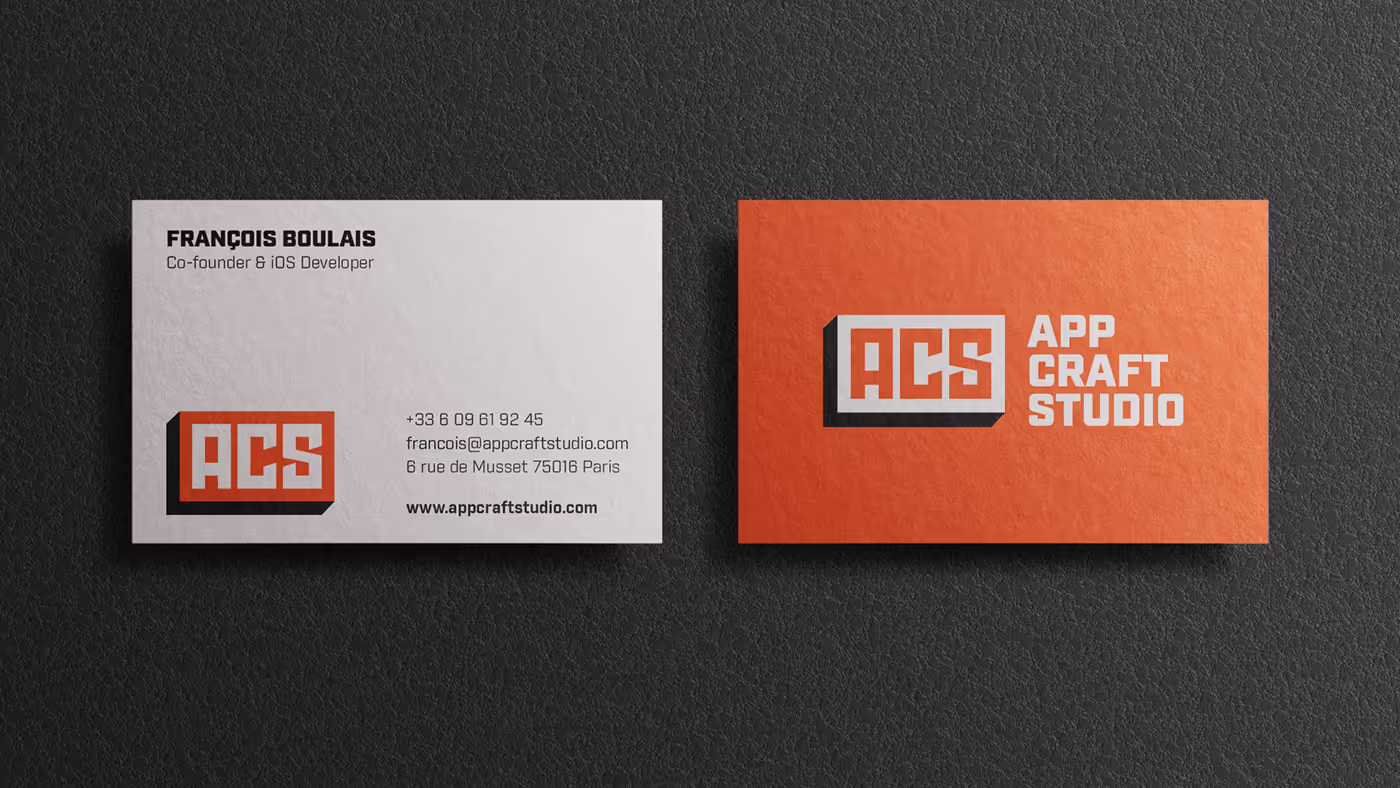
Business Card
The primary lockup, for example, is perfect for a business card, where you need to look professional and serious. We have organized the elements so that on one side of the card is a primary lockup in bright red background with white letters for an attractive and positive look. On the other side of the card, you can find the client’s information and a logo icon in Three-color Dark Mode, a sort of standardized representation of the company.
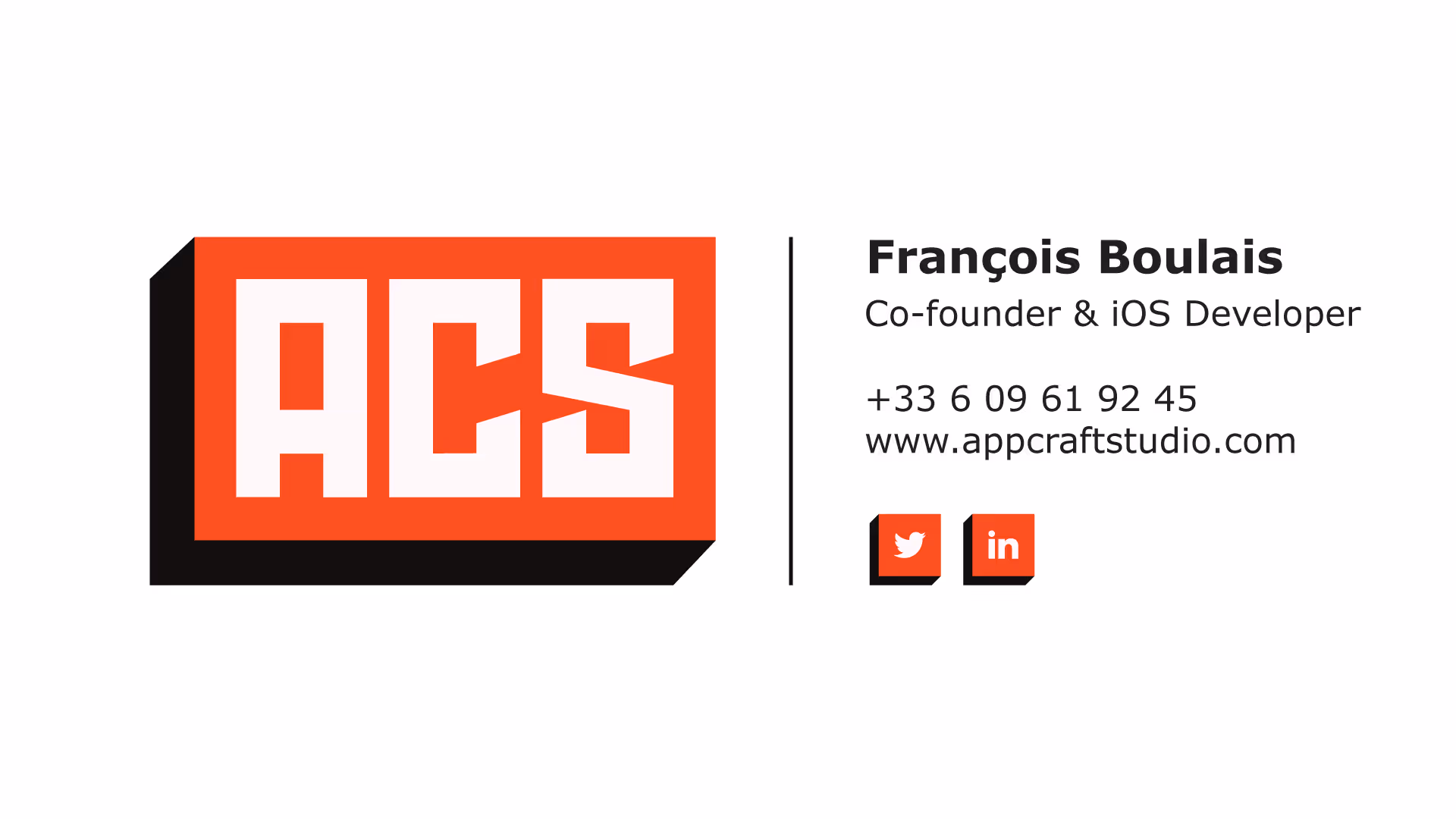
Email Signature
The same Dark Mode, white letters on the black button, is used for the email signature. Next to this ACS logo icon is clearly shown all the relevant information about the client, so that this signature can stand beneath every business conversation. Details that distinguish it from business card design are clickable buttons that quickly lead to contact with the client via some social network.
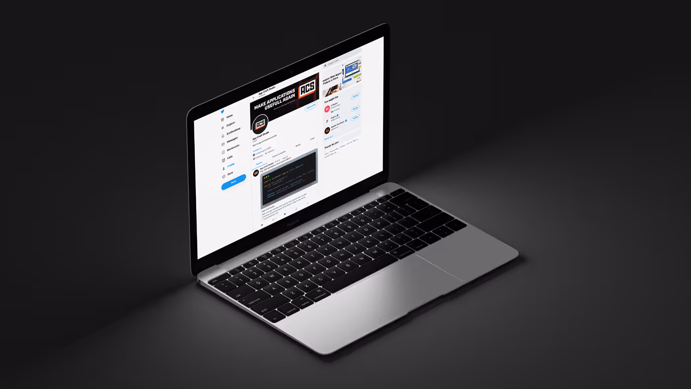
Social Media Cover
We also used this standardized three-color combination for social media cover. However, the best visual impression of the logo icon here is achieved in Light Mode. Dark letters on the white surface, with the bright red sides of the button that give that amazing 3D look. Logo icon as such can be combined on the web with, for example, captions and fits well in different frames so that it always looks cool and eye-catching.
Variability. Options. Usage.
Why so many solutions? This number of design versions has been created so that the materials of the ACS brand can reach anywhere - on any surface, in any size and environment, not only in the ones we have described here.
We believe that great design is one that is flexible in use yet stable in expression - that is what makes it so powerful. It carries a whole repertoire of useful alternatives, all legible and consistent, that very obviously represent ACS in any situation.
Therefore, when it comes to the product of our design, we like to keep it casual and always ready for a well-dosed transformation.
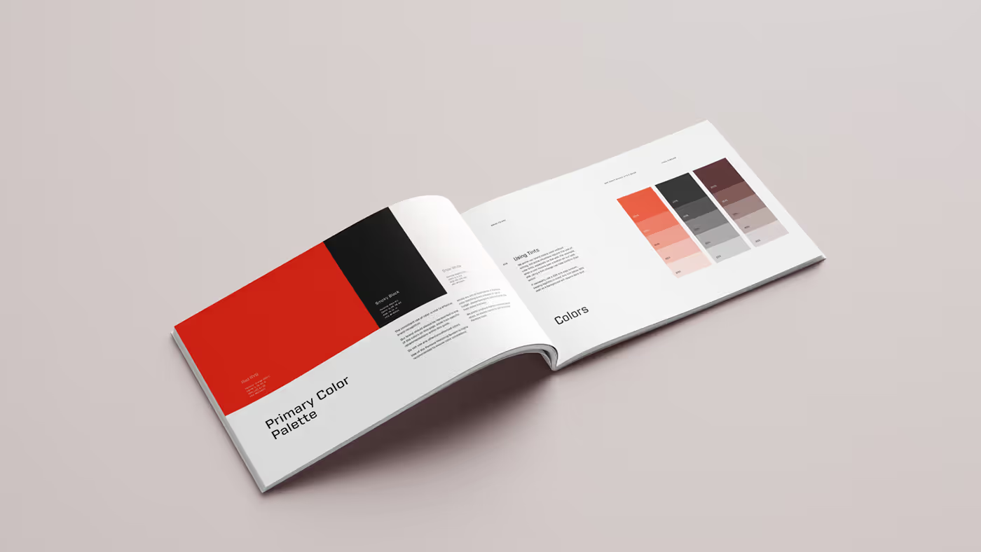
Style Guide Book
We did not hesitate to go into details.
The whole project is presented in a Style Guide Book with the same amount of style and energy that we invested in the project itself. We wanted to enable the client to see the whole process of creating each element of his brand identity. We went deep into explanations through words and illustrations. However, we claim with certainty that we have transferred even the most complex phases of design to paper clearly and interestingly. After all, every page of this guide book is dressed in our best design, with utmost care.
.svg)
.svg)